Neutral Sans Workhorse

Super Chunky + Cenura
Lets Super Chunky own the focal silhouette while handling secondary copy, sizing and subheads cleanly.
Inspect Cenura specimenDisclosure: MakerFileHub may earn a commission from qualifying purchases via paid links on this page. How our links work.
Retro groovy bubble display
Super Chunky is a retro groovy display in black on a pink quatrefoil ground: extremely fat letters with swelling strokes, small round counters and wobbly edges, stacked in two lines with a tracked caption beneath, so the pair reads as a hand-painted seventies poster rather than a modern sans.
Paid link
Get this fontProject & layout blueprintsAt-a-glance maker compatibility
Sturdy stroke walls and open counters weed cleanly on adhesive vinyl, HTV apparel film, and cut cardstock.
Visual anatomy & craft review
The two words fill the plate and every stroke is inflated: the stems bulge in the middle, the terminals round off, and the joins between strokes are soft enough that the letters look poured rather than drawn. The counters are small and round, which is what keeps a very heavy weight readable, and the edges carry a slight wobble so the shapes never look geometric. Spacing is tight and the two lines are stacked with almost no gap, which turns the pair into a single decorated block. The ground is a pale pink quatrefoil pattern, and the two captions beneath are set in a light hand-drawn grotesque, so the heavy display does all the talking on the page and the pattern behind it supplies the period texture.
Groovy, bubbly, fat, retro
Two-font hierarchy recipes
Tested contrast partners — pairing Super Chunky with grounded secondary typography.
Super Chunky + Cenura
Lets Super Chunky own the focal silhouette while handling secondary copy, sizing and subheads cleanly.
Inspect Cenura specimen
Super Chunky + Papillon Serif – Elegant Modern Luxury
Grounds bold display lettering with classic typographic authority on posters, badges and apparel.
Inspect Papillon Serif – Elegant Modern Luxury specimenPractical applications
Concrete hierarchy, scale and production guidance tailored to Super Chunky’s stroke geometry.
A groovy bubble face carries a seventies reference in one word, and the fat strokes read from a distance where a thin retro script would need a second element to hold the eye.
Hierarchy & layout recipe
A2 portrait: the headline at 130 mm cap height, the stalls in a 14 mm rounded sans, and the date at 20 mm. Keep 30 mm margins, print two flat colours, and keep the pattern behind the type at low contrast.
Pre-production check
Check the poster at five metres, where the small counters can close; keep the counters above 8 mm at final size. Confirm the 14 mm stalls read at two metres and that the pattern does not fight the letter edges.
A bubbly display turns a birthday into a party from across the room, and the heavy strokes print cleanly on fabric where a novelty script would break up.
Hierarchy & layout recipe
Print 800 by 400 mm: the name at 140 mm cap height, the age in a 50 mm rounded sans, and a 6 mm border. Keep 25 mm margins and print two colours on a white ground so the counters stay open.
Pre-production check
Check the banner at four metres, where the inflated strokes can merge two letters; open the tracking slightly. Confirm the 50 mm age reads at three metres and that the border clears the eyelets.
A groovy label stands out on a shelf of clean modern designs, and the fat letterforms stay legible on a small can where a fine retro face would disappear.
Hierarchy & layout recipe
Print a 60 by 90 mm label: the flavour at 18 pt, the volume in a 7 pt sans, and the brand at 8 pt. Keep 5 mm clear inside the die and print two flat colours on a coated stock so the bulges read as printed shapes.
Pre-production check
Check the 18 pt flavour on a curved can, where the outer letters distort; reduce the tracking. Confirm the 7 pt volume reads in the chiller and that the label wraps without squashing the counters.
Technical & licence verification
Confirm included OTF/TTF/WOFF formats, full glyph tables and licence coverage on the live store page before batch production.
Closest visual alternatives
Matched across letterform anatomy, stroke behaviour and craft applications.
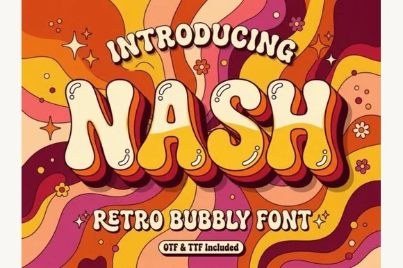
Groovy 1970s psychedelic lava-lamp bubble display (OTF & TTF)
Nash is a cheerful 1970s psychedelic bubble display font swelling bottom-heavy groovy curves for retro shirts, posters, and mugs (OTF & TTF).
Ideas for this font
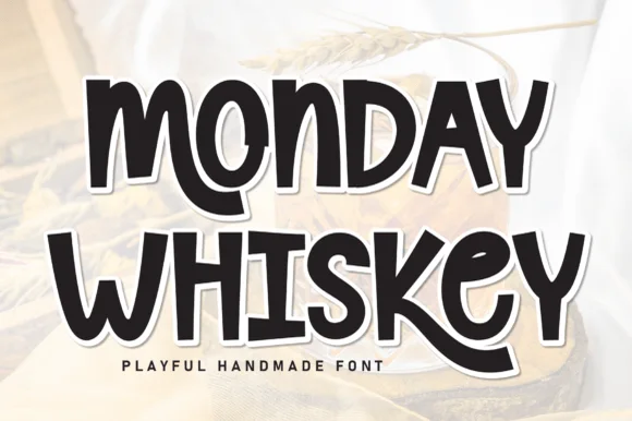
Playful hand-drawn caps with offset outline
Monday Whiskey is a playful hand-drawn display in near-black with a white contour and a heavy offset shadow, set over a warm sepia photograph: fat irregular caps, a bouncing baseline, an E drawn with uneven arms and an S that swings open, with a tracked caption beneath.
Ideas for this font
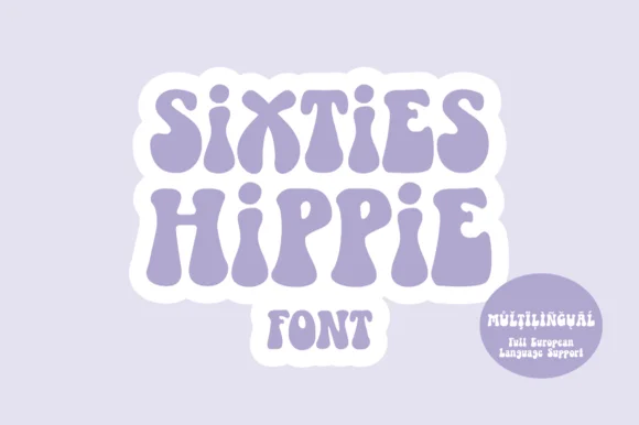
Heavy 1960s flower-power & Fillmore poster display
Sixties Hippie is a warm, bottom-heavy 1960s flower-power display font with pinched waists, plump teardrop feet, and full European multilingual support.
Ideas for this font
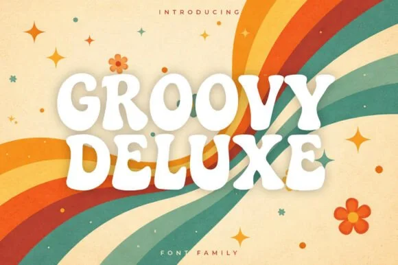
Soft groovy 1970s poster display family
Groovy Deluxe is a clean, upbeat 1970s retro display font family with softly pinched waists, plump rounded feet, and clear open counters.
Ideas for this font
Same independent foundry
Allow optional Google Analytics to measure visits and catalogue actions. Your search words and notes are not included. Privacy & storage