Neutral Sans Workhorse

Cameron Monogram + Swaraga
Lets Cameron Monogram own the focal silhouette while handling secondary copy, sizing and subheads cleanly.
Inspect Swaraga specimenDisclosure: MakerFileHub may earn a commission from qualifying purchases via paid links on this page. How our links work.
Large contrast serif initials crossed by finely drawn sunflower heads with separate script names
Cameron Monogram draws a heavy split capital with a sunflower blooming in its counter, runs a script name across the cut, and repeats the construction in four colourways.
Paid link
Get this fontProject & layout blueprintsAt-a-glance maker compatibility
Weld or Unite overlapping script joins into one continuous vector path before sending to the blade.
Visual anatomy & craft review
The preview shows four marks in a grid, a yellow C with Gabriel beneath it in black script, a pink D for Debby, a lilac G for Gebrina and a teal K for Katryna. Each capital is a wide serif letter with a heavy stem, cut horizontally so the script name can pass through it, and a line-drawn sunflower with a hatched centre sits in the space above the name. The script is a light brush hand that overlaps the letter on both sides, which is what makes the mark look assembled rather than typeset. Every version uses a single flat colour plus black, so the set prints cheaply, and the sunflower is drawn at the same line weight throughout, which is what holds four different letters together as a family.
Large contrast serif initials crossed by finely drawn sunflower heads with separate script names
Two-font hierarchy recipes
Tested contrast partners — pairing Cameron Monogram with grounded secondary typography.
Cameron Monogram + Swaraga
Lets Cameron Monogram own the focal silhouette while handling secondary copy, sizing and subheads cleanly.
Inspect Swaraga specimen
Cameron Monogram + Raffined
Grounds bold display lettering with classic typographic authority on posters, badges and apparel.
Inspect Raffined specimenPractical applications
Concrete hierarchy, scale and production guidance tailored to Cameron Monogram’s stroke geometry.
The sunflower and the script name make a place sign that suits an outdoor wedding, and the split lets a long surname fit across a narrow letter.
Hierarchy & layout recipe
Print a 150 by 200 mm sign: set the monogram at 140 mm tall with the name band at 30 pt, keep 16 mm of clear ground above and below the band, and hold 18 mm from the petals to the edge of the board.
Pre-production check
Thin petal lines snap when cut; print one sign on the intended material and test a petal before the set.
The drawn flower gives the card its season, and the name band makes it personal without a separate printed label underneath the mark.
Hierarchy & layout recipe
Print a 120 by 170 mm card: set the monogram at 90 mm tall with the name at 26 pt, keep 20 mm of clear ground beneath before the written message, and hold 14 mm from the letter to the card edge.
Pre-production check
Pale yellows disappear on cream card; print one card on the intended board and check the contrast before the batch.
The split letter carries the shop's initial and a name in one shape, and the sunflower repeats well on paper without a second motif.
Hierarchy & layout recipe
Print a 400 mm wide repeat on 80 gsm sheet: set the monogram at 60 mm tall inside a 90 mm tile, keep 18 mm of clear ground around the petals before the tile edge, and hold the tile spacing at 30 mm so the names do not collide across the seam.
Pre-production check
Sheet-fed printing drifts the repeat; print a short length and measure the tile before the full roll.
Technical & licence verification
Confirm included OTF/TTF/WOFF formats, full glyph tables and licence coverage on the live store page before batch production.
Closest visual alternatives
Matched across letterform anatomy, stroke behaviour and craft applications.
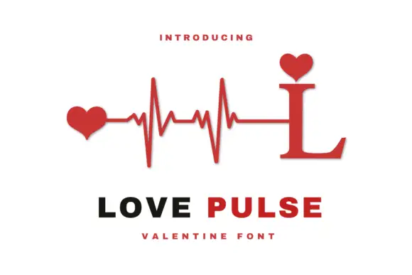
Heartbeat monogram design
Love Pulse Monogram is a monogram design in red and black on white: a serif capital L whose stem rises into a heartbeat line ending in two hearts, with a small heart seated on the ascender, and two plain lines beneath that name the design and the occasion.
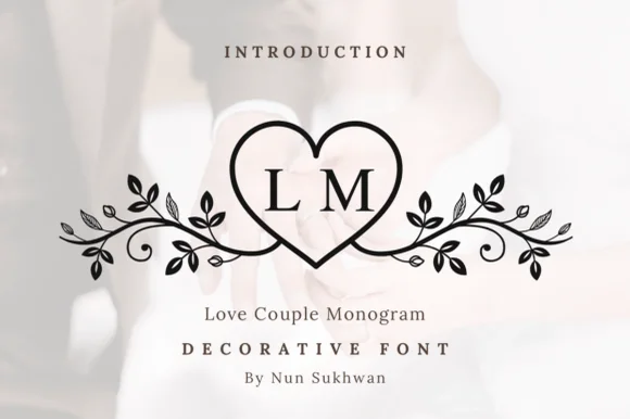
Line-art heart monogram with vine flourishes
Love Couple Monogram is a line-art monogram in black on a blurred wedding photograph: a heart drawn as a single outline, two serif initials set inside it, and vines with leaves and berries curling out to both sides.
Ideas for this font
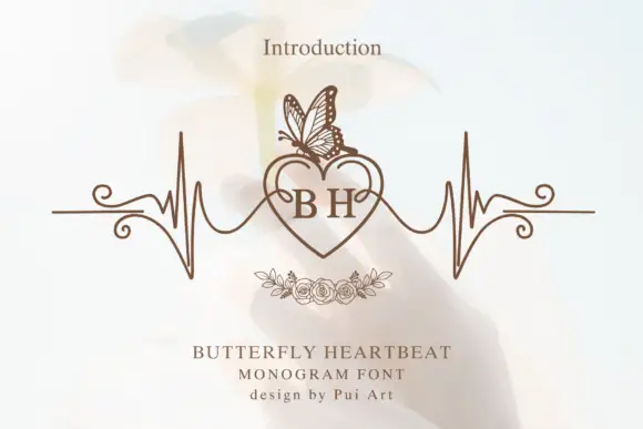
Serif B and H inside a heart topped by a butterfly and flanked by pulse-like lines
Butterfly Heartbeat draws two serif initials inside a heart, runs a drawn pulse line through the heart and out to both sides, and sets a line-drawn butterfly on the upper edge.
Ideas for this font
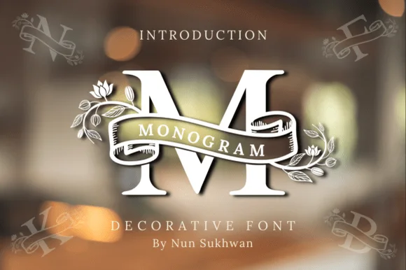
Ribbon-banner floral serif monogram
Amorette Monogram wraps classically built serif initials in a curved ribbon scroll and blooming botanical vines, and the corner specimens show N, F, K and B each carrying their own banner and floral detailing around bold structural stems.
Ideas for this font
Same independent foundry
Allow optional Google Analytics to measure visits and catalogue actions. Your search words and notes are not included. Privacy & storage