High-Contrast Display Serif

Modern Spooky + Alerigue
Pairs sculptural editorial warmth with Modern Spooky's clean modern geometry.
Inspect Alerigue specimenDisclosure: MakerFileHub may earn a commission from qualifying purchases via paid links on this page. How our links work.
Rounded monoline sans
Modern Spooky is a rounded monoline sans in charcoal on ruled paper: mixed case with circular bowls, a slanted e bar, open apertures and even strokes, framed by faint pink spider webs above and bats beneath, with a plain line at the foot naming the style.
Paid link
Get this fontProject & layout blueprintsAt-a-glance maker compatibility
Sturdy stroke walls and open counters weed cleanly on adhesive vinyl, HTV apparel film, and cut cardstock.
Visual anatomy & craft review
The two words are stacked on a sheet of ruled paper and the drawing is a monoline rounded sans: the stroke is even, the terminals are round, and the e keeps a slanted bar, which is what stops a friendly sans from becoming childish. The web and the bats are faint pink ornaments rather than part of the face, and they set the seasonal register without darkening it, which is unusual for the subject and useful for a buyer who wants a friendly rather than a frightening treatment. The ruled lines behind the type show that the face sits well on a baseline grid. Because the strokes are even and rounded, the face works at small sizes and in long-ish lines, and the plate sets two words large enough to judge the joins.
Sans serif, rounded, monoline, friendly
Two-font hierarchy recipes
Tested contrast partners — pairing Modern Spooky with grounded secondary typography.
Modern Spooky + Alerigue
Pairs sculptural editorial warmth with Modern Spooky's clean modern geometry.
Inspect Alerigue specimen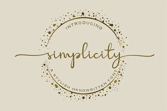
Modern Spooky + Simplicity
Introduces organic movement on pull-quotes, signatures and gift tags.
Inspect Simplicity specimenPractical applications
Concrete hierarchy, scale and production guidance tailored to Modern Spooky’s stroke geometry.
A rounded monoline sans keeps a Halloween invitation friendly rather than frightening, which suits a party for families.
Hierarchy & layout recipe
A6 card: the greeting at 24 pt, the details in a 9.5 pt sans, and the address at 8 pt. Keep 15 mm margins and print one ink on a cream card with a light ornament.
Pre-production check
Check the 9.5 pt details on cream card, where a rounded join can fill; keep the size above 10 pt. Confirm the 8 pt address keeps a 4.5:1 contrast and that the card folds flat.
A rounded sans reads as warm rather than clinical, and the even stroke keeps a long ingredient list legible on a small label.
Hierarchy & layout recipe
Print a 60 by 80 mm label: the bakery at 14 pt, the product at 8.5 pt, and the ingredients at 6.5 pt. Keep 5 mm inside the die and print two colours on a white stock.
Pre-production check
Check the 6.5 pt ingredients on a label, where a rounded join can close; keep the size above 7 pt. Confirm the label survives refrigeration and that the die cuts cleanly.
A friendly monoline sans reads at a child's eye level, and the open apertures help a new reader pick out the letters. It reads at child height.
Hierarchy & layout recipe
A3 poster: the class at 70 mm cap height, the ages in a 20 mm sans, and the room at 12 mm. Keep 25 mm margins and print two colours on a light stock. Keep 8 mm clear above the head.
Pre-production check
Check the poster at three metres, where the even stroke can look light; keep the weight up. Confirm the 12 mm room reads at two metres and that the poster sits below a sightline of 1.4 m.
Technical & licence verification
Confirm included OTF/TTF/WOFF formats, full glyph tables and licence coverage on the live store page before batch production.
Closest visual alternatives
Matched across letterform anatomy, stroke behaviour and craft applications.
Display
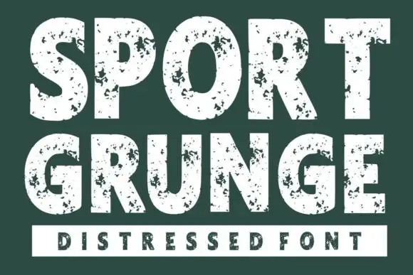
Sport Grunge is a heavy condensed sans with a distressed texture: the strokes are solid blocks, and the surface is eaten away by specks and scratches so the letters look stencilled onto a rough wall.
Ideas for this font
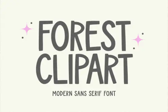
Tall hand-shaped capitals with uneven stroke edges and angled R legs
Forest Clipart draws tall hand-lettered capitals with a deliberately unsteady stroke, keeps the widths uneven, and sets two stacked words on a plain cream ground with small sparkles in the margins.
Ideas for this font
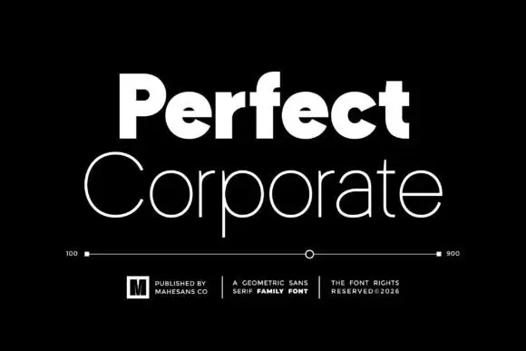
Heavy and thin geometric pair
Perfect Corporate is a geometric sans pair in white on black: a very heavy mixed-case word above a thin, wide mixed-case line, with a weight scale between them running from 100 to 900, three small credits beneath and a boxed mark at the left.

Heavy rounded school sans
School Bold shows heavy upright sans capitals with rounded corners and tall oval counters: the C opening stays broad and the B closes two small rounded bowls, while the cover adds a white edge and a deep offset shadow.
Ideas for this font
Same independent foundry
Allow optional Google Analytics to measure visits and catalogue actions. Your search words and notes are not included. Privacy & storage