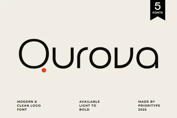
Neutral Sans Workhorse

Smile Darling + Taught
Lets Smile Darling own the focal silhouette while handling secondary copy, sizing and subheads cleanly.
Inspect Taught specimenDisclosure: MakerFileHub may earn a commission from qualifying purchases via paid links on this page. How our links work.
Stencil contrast serif display
Smile Darling is a stencil contrast serif in dusty rose beside a marble bust: mixed case with heavy stems, detached hairlines that float free of the letters, pointed terminals and curled spurs, set in two lines with a tracked line beneath naming the style.
Paid link
Get this fontProject & layout blueprintsAt-a-glance maker compatibility
Open counter bridges hold interior islands intact on laser-cut wood, acrylic, and mylar stencils.
Visual anatomy & craft review
The two words are stacked beside a photograph of a classical bust, and the drawing is a contrast serif built on the stencil principle: where a hairline would join a stem there is a gap, so small pieces of stroke appear detached, and the terminals are pointed with curls. That construction sets a size floor and a print requirement, because the gaps close and the detached hairlines drop out at small sizes, and the plate sets the words large enough that every gap reads. The bust is staging that places the face in a classical register. Because the letters depend on gaps, the face suits a cover, a large invitation and a screen at display sizes, and a buyer should proof the smallest intended size before committing.
Decorative, stencil, contrast, elegant
Two-font hierarchy recipes
Tested contrast partners — pairing Smile Darling with grounded secondary typography.
Smile Darling + Taught
Lets Smile Darling own the focal silhouette while handling secondary copy, sizing and subheads cleanly.
Inspect Taught specimen
Smile Darling + Grandeur – Elegant Classic Serif
Grounds bold display lettering with classic typographic authority on posters, badges and apparel.
Inspect Grandeur – Elegant Classic Serif specimenPractical applications
Concrete hierarchy, scale and production guidance tailored to Smile Darling’s stroke geometry.
A stencil serif gives a deco invitation a period feel, and the detached hairlines give the names a drawn quality. The gaps give the names a drawn elegance.
Hierarchy & layout recipe
A5 invitation: the names at 28 pt, the request in a 9.5 pt serif, and the date at 8.5 pt caps. Keep 24 mm margins and print one ink on a heavy card. Keep 6 mm between the two lines for the hairlines.
Pre-production check
Check the 28 pt names, where a stencil gap can close; keep the gap above 0.6 mm. Confirm the 9.5 pt request reads at arm's length and that the names clear the trim.
A stencil serif gives a cover a couture silhouette, and the detached strokes catch the eye on a shelf of plain serifs. A shelf of serifs rewards a stencil cut.
Hierarchy & layout recipe
Set the title at 75 mm cap height across 185 mm, the author in a 11 pt serif, and the imprint at 8 pt. Print one ink on a coated stock and keep 22 mm margins.
Pre-production check
Check the title at 75 mm, where a detached hairline can break in print; keep it above 0.4 mm. Confirm the 8 pt imprint survives lamination and that the title clears the trim.
A stencil serif gives a perfume label a considered mark, and the heavy stems hold on a small die where a hairline serif would fail.
Hierarchy & layout recipe
Print a 45 by 60 mm label: the house at 12 pt, the product at 7 pt, and the volume at 6 pt. Keep 4 mm inside the die and keep the stencil gaps above 0.4 mm.
Pre-production check
Check the 12 pt house on a small die, where a gap can close; drop to a sturdier instance. Confirm the 6 pt volume reads on the bottle and that the label holds in a warm room.
Technical & licence verification
Confirm included OTF/TTF/WOFF formats, full glyph tables and licence coverage on the live store page before batch production.
Closest visual alternatives
Matched across letterform anatomy, stroke behaviour and craft applications.

Capital silhouettes assembled from many separate small five-point stars
Color Stars fills every letter with a dense cluster of small five-pointed stars in white, so a word appears as a constellation drawn tightly enough to read as type.
Ideas for this font
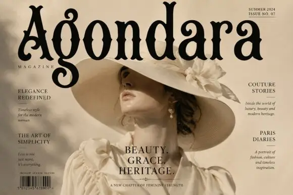
Condensed ornamental gothic with forked top terminals and spiral descenders
Agondara is a condensed ornamental gothic in which the strokes curve heavily, the top terminals fork into points, the bowls end in inward curls and the g drops into a large spiral, so a masthead reads as a heritage fashion title.
Ideas for this font
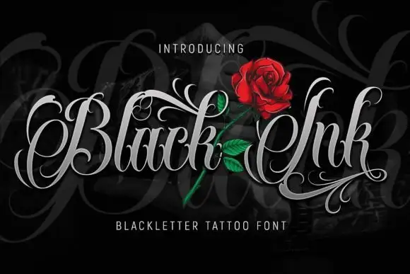
Fine-contrast ornamental lettering with looping capitals and long swashes
Black Ink sets a blackletter in silver on black, opens every capital into a swash and lets the flourishes cross the word, so the lettering reads as a tattoo design rather than as a heading.
Ideas for this font
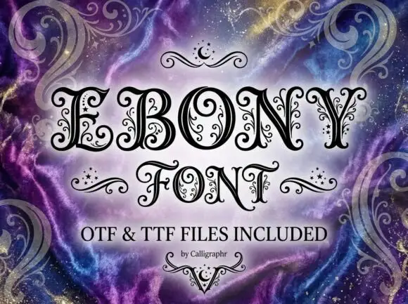
Contrast capitals with curled terminals, fine interior tendrils and small star-like marks
Ebony is an ornate Victorian display face in which every stroke carries a spiral, a dot or a small curl, so a word looks engraved and then hand-decorated on top.
Ideas for this font
Same independent foundry
Allow optional Google Analytics to measure visits and catalogue actions. Your search words and notes are not included. Privacy & storage