Modern Grotesque Body

Magic Flash + Base Edge
Creates crisp high-hierarchy contrast beneath Magic Flash headlines across menus, websites and labels.
Inspect Base Edge specimenDisclosure: MakerFileHub may earn a commission from qualifying purchases via paid links on this page. How our links work.
Contrasted serif with huge swash terminals
Magic Flash is a contrasted serif display in white on a dark ground: tall wide letters with hairline joins and enormous swash terminals that curl out of the M, the F and the h, with a scattering of drawn four-point stars.
Paid link
Get this fontProject & layout blueprintsAt-a-glance maker compatibility
Sturdy stroke walls and open counters weed cleanly on adhesive vinyl, HTV apparel film, and cut cardstock.
Visual anatomy & craft review
Two words are stacked and the face is a serif display with a heavy flourish: the stems are thick and the joins are hairlines, the serifs are fine flats, the M opens with a long swash that loops up and left, the F finishes into a curl that runs back under the word, and the h throws a tail that drops and swings to the right. The swashes are drawn at hairline weight while the stems stay heavy, so the flourish reads as a flourish rather than as extra letters, and the ascenders are tall enough to give the block height. Small four-point stars are scattered around the words, and the ground is a blurred dark field with soft points of light, which keeps the white face legible without a hard edge. Magic Flash is a serif for book covers, event posters, packaging and editorial titles with a storybook or theatrical mood, and it needs one or two short words at a large size and a dark ground.
Swashed, contrasted, magical
Two-font hierarchy recipes
Tested contrast partners — pairing Magic Flash with grounded secondary typography.
Magic Flash + Base Edge
Creates crisp high-hierarchy contrast beneath Magic Flash headlines across menus, websites and labels.
Inspect Base Edge specimen
Magic Flash + Simple Handwriting
Adds a warm human signature touch for 1-to-3-word callouts without competing against structured serif capitals.
Inspect Simple Handwriting specimenPractical applications
Concrete hierarchy, scale and production guidance tailored to Magic Flash’s stroke geometry.
A swashed serif sets a storybook tone on a cover, and the hairline terminals keep the title from feeling heavy at the size a shelf requires.
Hierarchy & layout recipe
Print a 135 by 205 mm cover: set the title at 46 pt over two lines, keep 20 mm of clear ground beneath before the author at 11 pt, and hold 14 mm of margin on all four sides.
Pre-production check
Long swashes can run past the trim; extend the artwork and check the overhang before sending to press.
A swashed serif gives an evening sign a theatrical warmth, and the white on dark reads across a dim room where a black on white sign would not.
Hierarchy & layout recipe
Print a 400 by 600 mm board: set the greeting at 90 pt over two lines, keep 32 mm of clear ground beneath before the names at 20 pt, and hold 24 mm of border on all four sides.
Pre-production check
Hairline swashes can break in a large print; proof one board at final size and check the thinnest curls.
A swashed serif makes a small bar look like a gift, and the contrast suits foil better than a heavy face would on a narrow wrapper.
Hierarchy & layout recipe
Print a 90 by 40 mm bar label: set the name at 15 pt on one line, keep 4 mm of clear ground beneath before the cocoa at 4.5 pt, and hold 4 mm of margin on all four sides.
Pre-production check
Foil on a hairline swash can bridge; order one foil proof on the real wrapper before the print run.
Technical & licence verification
Confirm included OTF/TTF/WOFF formats, full glyph tables and licence coverage on the live store page before batch production.
Closest visual alternatives
Matched across letterform anatomy, stroke behaviour and craft applications.
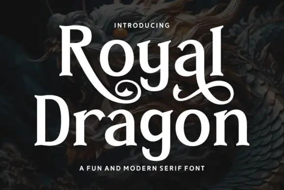
Modern serif with playful flourishes
Royal Dragon is a modern serif in cream on a dark dragon painting: moderate contrast, sturdy serifs, and flourishes that curl from the g and the l, so the word reads as a friendly editorial face with one decorative move.
Tall fantasy serif with a long swash
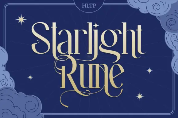
Starlight Rune is a tall fantasy serif in gold on navy: elongated letters with hairline joins, a long swash that runs through the middle of the block, and a drawn night sky of clouds and stars behind it.
Ideas for this font
Magical display serif with elongated spurs and pointed curls
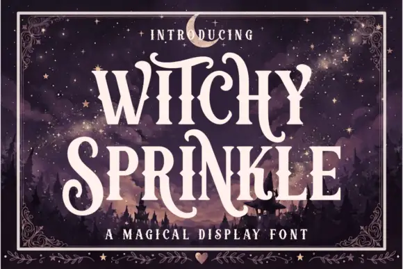
Witchy Sprinkle is a magical display serif in which the stems rise into elongated spurs, the terminals curl into points and the contrast stays high, so a two-word title reads as a hand-drawn storybook sign.
Ideas for this font
Display
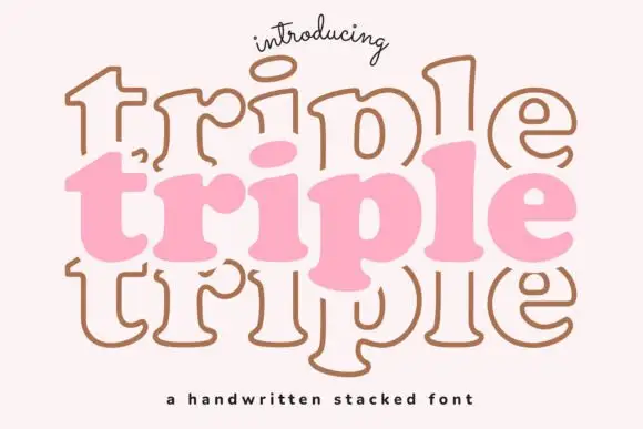
Triple is a handwritten display face built for stacking: the same soft capital is drawn three times, once filled and twice as outline, offset above and below, so a word looks like a hand-drawn sign layered on itself.
Ideas for this font
Same independent foundry
Allow optional Google Analytics to measure visits and catalogue actions. Your search words and notes are not included. Privacy & storage