Modern Grotesque Body

Groulyn + Olline
Creates crisp high-hierarchy contrast beneath Groulyn headlines across menus, websites and labels.
Inspect Olline specimenDisclosure: MakerFileHub may earn a commission from qualifying purchases via paid links on this page. How our links work.
Modern luxury display serif with wide caps and sharp fine serifs
Groulyn is a modern display serif in which the capitals sit wide, the contrast runs high and the serifs finish as sharp points, so a single word reads as a fashion house name rather than as a headline.
Paid link
Get this fontProject & layout blueprintsAt-a-glance maker compatibility
Crisp hairline serifs shine on stationery, foil stamping, and packaging; add slight offset for small decals.
Visual anatomy & craft review
The G closes a wide bowl with a straight spur, the R turns a fine leg, the O stays almost circular, the U keeps two thin stems and the Y splays two hairline arms, all at a high contrast with sharp unbracketed serifs and generous letterspacing. The width is the character: the face fills a line without stretching, which is why the sample sets one word in white across a dark photograph and lets it hold the page alone. Because the hairlines are fine, the face needs 42 pt upward and a coated stock, and it reads best in reverse. The dark rock texture, the small letter-spaced line above and the caption beneath are presentation; the light display word is the face.
Luxury · Wide · Display
Two-font hierarchy recipes
Tested contrast partners — pairing Groulyn with grounded secondary typography.
Groulyn + Olline
Creates crisp high-hierarchy contrast beneath Groulyn headlines across menus, websites and labels.
Inspect Olline specimen
Groulyn + Abigail
Adds a warm human signature touch for 1-to-3-word callouts without competing against structured serif capitals.
Inspect Abigail specimenPractical applications
Concrete hierarchy, scale and production guidance tailored to Groulyn’s stroke geometry.
The wide luxury serif gives a small label instant authority, and the sharp serifs hold a short name at 24 pt on a woven tag with no extra ornament needed.
Hierarchy & layout recipe
Print a 50 by 25 mm tag: set the label name at 24 pt with 3 percent tracking, set the size line in a 5 pt sans at the foot, and keep 4 mm of border so the hairline serifs stay inside the cut.
Pre-production check
Hairline serifs on a woven tag fill with thread; check the woven proof and keep the name at 26 pt or above if the tag looks solid.
The high contrast carries a cover on its own, and the wide fit sets a long title on one line at 110 pt without condensing or stretching the letters.
Hierarchy & layout recipe
Print an A4 cover: set the title at 110 pt across the middle third, keep a 28 mm margin at each side, and set the issue line in a 9 pt caps sans 26 mm beneath the baseline.
Pre-production check
Hairline serifs printed in reverse on a dark photograph can fill in; check the proof and keep the title at 110 pt or above.
The dressy contrast suits a formal invitation, and the wide fit keeps both names on one line at 30 pt on a heavy cotton card without a swash.
Hierarchy & layout recipe
Print a 130 by 180 mm card: set both names at 30 pt on the centre line, set the venue in an 8 pt caps serif 22 mm beneath, and keep 20 mm of margin so the wide bowls sit inside the trim.
Pre-production check
Wide letterspaced capitals at 30 pt can run past the margin; check the imposed card and centre the line rather than reducing the tracking.
Technical & licence verification
Confirm included OTF/TTF/WOFF formats, full glyph tables and licence coverage on the live store page before batch production.
Closest visual alternatives
Matched across letterform anatomy, stroke behaviour and craft applications.
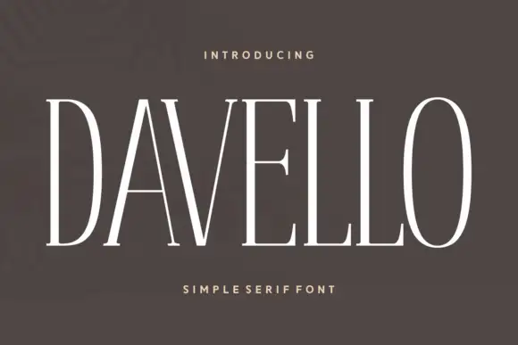
Very tall narrow capitals with fine flat serifs and a single weight
Davello is a very tall capital serif in which the stems run high, the serifs stay fine and flat and the counters close to narrow slits, so a single word reads as a modern museum caption.
Ideas for this font
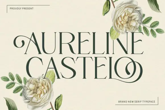
Fine capitals with a curled first A and looping final O
Aureline Castelo is a fine high-contrast capital serif in which the first A begins with an outward curl, the stems stay slender, the bowls open round and the final O extends into a low sweeping loop, so a name reads as elegant engraved lettering.
Ideas for this font
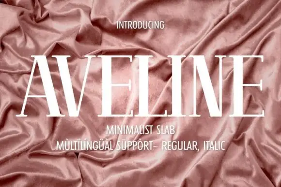
Very tall high-contrast capitals with fine crossbars and hairline feet
Aveline is a very tall high-contrast capital face in which the uprights narrow, the A and V spread wide diagonals and the crossbars and feet thin to hairlines, so a name reads as delicate couture lettering.
Ideas for this font
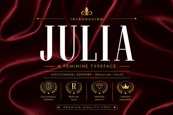
Tall fine-contrast capitals with hairline crossbars and narrow bowls
Julia sets a narrow didone in cream on burgundy silk, its stems heavy, its joins and serifs reduced to hairlines, and its caps tall enough to fill a masthead on their own.
Ideas for this font
Same independent foundry
Allow optional Google Analytics to measure visits and catalogue actions. Your search words and notes are not included. Privacy & storage