Editorial Serif Anchor

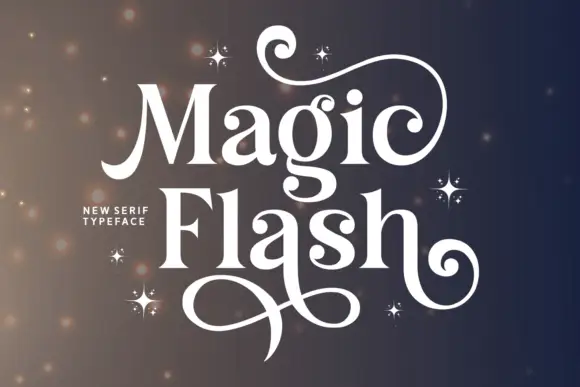
Amibas + Wolles Elegant Modern Serif
Anchors Amibas's fluid strokes with crisp Roman proportions on wedding suites, headers and packaging.
Inspect Wolles Elegant Modern Serif specimenDisclosure: MakerFileHub may earn a commission from qualifying purchases via paid links on this page. How our links work.
Heavy retro script with a looped capital and a returning under-tail
Amibas is a heavy retro script in which the letters slant together, the capital loops back over its own stem and a long tail returns beneath the whole word, so a name reads as a seventies sports badge.
Paid link
Get this fontProject & layout blueprintsAt-a-glance maker compatibility
Weld or Unite overlapping script joins into one continuous vector path before sending to the blade.
Visual anatomy & craft review
The A lifts a wide loop above the cap line, the downstrokes keep an even heavy weight, the connectors thicken as they turn and the final stroke travels under the word before it curls back up. The under-tail is the character: it frames the name from below and acts as its own rule, which is why the sample sets one word with a layered shadow behind it. Because the tail is part of the letter, the face needs 1.1 inches of x-height in vinyl and 24 pt in print, and the joins must be welded before cutting. The yellow fill, the red edging and the offset shadow in the sample are layered treatment rather than extra glyphs; the heavy script word is the face.
Retro · Heavy · Under-tail
Two-font hierarchy recipes
Tested contrast partners — pairing Amibas with grounded secondary typography.
Amibas + Wolles Elegant Modern Serif
Anchors Amibas's fluid strokes with crisp Roman proportions on wedding suites, headers and packaging.
Inspect Wolles Elegant Modern Serif specimen
Amibas + Olline
Keeps small-scale dates, URLs, nutrition facts and care instructions crisp and legible below script titles.
Inspect Olline specimenPractical applications
Concrete hierarchy, scale and production guidance tailored to Amibas’s stroke geometry.
The under-tail closes a badge without drawing a rule, and the heavy script holds the shop name at 40 mm inside a printed roundel.
Hierarchy & layout recipe
Print a 90 mm roundel: set the name at 40 mm across the middle, let the tail form the lower curve of the badge, and set the street line in a 7 pt caps outside the tail.
Pre-production check
A tail printed over a circular border fights the circle; check the roundel and keep 6 mm between the tail and any rule.
The heavy slant sets the period of the feature, and the returning tail gives a one-word headline weight at 60 pt across a printed spread.
Hierarchy & layout recipe
Print a 210 mm spread: set the headline at 60 pt on the calm upper third, keep 16 mm below the tail before the standfirst, and set the standfirst at 11 pt in a neutral serif.
Pre-production check
An offset shadow printed on top of a photograph muddies the edge; check the spread and keep the shadow on a plain band.
The retro weight suits a small label, and the even stroke keeps a brand name clear at 20 pt on a 50 mm panel in one ink.
Hierarchy & layout recipe
Print a 50 by 70 mm label: set the brand at 20 pt, keep 8 mm at each end for the capital loop and the tail, and set the volume in a 6 pt caps at the foot.
Pre-production check
A loop printed to the die edge is cut through; check the imposed label and keep 6 mm of clearance.
Technical & licence verification
Confirm included OTF/TTF/WOFF formats, full glyph tables and licence coverage on the live store page before batch production.
Closest visual alternatives
Matched across letterform anatomy, stroke behaviour and craft applications.
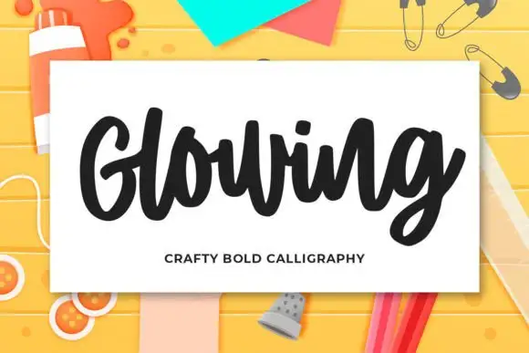
Heavy compact craft calligraphy
Glowing is a heavy compact craft script whose broad G opening and thick rounded lowercase letters read as one solid, friendly mass on a pale card.
Ideas for this font
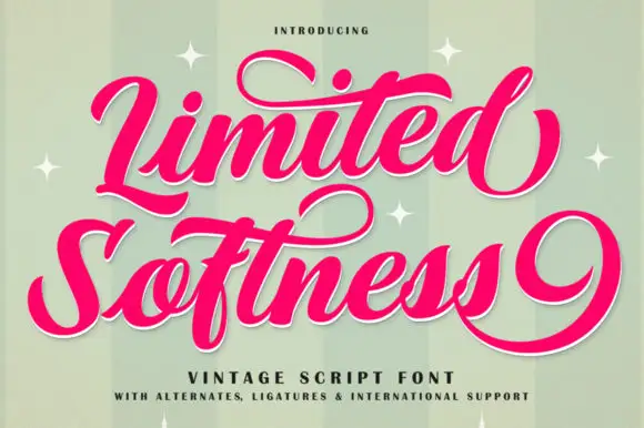
Broad vintage script with large curls
Limited Softness is a broad vintage script in magenta on mint stripes: heavy thick-and-thin strokes, a capital L that curls under the word and an S whose tail runs the full width, finished with a white keyline.
Ideas for this font
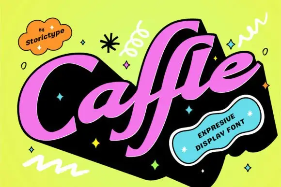
Heavy slanted retro script with flat-cut terminals
Caffle sets a heavy slanted script in solid pink on a black slab, with a wide capital leaning across the word and lowercase letters packed so tight they nearly touch, so the line reads as one painted shape instead of a string of joined letters.
Ideas for this font
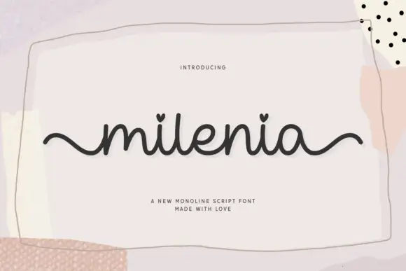
Monoline script with heart tittles
Milenia is a monoline script in charcoal on pale pink: a thick even stroke, curly ascenders, round bowls and small hearts standing in for the dots on the i, shown on a card floating over a collage of tape and paint.
Ideas for this font
Same independent foundry
Allow optional Google Analytics to measure visits and catalogue actions. Your search words and notes are not included. Privacy & storage