High-Contrast Display Serif

Magic Bubble + Lumera Editorial
Pairs sculptural editorial warmth with Magic Bubble's clean modern geometry.
Inspect Lumera Editorial specimenDisclosure: MakerFileHub may earn a commission from qualifying purchases via paid links on this page. How our links work.
Bubble caps with handwritten script
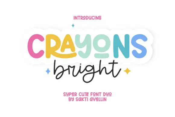
Magic Bubble is a duo in pastel colours on white: a set of fat bubble capitals in mint, peach and coral, paired with a black hand-lettered script that sits beneath, plus a line of small stars and a tracked caption, so the plate reads as a card design rather than a type specimen.
Paid link
Get this fontProject & layout blueprintsAt-a-glance maker compatibility
Weld or Unite overlapping script joins into one continuous vector path before sending to the blade.
Visual anatomy & craft review
The pairing does the work: the caps are rounded, wide and filled in flat pastel, while the script is a looser hand-lettering with a visible baseline bounce, and the two share an informal tone without sharing a skeleton. Each cap is a single colour, and the colour changes letter by letter, which turns the word into a row of objects and gives the script room to breathe beneath it. The counters stay large enough that the caps read at sticker size, and the script's loops stay open so it survives a small print. Small stars sit at the edges of the lockup, and the caption beneath is set in a light grotesque with one line of script, which is how a commercial duo is usually described.
Duo, bubbly, playful, sweet
Two-font hierarchy recipes
Tested contrast partners — pairing Magic Bubble with grounded secondary typography.
Magic Bubble + Lumera Editorial
Pairs sculptural editorial warmth with Magic Bubble's clean modern geometry.
Inspect Lumera Editorial specimen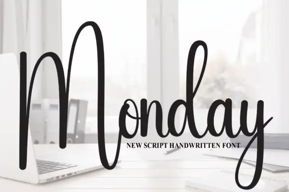
Magic Bubble + Monday
Introduces organic movement on pull-quotes, signatures and gift tags.
Inspect Monday specimenPractical applications
Concrete hierarchy, scale and production guidance tailored to Magic Bubble’s stroke geometry.
A pastel bubble set with a script underneath reads as a decorated card, and the two parts can be recoloured for any palette without redrawing the lettering.
Hierarchy & layout recipe
A6 card: the name in caps at 30 pt, the greeting in the script at 22 pt, and the details in a 9 pt sans. Keep 12 mm margins, limit the palette to three pastels, and print on a white card so the counters stay open.
Pre-production check
Check the 30 pt caps on a home printer, where a pastel fill can look washed out; deepen one tone. Confirm the 9 pt details keep a 4.5:1 contrast and that the script does not collide with the caps above.
A pastel bubble set gives a bakery a cheerful range that reads on a small sticker, and the script supplies a second voice for the shop name.
Hierarchy & layout recipe
Die-cut 50 mm stickers: the product in caps at 14 pt, the shop name in the script at 9 pt, and 2 mm clear to the die. Keep to three pastels and print on a white stock so the rounded fills stay clean.
Pre-production check
Check the 14 pt caps, where a light pastel can grey at small size; deepen the fill. Confirm the sticker adheres to a bag and that the 9 pt script reads at arm's length.
A friendly bubble set draws attention on a noticeboard, and the caps stay readable from a corridor where a decorative script alone would fail.
Hierarchy & layout recipe
A4 print: the headline in caps at 50 mm, the welcome in the script at 26 mm, and the times in a 10 mm sans. Keep 20 mm margins and print three colours on white so the notice stands out among plain sheets.
Pre-production check
Check the A4 at two metres, where a pastel fill can disappear; keep the contrast against the paper. Confirm the 10 mm times read at arm's length and that the script line fits the width without shrinking.
Technical & licence verification
Confirm included OTF/TTF/WOFF formats, full glyph tables and licence coverage on the live store page before batch production.
Closest visual alternatives
Matched across letterform anatomy, stroke behaviour and craft applications.
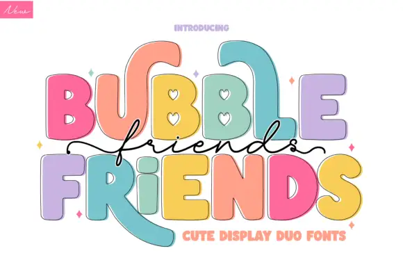
Bubble blocks with a stitched inset crossed by a fine script
Bubble Friends pairs fat bubble blocks carrying a stitched inset line with a fine script that crosses the middle of the lockup, so a name reads as a sewn cut-out with a handwritten band across it.
Ideas for this font
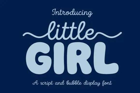
Script and bubble display pair
Little Girl is a duo in pale blue on navy: a light monoline script with a long wavy swash carrying the first word, and a very fat rounded bubble face with fully closed counters for the second, with a caption beneath naming both parts of the pair.
Ideas for this font
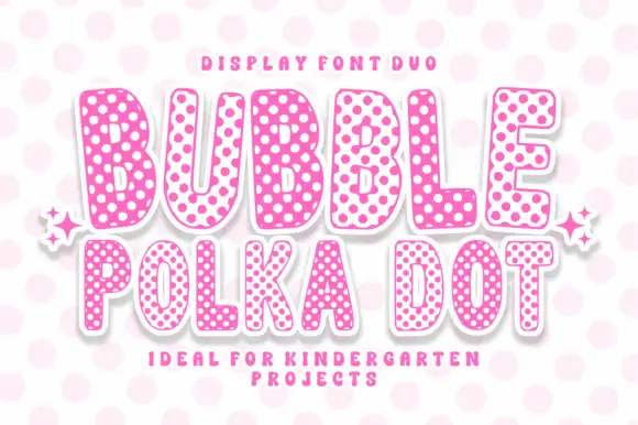
Rounded bubble capitals in two polka-dot colourways with a soft edge
Bubble Polka Dot is a duo of rounded bubble capitals supplied in two dotted colourways, one pale letters on a pink dot field and one pink letters on a pale field, so a poster can alternate letters for contrast.
Ideas for this font
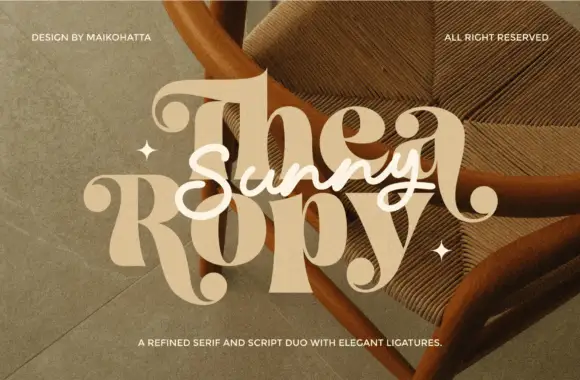
Refined serif paired with an elegant script
Thea Ropy is a duo in cream and white over a warm photograph: a refined high-contrast serif with long ligatures for the two large words, and an elegant script set across them, sold as a serif and script pair.
Ideas for this font
Same independent foundry
Allow optional Google Analytics to measure visits and catalogue actions. Your search words and notes are not included. Privacy & storage