High-Contrast Display Serif

Thea Ropy + Askinо
Pairs sculptural editorial warmth with Thea Ropy's clean modern geometry.
Inspect Askinо specimenDisclosure: MakerFileHub may earn a commission from qualifying purchases via paid links on this page. How our links work.
Refined serif paired with an elegant script
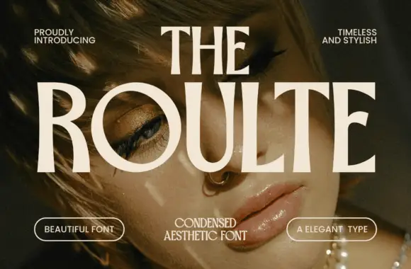
Thea Ropy is a duo in cream and white over a warm photograph: a refined high-contrast serif with long ligatures for the two large words, and an elegant script set across them, sold as a serif and script pair.
Paid link
Get this fontProject & layout blueprintsAt-a-glance maker compatibility
Sturdy stroke walls and open counters weed cleanly on adhesive vinyl, HTV apparel film, and cut cardstock.
Visual anatomy & craft review
The sample layers the two hands rather than stacking them: the serif carries two large words at a high contrast, with hairline joins, long flat serifs and a ligature that ties one letter into the next, while the script runs across the middle in a lighter weight, with tall loops, a fine stroke and a swash that extends past the block on both sides. The pairing works because the script is much lighter than the serif, so the two do not compete, and because both carry the same warmth of colour. The serif's terminals curl slightly, which keeps a formal face from feeling cold, and the script's joins are drawn as fine hairlines. The composition sits over a warm photograph of a rattan chair, with two small capital lines in the corners, one naming the designer and one reserving rights. Thea Ropy is a pair for packaging, editorial titles, invitations and branding, and it needs a wide measure, a large size and a quiet background.
Refined, contrasted, layered
Two-font hierarchy recipes
Tested contrast partners — pairing Thea Ropy with grounded secondary typography.
Thea Ropy + Askinо
Pairs sculptural editorial warmth with Thea Ropy's clean modern geometry.
Inspect Askinо specimen
Thea Ropy + Simple Alphabet
Introduces organic movement on pull-quotes, signatures and gift tags.
Inspect Simple Alphabet specimenPractical applications
Concrete hierarchy, scale and production guidance tailored to Thea Ropy’s stroke geometry.
A contrasted serif under an elegant script gives a title spread two voices without a third face, and the layering fills a wide page.
Hierarchy & layout recipe
Print a 240 by 300 mm spread: set the serif at 80 pt over two lines, set the script at 60 pt across them with 24 mm of clear ground, and hold 20 mm of margin on the outer edges.
Pre-production check
A script over a serif can hide the serif's hairlines; proof the spread flat and check the overlap before printing.
The pair covers a brand name and a product line on a single small label, and the fine serif reads as premium on a narrow bottle standing in a row.
Hierarchy & layout recipe
Print a 45 by 80 mm label: set the serif at 13 pt, set the script at 11 pt with 5 mm of clear ground between the lines, and hold 3.5 mm of margin on all four sides.
Pre-production check
Two light faces on a curved label can both suffer; print one on the real bottle and check each before the order.
A serif with a script overlay gives a modern wedding card its formality without ornament, and the long ligatures handle two names on one line.
Hierarchy & layout recipe
Print a 130 by 190 mm card: set the names at 26 pt in the serif, set the date at 18 pt in the script with 16 mm of clear ground, and hold 14 mm of margin on all four sides.
Pre-production check
Long ligatures can collide with the script above; set the two layers in position and proof one card before the suite.
Technical & licence verification
Confirm included OTF/TTF/WOFF formats, full glyph tables and licence coverage on the live store page before batch production.
Closest visual alternatives
Matched across letterform anatomy, stroke behaviour and craft applications.
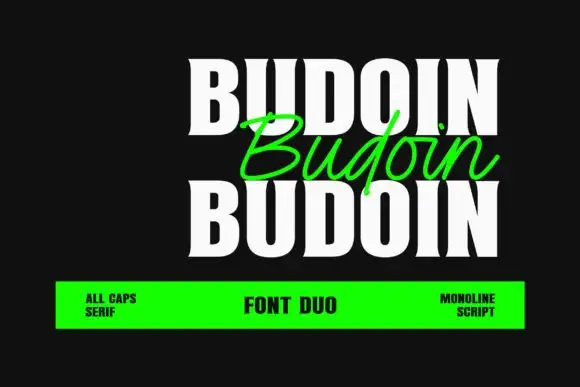
Heavy condensed serif capitals paired with a light slanted monoline script
Budoin repeats a white uppercase word above and below a green connected script version on black, where the capitals carry thick vertical stems, narrow bowls and short flared serif ends, and the script crosses between the two cap rows with a single even stroke.
Ideas for this font
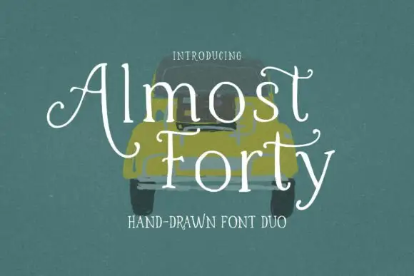
Light hand-drawn serif with curled crossbars paired with a plain companion cut
Almost Forty pairs a light hand-drawn serif whose crossbars curl at the ends with a plainer companion cut, so a title can be drawn and a supporting line can stay quiet in the same family.
Ideas for this font
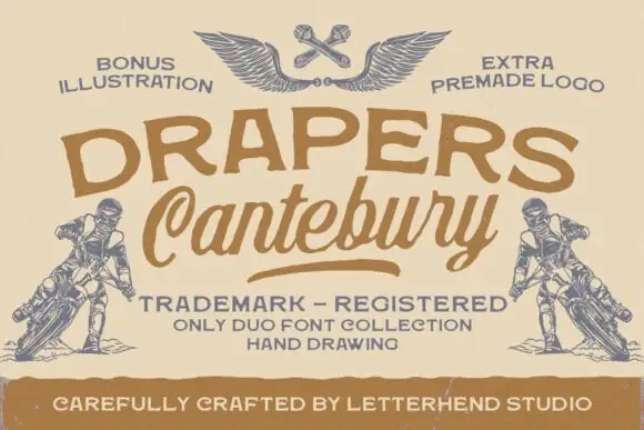
Rough broad capitals above a slanted connected script with an underline
Drapers Canterbury shows brown rough-edged capitals above a larger slanted script: broad curved strokes and a long exit underline on the script contrast with the uneven block-like forms of the upper row.
Ideas for this font
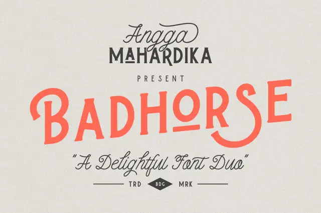
Uneven upright capitals with a rising baseline paired with a fine script
Badhorse is a two-cut pair in which coral capitals rise gently across the line, the widths shift letter to letter and a fine connected script supplies small accents above and below, so a title reads as a hand-composed sign.
Ideas for this font
Same independent foundry
Allow optional Google Analytics to measure visits and catalogue actions. Your search words and notes are not included. Privacy & storage