High-Contrast Display Serif

Bubble Friends + The Bilstein Editorial
Pairs sculptural editorial warmth with Bubble Friends's clean modern geometry.
Inspect The Bilstein Editorial specimenDisclosure: MakerFileHub may earn a commission from qualifying purchases via paid links on this page. How our links work.
Bubble blocks with a stitched inset crossed by a fine script
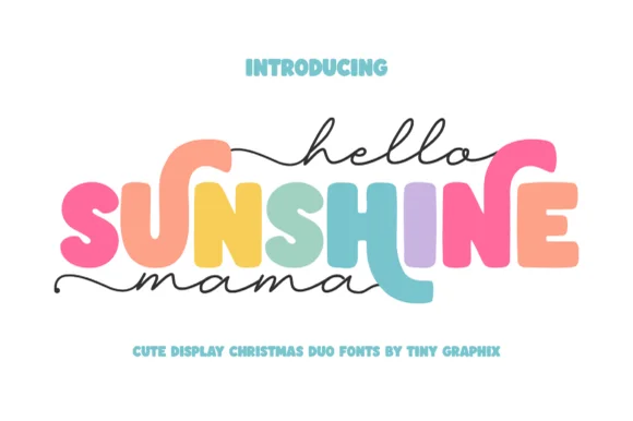
Bubble Friends pairs fat bubble blocks carrying a stitched inset line with a fine script that crosses the middle of the lockup, so a name reads as a sewn cut-out with a handwritten band across it.
Paid link
Get this fontProject & layout blueprintsAt-a-glance maker compatibility
Weld or Unite overlapping script joins into one continuous vector path before sending to the blade.
Visual anatomy & craft review
The block half is heavy and rounded: the B closes two plump lobes, the F keeps two arms and a short middle bar, the D holds a full bowl and the S swells through two curves, each with a dashed stitch line running inside the contour. That inset is what makes the blocks look made rather than printed, and it survives at 30 pt on a sticker. The script half is a fine monoline with open loops and a light slant, set across the middle in the sample so it reads as a band rather than as a second headline. Together they carry the colour and the personality at once. The white ground, the pastel fills, the small hearts and the caption are presentation; the duo is the lettering.
Bubble · Stitched · Paired
Two-font hierarchy recipes
Tested contrast partners — pairing Bubble Friends with grounded secondary typography.
Bubble Friends + The Bilstein Editorial
Pairs sculptural editorial warmth with Bubble Friends's clean modern geometry.
Inspect The Bilstein Editorial specimen
Bubble Friends + Simple Alphabet
Introduces organic movement on pull-quotes, signatures and gift tags.
Inspect Simple Alphabet specimenPractical applications
Concrete hierarchy, scale and production guidance tailored to Bubble Friends’s stroke geometry.
The stitched blocks give a workbook cover its friendly weight while the fine script carries the subtitle at 14 pt, which suits a title aimed at families.
Hierarchy & layout recipe
Print a 210 by 297 mm cover: set the main title in the blocks at 60 pt across the upper half, set the subtitle in the script at 14 pt across it, and keep 20 mm of margin so the stitch line is not trimmed by the bleed.
Pre-production check
A dashed inset printed under 0.3 mm fills in on a digital press; check a proof and widen the gaps rather than the letters.
The blocks read at 20 pt on an insert while the script carries the details, so one small card holds both the shout and the information.
Hierarchy & layout recipe
Print a 105 by 74 mm insert: set the name in the blocks at 20 pt, set the time and place in the script at 11 pt beneath, and keep 8 mm of margin so the stitched edge stays visible around the whole lockup.
Pre-production check
Small inserts lose detail fast; check the card at final size and drop the stitch inset below 18 pt rather than shrinking it.
The stitched blocks read as fabric work, which is what a soft toy brand wants on a kraft tag at 11 pt where a plain sans would look industrial.
Hierarchy & layout recipe
Print a 40 by 60 mm kraft tag: set the brand in the blocks at 11 pt, set the care line in the script at 8 pt beneath, and keep a clear 10 mm band at the top for the punched hole so the string does not cross the stitch line.
Pre-production check
Kraft absorbs ink and closes a dashed inset; print one tag on the actual stock and open the gaps if the stitch turns into a solid rule.
Technical & licence verification
Confirm included OTF/TTF/WOFF formats, full glyph tables and licence coverage on the live store page before batch production.
Closest visual alternatives
Matched across letterform anatomy, stroke behaviour and craft applications.
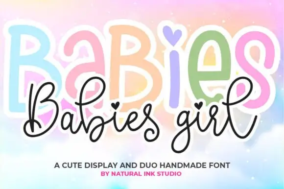
Rounded bubble display caps paired with a fine heart-dotted script
Babies Girl pairs rounded bubble display caps that can carry a different colour per letter with a fine script whose dots become small hearts, so a name reads as a playful shape with a delicate signed line over it.
Ideas for this font
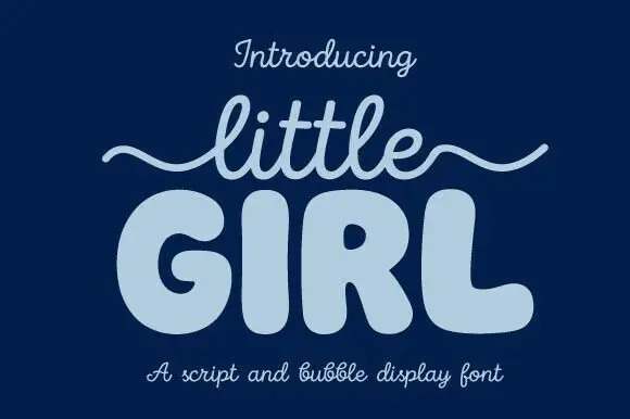
Script and bubble display pair
Little Girl is a duo in pale blue on navy: a light monoline script with a long wavy swash carrying the first word, and a very fat rounded bubble face with fully closed counters for the second, with a caption beneath naming both parts of the pair.
Ideas for this font
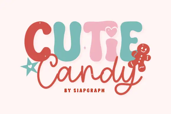
Playful duo pairing puffy candy capitals with a loose monoline script
Cutie Candy is a two-cut family in which puffy pastel capitals bounce along a wavy baseline and a loose monoline script writes the second word, so a short greeting reads as something decorated on a gingerbread tile.
Ideas for this font
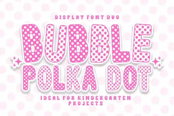
Rounded bubble capitals in two polka-dot colourways with a soft edge
Bubble Polka Dot is a duo of rounded bubble capitals supplied in two dotted colourways, one pale letters on a pink dot field and one pink letters on a pale field, so a poster can alternate letters for contrast.
Ideas for this font
Same independent foundry
Allow optional Google Analytics to measure visits and catalogue actions. Your search words and notes are not included. Privacy & storage