Neutral Sans Workhorse

Lightes + Corven
Lets Lightes own the focal silhouette while handling secondary copy, sizing and subheads cleanly.
Inspect Corven specimenDisclosure: MakerFileHub may earn a commission from qualifying purchases via paid links on this page. How our links work.
Experimental rounded display
Lightes is an experimental rounded display in amber on black: mixed case in which the g loop drops below the baseline, the h carries a rising curl and the t foot is shortened, with swelled strokes and tight spacing, set as one word with a small line above and two notes at the foot.
Paid link
Get this fontProject & layout blueprintsAt-a-glance maker compatibility
Sturdy stroke walls and open counters weed cleanly on adhesive vinyl, HTV apparel film, and cut cardstock.
Visual anatomy & craft review
The word sits centred on a black sheet and the drawing is a rounded display with altered anatomy: the g loop hangs low, the h rises into a curl, the t is cut short, and the strokes swell and thin, so the face reads as a drawn word rather than as typesetting. That construction sets a large size floor and makes the face unsuitable for long copy, which the plate implicitly admits. The black ground makes the amber glow, and the notes at the foot name the style and the year. Because the letters are altered, a buyer should expect to letterspace by eye rather than trust the default, and the tight spacing on the plate shows what happens at the extremes. It suits a poster, a logo and a cover line rather than a heading in running text.
Display, experimental, rounded, energetic
Two-font hierarchy recipes
Tested contrast partners — pairing Lightes with grounded secondary typography.
Lightes + Corven
Lets Lightes own the focal silhouette while handling secondary copy, sizing and subheads cleanly.
Inspect Corven specimen
Lightes + Kernova
Grounds bold display lettering with classic typographic authority on posters, badges and apparel.
Inspect Kernova specimenPractical applications
Concrete hierarchy, scale and production guidance tailored to Lightes’s stroke geometry.
An experimental display gives a venue a mark that reads as a poster, and the amber on black carries through a dark interior.
Hierarchy & layout recipe
Set the mark at 20 pt on a badge, 100 mm on a wall and 14 pt on a card, keeping the loops only above 24 pt. Keep two colours and clear space equal to half the mark height.
Pre-production check
Check the 14 pt card mark, where the g loop can close; drop it at that size. Confirm the wall mark reads at eight metres and that the markers hold under a spotlight.
A rounded experimental face sets an album apart on a shelf, and the swelled strokes hold against a dark photograph. The swells read against a dark ground.
Hierarchy & layout recipe
Set the title at 75 mm cap height across 170 mm, the artist in a 10 pt sans, and the label at 8 pt. Print two colours on a matte stock and keep the loops clear of the artist line.
Pre-production check
Check the title at 75 mm, where a thin swell can break in print; keep it above 0.4 mm. Confirm the 8 pt label reads and that the loops clear the trim by 10 mm.
An experimental face makes an opening card feel like a flyer, and two colours carry the date without a second typeface. It reads as flyer type.
Hierarchy & layout recipe
A6 card: the greeting at 22 pt, the details in a 9 pt sans, and the date at 8 pt. Keep 15 mm margins and print two colours on a dark card. Leave 14 mm at the foot for the address.
Pre-production check
Check the 22 pt greeting, where a curl can crowd the line above; keep 7 mm leading. Confirm the 9 pt details keep a 4.5:1 contrast and that the card takes an envelope.
Technical & licence verification
Confirm included OTF/TTF/WOFF formats, full glyph tables and licence coverage on the live store page before batch production.
Closest visual alternatives
Matched across letterform anatomy, stroke behaviour and craft applications.
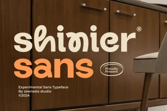
Experimental looped display
Shinier is an experimental display in cream and orange on a walnut cabinet: rounded mixed case in which tall loops are threaded through the letters, an interlocked final n and r, and a registered mark at the shoulder, with a plain sans caption at the foot.
Ideas for this font
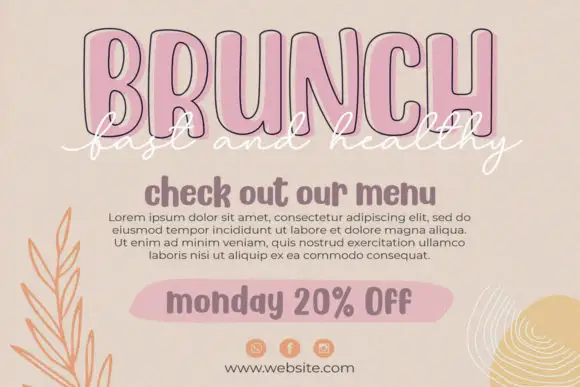
Condensed outline capitals with a script overlay
Twinkling Stars is a layered set on a beige page: tall condensed outline capitals in pink for a headline, a white script written across them, a rounded sans for a subhead and a tinted pill for a note, laid out as a social post.
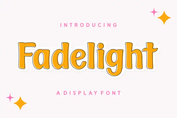
Soft upright mixed case with slight flaring and broad lowercase bowls
Fadelight is a soft upright display in which the letters carry moderate weight, the ends flare gently, the bowls stay broad and the tall ascenders set a steady rhythm with one descending g, so a phrase reads as friendly sign lettering.
Ideas for this font
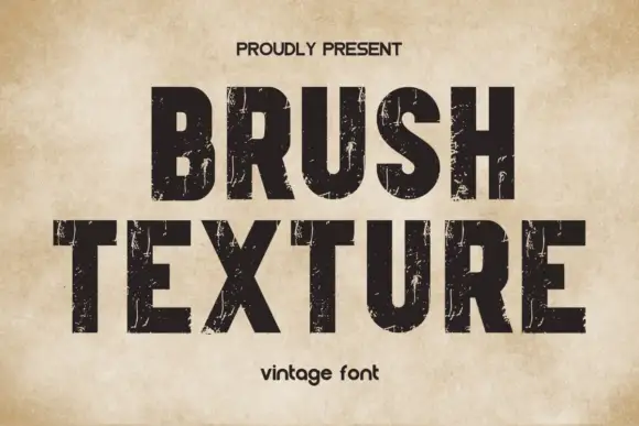
Heavy compact capitals crossed by fine vertical scratches
Brush Texture shows solid black blunt capitals with tall compact bowls on an aged cream field, where thin pale streaks scrape vertically through the ink rather than reading as a brush script, and the fine marks vary in density from letter to letter.
Ideas for this font
Same independent foundry
Allow optional Google Analytics to measure visits and catalogue actions. Your search words and notes are not included. Privacy & storage