Neutral Sans Workhorse

Kids Name + Lemon Milk Pro FTR
Lets Kids Name own the focal silhouette while handling secondary copy, sizing and subheads cleanly.
Inspect Lemon Milk Pro FTR specimenDisclosure: MakerFileHub may earn a commission from qualifying purchases via paid links on this page. How our links work.
Broad playful capitals with flat bright fills and black lower edges
Kids Name is a fat cartoon display face: rounded colour caps with a heavy black contour and a hard offset shadow, built to be set large on a wall, a door or a shirt.
Paid link
Get this fontProject & layout blueprintsAt-a-glance maker compatibility
Cut solid base, outline, and shadow layers in separate vinyl colors and align on registration marks.
Visual anatomy & craft review
KIDS over NAME fills the card in five colours — red, orange, yellow, blue, red — and each letter is a chunky shape with soft corners, a black outline and a shadow that steps to the lower left rather than blurring. The colours change letter by letter, which is the intended use: a child's name with each letter in a different colour, outlined once and shadowed once. A thin rainbow rule sits under the small caption at the top, and the ground is a faint white pattern of shapes. There are no other elements on the card, which is telling: the face is a one-job alphabet, and its strength is that a name in six colours still reads as one word because the contour and the shadow are identical across every letter.
Broad playful capitals with flat bright fills and black lower edges
Two-font hierarchy recipes
Tested contrast partners — pairing Kids Name with grounded secondary typography.
Kids Name + Lemon Milk Pro FTR
Lets Kids Name own the focal silhouette while handling secondary copy, sizing and subheads cleanly.
Inspect Lemon Milk Pro FTR specimen
Kids Name + Aureline
Grounds bold display lettering with classic typographic authority on posters, badges and apparel.
Inspect Aureline specimenPractical applications
Concrete hierarchy, scale and production guidance tailored to Kids Name’s stroke geometry.
The face is built to set a single name at a large size, and the shared contour keeps six different colours reading as one word.
Hierarchy & layout recipe
Print a 300 by 100 mm door plaque: set the name at 120 pt on one row with a different colour per letter, keep 16 mm of clear ground around the word before the frame, and hold 20 mm from the shadow to the plaque edge.
Pre-production check
Five bright colours fight at close range; print one plaque on the intended material and check the palette before the order.
A name banner is what the face is designed for, and the offset shadow gives a paper garland a printed look without a second element.
Hierarchy & layout recipe
Print six A5 letters on card: one letter per sheet at 200 pt, hold 20 mm of border so the outline is not clipped, and keep the shadow direction identical on every letter before stringing.
Pre-production check
Cards cut at slightly different sizes make a crooked banner; print one letter and check the trim against the next.
The heavy contour survives a screen print, and a child's name on a shirt reads from across a playground where a thin face would not.
Hierarchy & layout recipe
Print a 250 by 120 mm chest print: set the name at 90 pt on one row, keep 24 mm of clear ground beneath before the club line at 10 pt, and hold 20 mm from the shadow to the print edge.
Pre-production check
Offset shadows are the first thing to fill in on a coarse screen; print one pull on the actual shirt before the run.
Technical & licence verification
Confirm included OTF/TTF/WOFF formats, full glyph tables and licence coverage on the live store page before batch production.
Closest visual alternatives
Matched across letterform anatomy, stroke behaviour and craft applications.
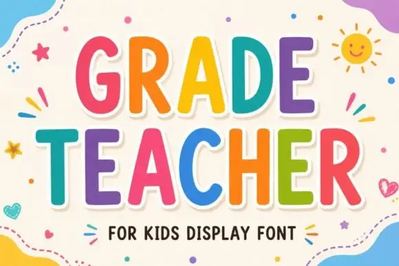
Tall rounded classroom capitals with simple counters and per-letter colour
Grade Teacher is a tall rounded capital alphabet with simple counters, drawn so a heading reads as classroom lettering that a teacher could have cut out of coloured card.
Ideas for this font
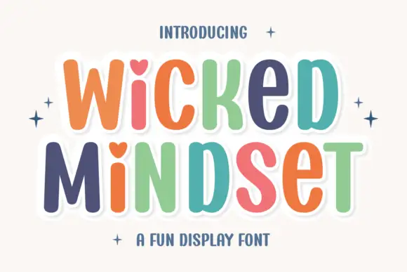
Playful multicolour caps with heart counters
Wicked Mindset is a playful rounded caps display in multicolour with a white contour and offset shadow: fat letters with soft corners, hearts cut into three counters, a bounce across both lines, and four-point sparkles at the sides of a plain cream ground.
Ideas for this font
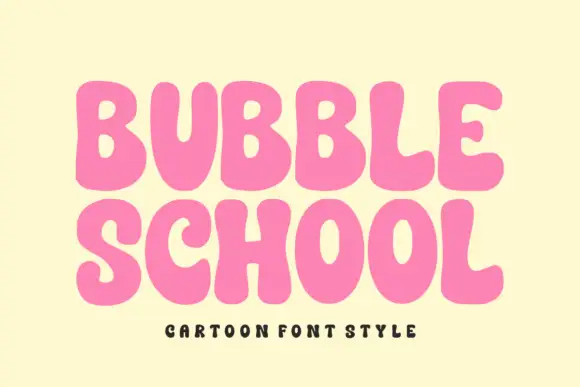
Solid bubble capitals with soft uneven contours and a heavy fill
Bubble School is a solid bubble capital alphabet in which the strokes swell, the contours wobble slightly and the fill is flat, so a word reads as thick foam letters rather than as a sticker.
Ideas for this font
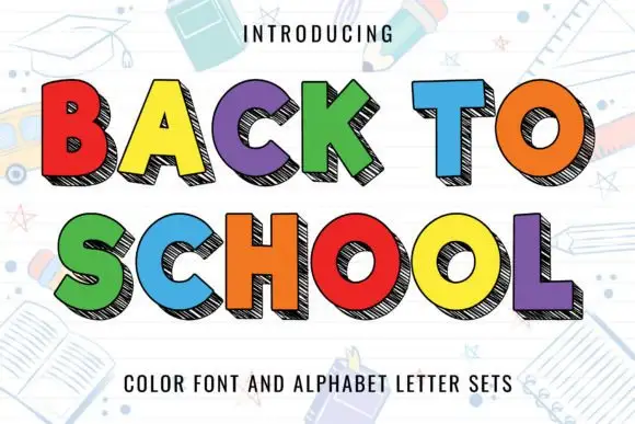
Flat bright block capitals with dark diagonally hatched offset depth
Back to School sets chunky flat-colour capitals against a white page of pale classroom doodles, each letter carrying a dark offset shadow that is filled with close diagonal hatching instead of a solid tone.
Ideas for this font
Same independent foundry
Allow optional Google Analytics to measure visits and catalogue actions. Your search words and notes are not included. Privacy & storage