Neutral Sans Workhorse

Judge Color Pink Green + Noar
Lets Judge Color Pink Green own the focal silhouette while handling secondary copy, sizing and subheads cleanly.
Inspect Noar specimenDisclosure: MakerFileHub may earn a commission from qualifying purchases via paid links on this page. How our links work.
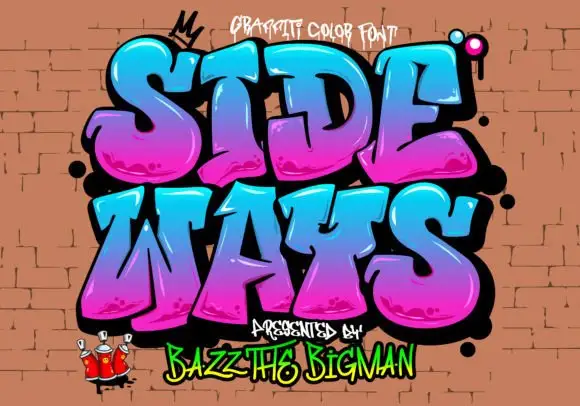
Angular graffiti capitals with hot-pink to lime gradients
Judge Color is a graffiti colour face in which the capitals are fat, tilted block shapes with a heavy black outline, a pink-to-green gradient across each letter and small speckled highlights inside them.
Paid link
Get this fontProject & layout blueprintsAt-a-glance maker compatibility
Sturdy stroke walls and open counters weed cleanly on adhesive vinyl, HTV apparel film, and cut cardstock.
Visual anatomy & craft review
JUDGE over COLOR fills the card at a strong tilt, and each letter is a thick graffiti shape with a soft gradient that runs from magenta at the top to acid green at the base, speckled with small dots and edged in a heavy black contour with a drop shadow. Behind the words a light-grey wall with a faint texture stands in for a sprayed surface, and small sprayed marks and a crown sit around the letters. A small caption at the top names the set, and a line at the foot credits the studio. The construction is a colour font built for print at size: the gradient and the speckle are inside the fill, so a word reads as a piece of wall art at poster scale but turns to noise on a small label.
Angular graffiti capitals with hot-pink to lime gradients
Two-font hierarchy recipes
Tested contrast partners — pairing Judge Color Pink Green with grounded secondary typography.
Judge Color Pink Green + Noar
Lets Judge Color Pink Green own the focal silhouette while handling secondary copy, sizing and subheads cleanly.
Inspect Noar specimen
Judge Color Pink Green + Auretha
Grounds bold display lettering with classic typographic authority on posters, badges and apparel.
Inspect Auretha specimenPractical applications
Concrete hierarchy, scale and production guidance tailored to Judge Color Pink Green’s stroke geometry.
The lettering speaks the language of the audience, and one word carries the whole poster without a photograph of a crowd.
Hierarchy & layout recipe
Print an A2 poster: set the event name at 140 pt across two rows, keep 34 mm of clear ground beneath before the line-up at 13 pt, and hold 28 mm of margin so the outline survives the trim.
Pre-production check
Gradients band at large sizes; print one poster at the final size and check across a letter before the run.
The style gives a party for an older child a voice that a pastel design cannot, and the tilt makes a short name fill the card.
Hierarchy & layout recipe
Print a 105 by 148 mm invitation: set the name at 40 pt across two rows, keep 16 mm of clear ground beneath before the details at 8.5 pt, and hold 13 mm from the outline to the card edge.
Pre-production check
The speckle disappears below 24 pt; print one invitation at the finished size and check the fill first.
The face reads as street graphics, and the heavy contour survives being cut as a sticker and stuck on a board or a helmet.
Hierarchy & layout recipe
Print a 90 mm wide sticker: set the shop name at 26 pt on one row, keep 7 mm of clear white edge around the cut line, and hold 8 mm of ground beneath for the street at 6 pt.
Pre-production check
The gradient prints unevenly on vinyl; print one sticker on the real material and check the cut before the batch.
Technical & licence verification
Confirm included OTF/TTF/WOFF formats, full glyph tables and licence coverage on the live store page before batch production.
Closest visual alternatives
Matched across letterform anatomy, stroke behaviour and craft applications.
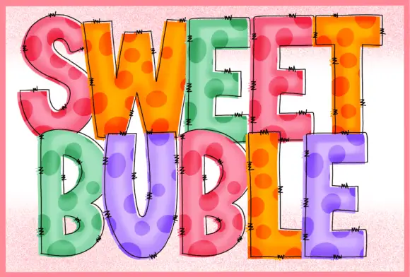
Stitched dotted translucent blocks
Sweet Buble is a colour display on a pale textured ground: tall blocks in pastel pink, orange, green and violet with large darker dots inside, a translucent-looking overlay, fine drawn edge stitches and dark outlines, set in two stacked words.
Ideas for this font
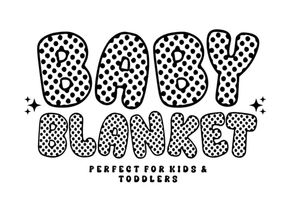
Uneven rounded bubble letters covered with dense irregular dark spots
Baby Blanket draws fat round capitals and fills them with a dense grid of black dots that carry a white centre, so the letters look like printed fabric with a quilted edge.
Ideas for this font
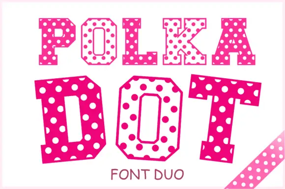
Angular slab-serif capitals alternating solid dotted and hollow dotted treatments
Polka Dot draws its capitals as octagons with the corners cut straight off, then punches a scatter of round holes through the fill so every letter looks like a punched paper tag.
Ideas for this font
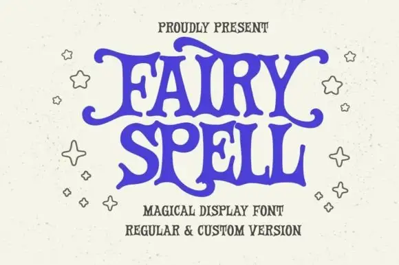
Heavy storybook capitals with wavy arms and curled tips
Fairy Spell shows purple capitals with thick curved strokes, broad pointed feet and irregular wavy horizontal arms, where the F and Y extend outward into curled tips and the R leg sweeps below the following letter.
Same independent foundry
Allow optional Google Analytics to measure visits and catalogue actions. Your search words and notes are not included. Privacy & storage