Neutral Sans Workhorse

Fairy Spell + Godthem
Lets Fairy Spell own the focal silhouette while handling secondary copy, sizing and subheads cleanly.
Inspect Godthem specimenDisclosure: MakerFileHub may earn a commission from qualifying purchases via paid links on this page. How our links work.
Heavy storybook capitals with wavy arms and curled tips
Fairy Spell shows purple capitals with thick curved strokes, broad pointed feet and irregular wavy horizontal arms, where the F and Y extend outward into curled tips and the R leg sweeps below the following letter.
Paid link
Get this fontProject & layout blueprintsAt-a-glance maker compatibility
Sturdy stroke walls and open counters weed cleanly on adhesive vinyl, HTV apparel film, and cut cardstock.
Visual anatomy & craft review
The strokes stay heavy, the arms undulate, the feet come to soft points and the ends curl outward. That wavy arm is the character: the word reads as a page from a children's book rather than a display face with a novelty outline, which is why the sample sets two rows among outlined stars. Because only one short title is shown, set your own wording at 30 pt, check the punctuation and the letters absent from the sample, and keep 18 mm above the curled tips so the stars and the title do not compete inside one layout.
Storybook · Wavy arms · Curled tips
Two-font hierarchy recipes
Tested contrast partners — pairing Fairy Spell with grounded secondary typography.
Fairy Spell + Godthem
Lets Fairy Spell own the focal silhouette while handling secondary copy, sizing and subheads cleanly.
Inspect Godthem specimen
Fairy Spell + The Lumina Awesome
Grounds bold display lettering with classic typographic authority on posters, badges and apparel.
Inspect The Lumina Awesome specimenPractical applications
Concrete hierarchy, scale and production guidance tailored to Fairy Spell’s stroke geometry.
The wavy caps set a themed card, and the curled tips hold a short greeting at 34 pt on an A6 sheet with space around it.
Hierarchy & layout recipe
Print an A6 card: set the greeting at 34 pt over two rows, keep 16 mm of clear ground between them so the curls do not touch, and set the details at 11 pt in a plain serif at the foot.
Pre-production check
Curled tips that meet between rows look like one smear; check the card and open 6 mm between the rows.
The storybook lettering suits a classroom corner, and the thick forms hold a short sign at 48 pt on a printed sheet, where the wavy arms still read as waves.
Hierarchy & layout recipe
Print an A4 sign: set the sign at 48 pt on one row, keep 20 mm of clear ground beneath before the opening times at 12 pt, and keep 20 mm of margin so the R leg stays inside.
Pre-production check
Wavy arms printed at 26 pt lose their shape; check the sheet and keep the sign at 40 pt or above.
The curled caps suit a small gift tag, and the heavy bodies stay clear at 24 pt on a 45 mm tag, with the curled leg given its own clear ground.
Hierarchy & layout recipe
Print a 45 by 60 mm tag: set the name at 24 pt across the centre, keep 10 mm of clear ground beneath for the curled leg, and keep 6 mm of border all round so no pointed tip is clipped.
Pre-production check
A pointed foot at the die edge looks broken; check the artwork and keep 7 mm from the trim.
Technical & licence verification
Confirm included OTF/TTF/WOFF formats, full glyph tables and licence coverage on the live store page before batch production.
Closest visual alternatives
Matched across letterform anatomy, stroke behaviour and craft applications.
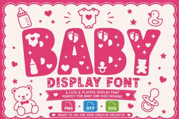
Heavy baby-themed capitals with small pictorial cutouts
Baby shows very broad rounded capitals punctuated by footprints, hearts, stars and small nursery-object silhouettes, where the openings vary markedly between the four sampled letters, and outlined bottles, a teddy and a pacifier fill the space around the pink word.
Ideas for this font
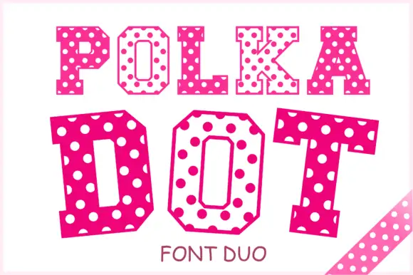
Angular slab-serif capitals alternating solid dotted and hollow dotted treatments
Polka Dot draws its capitals as octagons with the corners cut straight off, then punches a scatter of round holes through the fill so every letter looks like a punched paper tag.
Ideas for this font
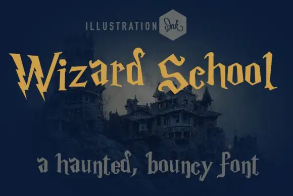
Whimsical gothic with spiky wobbly serifs
Wizard School is a whimsical gothic display in gold on a dark castle scene: letters built from wobbly stems with spiky serifs and uneven heights, with a second line set in a softer grey gothic beneath them.
Ideas for this font
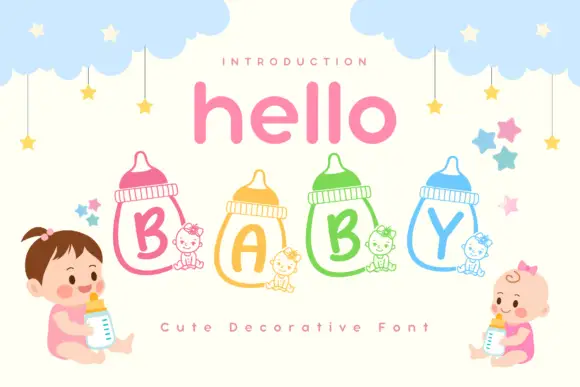
Rounded capitals inside outlined feeding bottles with small seated-animal companions
Hello Baby is a cute colour font in which each capital sits inside a drawn baby bottle, with a pastel keyline and a row of cartoon babies, clouds and stars around the words.
Ideas for this font
Same independent foundry
Allow optional Google Analytics to measure visits and catalogue actions. Your search words and notes are not included. Privacy & storage



