Neutral Sans Workhorse

Rabbit Hole + Modern Limited
Lets Rabbit Hole own the focal silhouette while handling secondary copy, sizing and subheads cleanly.
Inspect Modern Limited specimenDisclosure: MakerFileHub may earn a commission from qualifying purchases via paid links on this page. How our links work.
Groovy multicolour display
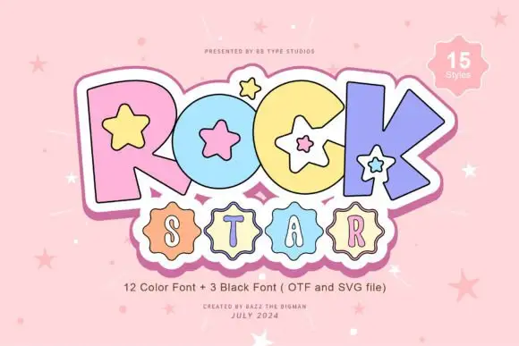
Rabbit Hole is a groovy multicolour display in pastel tones on a black ground: chunky rounded letters with soft corners and uneven widths, a bounce across both lines, four-point sparkles at the sides and a small crest at the foot.
Paid link
Get this fontProject & layout blueprintsAt-a-glance maker compatibility
Sturdy stroke walls and open counters weed cleanly on adhesive vinyl, HTV apparel film, and cut cardstock.
Visual anatomy & craft review
The two words are stacked and each letter is a soft chunky form in a different pastel, which gives the block its seventies feel without a texture. The widths vary deliberately, and the bounce keeps the pair moving, so the word reads as a drawn logo rather than a set line. Because the colours change letter by letter, the silhouette has to be strong enough to hold them, and the specimen shows that by keeping the background black and adding nothing but sparkles. The small crest at the foot and the tracked credits are set in a plain face, which keeps the plate from competing with the display. The palette is five pastels, which reproduce well on fabric and vinyl.
Groovy, playful, multicolour, retro
Two-font hierarchy recipes
Tested contrast partners — pairing Rabbit Hole with grounded secondary typography.
Rabbit Hole + Modern Limited
Lets Rabbit Hole own the focal silhouette while handling secondary copy, sizing and subheads cleanly.
Inspect Modern Limited specimen
Rabbit Hole + The Lumina Awesome
Grounds bold display lettering with classic typographic authority on posters, badges and apparel.
Inspect The Lumina Awesome specimenPractical applications
Concrete hierarchy, scale and production guidance tailored to Rabbit Hole’s stroke geometry.
A groovy display sets a period mood at a glance, and the multicolour version reads across a dark room where a single-ink face would fade.
Hierarchy & layout recipe
A2 portrait: the event at 130 mm x-height, the date in a 24 mm sans, and a 6 mm rule. Keep 30 mm margins and print five flat colours on a dark ground.
Pre-production check
Check the poster at five metres, where the pastels can vibrate against black; keep the fills solid and avoid outlines. Confirm the 24 mm date reads at three metres and that the rule clears the block.
A groovy display prints as a multi-screen tote and reads as a period graphic, and the chunky shapes hold on canvas where a fine retro face would break up.
Hierarchy & layout recipe
Print a 300 by 300 mm tote graphic: the phrase at 45 mm x-height, the shop at 8 mm, and five colours on a natural canvas. Keep the smallest counter at 5 mm and leave 30 mm to the seam.
Pre-production check
Check the screen at actual mesh, where a 5 mm counter fills; open it. Wash-test one bag and confirm the colours stay registered after five cycles.
A groovy card reads as a themed invitation, and the bounce keeps the greeting friendly without a second decorative element.
Hierarchy & layout recipe
A6 card: the greeting at 30 pt, the details in a 9 pt sans, and two sparkles. Keep 12 mm margins and print four colours on a cream card so the pastels stay soft.
Pre-production check
Check the 30 pt greeting at home-print resolution, where a small counter can fill; keep it above 2 mm. Confirm the 9 pt details keep a 4.5:1 contrast and that the sparkles clear the trim.
Technical & licence verification
Confirm included OTF/TTF/WOFF formats, full glyph tables and licence coverage on the live store page before batch production.
Closest visual alternatives
Matched across letterform anatomy, stroke behaviour and craft applications.
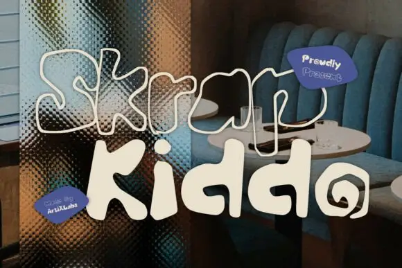
Wavy solid and outline shapes
Skrap Kiddo is a wavy display face in two cuts, one solid and one outline: fat rounded letters with wobbly contours and a loose hand-drawn bounce, presented over a dark photograph of a café banquette.
Ideas for this font
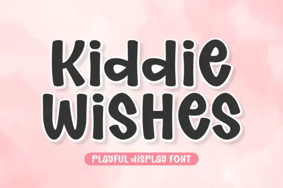
Chubby rounded sans with a warm wobble and open counters
Kiddie Wishes is a chubby rounded sans in which the strokes swell at the joints, the terminals round off and every letter leans a little, so a word reads as something drawn on a card with a fat marker.
Ideas for this font
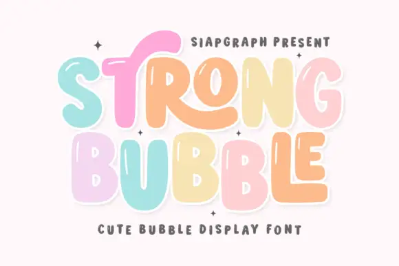
Pastel bubble display with shine
Strong Bubble is a pastel bubble display in mint, pink, peach and butter on white: fat rounded letters of uneven size, small white shine marks inside the strokes, a heavy outline and a bouncing baseline, so the pair reads as a hand-drawn sticker set rather than a typographic family.
Ideas for this font
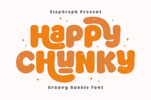
Extra-plump groovy bubble letters with tucked curl terminals
Happy Chunky is an extra-plump bubble display in which the stems balloon, the counters shrink to small openings, the terminals tuck into curls and the letters almost touch, so a short phrase reads as one sticker-ready block.
Same independent foundry
Allow optional Google Analytics to measure visits and catalogue actions. Your search words and notes are not included. Privacy & storage