Neutral Sans Workhorse

Ganky + Mango Dream
Lets Ganky own the focal silhouette while handling secondary copy, sizing and subheads cleanly.
Inspect Mango Dream specimenDisclosure: MakerFileHub may earn a commission from qualifying purchases via paid links on this page. How our links work.
Geometric mixed case with reversed-looking a curves and angular open n and k forms
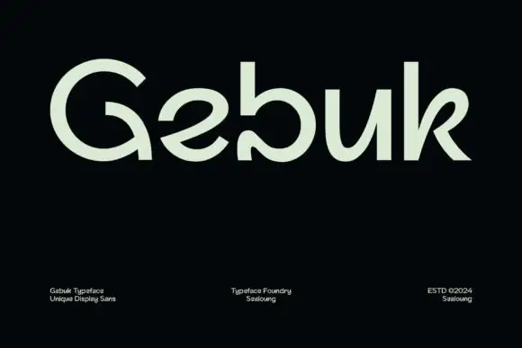
Ganky draws a modern geometric sans with wide round bowls, cut joins and a few letters that open where the join should close, so a short name looks engineered rather than drawn.
Paid link
Get this fontProject & layout blueprintsAt-a-glance maker compatibility
Sturdy stroke walls and open counters weed cleanly on adhesive vinyl, HTV apparel film, and cut cardstock.
Visual anatomy & craft review
The name runs in black on a pale swoosh, the G built from a circle with a cut bar, the a and the n keeping straight stems and round shoulders, and the k meeting its arm at an angle instead of a point. There is no contrast, and the weight stays even, so the character comes from those small structural choices. Three corner notes name the style, the studio and the year, all in small tracked capitals. It is a face for marks and headings: it looks deliberate at logo size and starts to feel gimmicky in a long line of text, where the cut joins read as glitches.
Geometric mixed case with reversed-looking a curves and angular open n and k forms
Two-font hierarchy recipes
Tested contrast partners — pairing Ganky with grounded secondary typography.
Ganky + Mango Dream
Lets Ganky own the focal silhouette while handling secondary copy, sizing and subheads cleanly.
Inspect Mango Dream specimen
Ganky + The Lumina Awesome
Grounds bold display lettering with classic typographic authority on posters, badges and apparel.
Inspect The Lumina Awesome specimenPractical applications
Concrete hierarchy, scale and production guidance tailored to Ganky’s stroke geometry.
The cut joins read as a considered mark rather than a stock grotesque, and the wide bowls hold on a small avatar or a favicon.
Hierarchy & layout recipe
Print a 55 by 90 mm card: set the studio name at 14 pt on one row, keep 7 mm of clear ground beneath before the contact line at 6 pt, and keep 6 mm of margin so the wide bowls are not clipped.
Pre-production check
The cuts are small at 12 pt; check the printed card before ordering the box. Confirm it on a printed sample, not on screen.
The geometric weight holds a short heading, and the structural details give a technology page a graphic voice without a photograph.
Hierarchy & layout recipe
Print a 210 by 280 mm spread: set the heading at 58 pt across two lines, keep 20 mm of clear ground beneath before the standfirst at 10 pt, and keep 18 mm of margin from the text block edge.
Pre-production check
Wide letters eat line length; check the longest heading at final size before the page is set.
The mark-like letterforms read across a busy hall, and a short company name fills a wide banner without a second element.
Hierarchy & layout recipe
Print a 1000 by 300 mm banner: set the company name at 120 pt on one row, keep 28 mm of clear ground beneath before the booth number at 20 pt, and keep 32 mm of border so the round forms stay on the banner.
Pre-production check
Cut joins can fill in banner printing; check a physical proof before the order. Have the printer send a physical sample first.
Technical & licence verification
Confirm included OTF/TTF/WOFF formats, full glyph tables and licence coverage on the live store page before batch production.
Closest visual alternatives
Matched across letterform anatomy, stroke behaviour and craft applications.
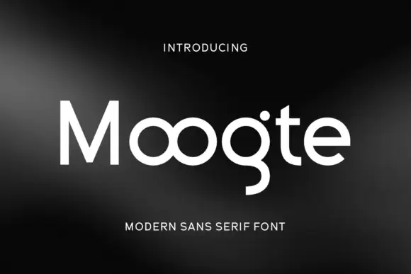
Joined circular display
Moogte is a joined circular display in white on a black ground: mixed case built from near-perfect circles, with the two o bowls fused into a single loop, a curling g descender and a cut on the t, set as one word with a small tracked line above and beneath.
Ideas for this font
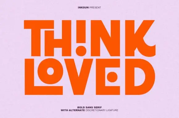
Bold sans with ligature alternates
Think Loved is a bold sans in orange on a pale ground: wide geometric caps with flat terminals, a very high waist and tight spacing, with a ligature that fuses two letters into a single drawn shape, set in two lines with a small tracked note beneath naming the alternate.
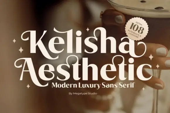
Heavy contrast mixed case with looped entry strokes and long curling capital legs
Kelisha Aesthetic is a modern luxury sans with high stroke contrast, tall narrow letters and a set of alternates in which an arm or an ascender curls into a loop.
Ideas for this font
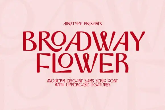
Contrast capitals with sweeping R and L tails and looped W centres
Broadway Flower is a slender sans in capitals where the ligatures do the decorating: an O grows a ribbon loop, a W folds into a wave, and adjacent letters share a stroke that curls away.
Ideas for this font
Same independent foundry
Allow optional Google Analytics to measure visits and catalogue actions. Your search words and notes are not included. Privacy & storage