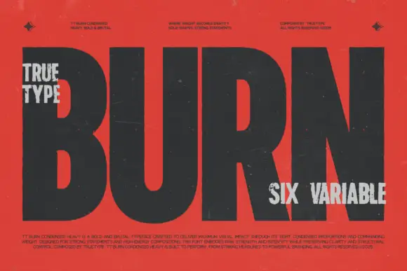
Modern Grotesque Body

Epic Dope + Miniplate
Creates crisp high-hierarchy contrast beneath Epic Dope headlines across menus, websites and labels.
Inspect Miniplate specimenDisclosure: MakerFileHub may earn a commission from qualifying purchases via paid links on this page. How our links work.
Condensed old-style serif with tall narrow letterspaced capitals
Epic Dope is a condensed old-style serif in which the capitals stretch tall, the serifs finish in small balls and the fit runs narrow, so a two-word title reads as a film credit card rather than as a headline.
Paid link
Get this fontProject & layout blueprintsAt-a-glance maker compatibility
Sturdy stroke walls and open counters weed cleanly on adhesive vinyl, HTV apparel film, and cut cardstock.
Visual anatomy & craft review
The E stacks three narrow arms on a thin stem, the P closes a small bowl, the I holds ball terminals, the C curls a narrow crescent and the D fills a tall oval, all at a moderate contrast with ball serifs and a compressed proportion. The condensation is the character: the sample sets two words in wide letterspacing across a dark field, which is how the face reaches full width without a second weight. Because the stems stay modest, the face reads at 30 pt and holds a poster at 160 pt; the ball serifs need a smooth stock at small sizes. The dark blurred portrait, the small caps in the corners and the three-column notes below are presentation; the cream condensed title is the face.
Condensed · Editorial · Old style
Two-font hierarchy recipes
Tested contrast partners — pairing Epic Dope with grounded secondary typography.
Epic Dope + Miniplate
Creates crisp high-hierarchy contrast beneath Epic Dope headlines across menus, websites and labels.
Inspect Miniplate specimen
Epic Dope + I Heart You
Adds a warm human signature touch for 1-to-3-word callouts without competing against structured serif capitals.
Inspect I Heart You specimenPractical applications
Concrete hierarchy, scale and production guidance tailored to Epic Dope’s stroke geometry.
The condensed caps set a long title on one line at credit size, and the letterspacing gives the block its film-poster calm at 60 pt.
Hierarchy & layout recipe
Print an A4 poster: set the title at 60 pt with 8 percent tracking across the middle, set the cast names in a 9 pt caps line beneath, and keep 25 mm of margin so the ball serifs sit inside the trim.
Pre-production check
Ball serifs printed on an uncoated poster sheet fill in at 60 pt; check the proof and keep the title above 70 pt if the sheet is textured.
The condensed caps fit a narrow credit box, and the ball serifs give a small studio a considered mark at 22 pt on a card.
Hierarchy & layout recipe
Print an 85 by 55 mm card: set the studio name at 22 pt with 4 percent tracking, set the credits line in a 6 pt sans beneath, and keep 10 mm of white under the word so the serifs have air.
Pre-production check
A wide-tracked caps line over small type looks top heavy; check the card and centre the block on the word rather than the page.
The condensed caps mark a section cleanly, and the open letterspacing keeps a short word readable at 90 pt on a plain page.
Hierarchy & layout recipe
Print an A4 divider: set the section number at 90 pt centred, set the section title in a 12 pt caps beneath with 6 percent tracking, and keep 55 mm of clear space above and below the block.
Pre-production check
A letterspaced caps line printed tight to body copy looks crowded; check the page and keep 20 mm of clear space under the block.
Technical & licence verification
Confirm included OTF/TTF/WOFF formats, full glyph tables and licence coverage on the live store page before batch production.
Closest visual alternatives
Matched across letterform anatomy, stroke behaviour and craft applications.
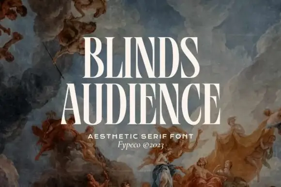
Tall condensed serif capitals with heavy uprights and narrow counters
Blinds Audience is a tall condensed serif in which the uprights keep heavy weight, the joins thin, the counters compress into narrow slots and the A opens a long triangular counter, so a stacked title reads as a gallery poster.
Ideas for this font
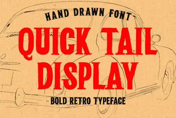
Hand-drawn condensed retro display with slab serifs
Quick Tail is a bold retro display in red over a pencil sketch: condensed capitals with heavy slab serifs, uneven edges and a hand-drawn bulge, set as two stacked words with a tracked capital line beneath.
Ideas for this font

Elegant feminine serif
Olivia Serif is an elegant serif in black on warm cream: high contrast, bracketed serifs, a large x-height and round bowls, set in title case on one line with a smaller serif line beneath, two tracked caps lines under that, and a fine ornamental frame with fleurons at the corners.
Ideas for this font
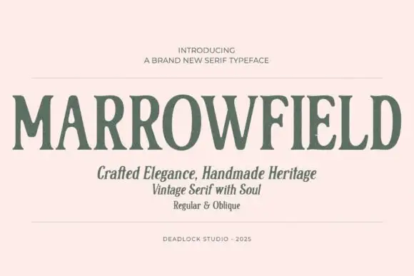
Narrow flared serif
Marrowfield is a narrow serif in sage on blush: tall condensed capitals with softly irregular flared stems, a wavering edge and a low contrast, set as one long word between two rules, with three lines beneath in title case and a studio credit at the foot.
Ideas for this font
Same independent foundry
Allow optional Google Analytics to measure visits and catalogue actions. Your search words and notes are not included. Privacy & storage