Neutral Sans Workhorse

Hip Hop + One More
Lets Hip Hop own the focal silhouette while handling secondary copy, sizing and subheads cleanly.
Inspect One More specimenDisclosure: MakerFileHub may earn a commission from qualifying purchases via paid links on this page. How our links work.
Inflated uneven letters with small white highlight cuts and rounded bulbous feet
Hip Hop draws fat retro caps with an inset groove running through each stroke, sets them in navy on cream, and frames the card with a marbled orange and pink border.
Paid link
Get this fontProject & layout blueprintsAt-a-glance maker compatibility
Sturdy stroke walls and open counters weed cleanly on adhesive vinyl, HTV apparel film, and cut cardstock.
Visual anatomy & craft review
HIP HOP sits in two rows at the centre of a white panel, the letters bulging with soft shoulders and an inline groove that turns each stroke into two tubes. Under it a second line repeats the treatment in lowercase, which shows that the shapes hold at a smaller size and with different proportions. Around the white panel the ground is a swirl of orange, coral, mustard and mint, drawn like poured paint with pale speckles, and a hexagonal badge holds a script mark next to the introduction line. All the type is flat navy with no shading beyond the groove, so the colour stays in the frame and the words stay legible. The face is deliberately soft and old-fashioned: it suits record sleeves, skate graphics and party invitations, and it needs enough size for the inline groove to read as a groove rather than as a highlight.
Inflated uneven letters with small white highlight cuts and rounded bulbous feet
Two-font hierarchy recipes
Tested contrast partners — pairing Hip Hop with grounded secondary typography.
Hip Hop + One More
Lets Hip Hop own the focal silhouette while handling secondary copy, sizing and subheads cleanly.
Inspect One More specimen
Hip Hop + Majestic Letters
Grounds bold display lettering with classic typographic authority on posters, badges and apparel.
Inspect Majestic Letters specimenPractical applications
Concrete hierarchy, scale and production guidance tailored to Hip Hop’s stroke geometry.
The warm swirl palette matches a street party's paper decorations, and the inline letters hold a short event name at poster size without an illustration behind them.
Hierarchy & layout recipe
Print an A5 flyer: set the event name at 58 pt across two rows, keep 14 mm of clear ground beneath before the date and street at 9 pt, and hold 12 mm of margin on each side of the flyer.
Pre-production check
The inline groove fills in on cheap laser printing; run one flyer on the actual stock and check the gap before the batch.
The retro bulge sets the decade in one word, and the groove gives the letters enough internal detail to look decorated without adding a single drawn object.
Hierarchy & layout recipe
Print a 400 by 600 mm sign: set the greeting at 96 pt across two rows, keep 26 mm of clear ground beneath before the time at 16 pt, and hold 28 mm of border so the rounded shoulders stay whole.
Pre-production check
Navy on cream loses definition in dim light; print one sign and check it in the room where the party will happen.
The softer retro outline separates a zine from the hard grotesques on the same shelf, and the colour frame gives a cheap print a deliberate, finished edge.
Hierarchy & layout recipe
Print a 148 by 210 mm cover: set the issue word at 62 pt across two rows, keep 18 mm of clear ground beneath before the issue number at 8 pt, and hold 15 mm from the outer letters to the colour border.
Pre-production check
Two-color printing shifts the groove out of register; print one cover with the real separations before the run is placed.
Technical & licence verification
Confirm included OTF/TTF/WOFF formats, full glyph tables and licence coverage on the live store page before batch production.
Closest visual alternatives
Matched across letterform anatomy, stroke behaviour and craft applications.
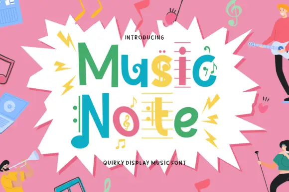
Music-note display
Music Note is a quirky display in green, teal, pink and yellow inside a white burst on a pink ground: mixed case whose letters carry note heads, staff-like bars and a clef, with small figures playing instruments around the edge and a plain line beneath naming the style.
Ideas for this font
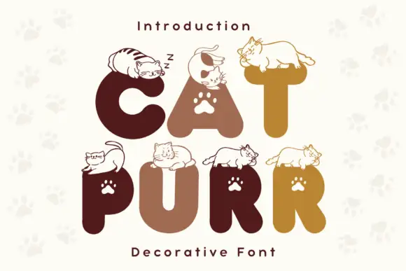
Rounded heavy capitals topped by resting cat drawings with paw-shaped counters
Cat Purr is a colour font that draws fat rounded letters in warm browns and golds, sets a white paw print in most counters, and rests a drawn cat on top of nearly every letter.
Ideas for this font
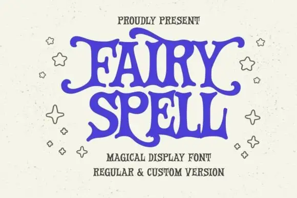
Heavy storybook capitals with wavy arms and curled tips
Fairy Spell shows purple capitals with thick curved strokes, broad pointed feet and irregular wavy horizontal arms, where the F and Y extend outward into curled tips and the R leg sweeps below the following letter.
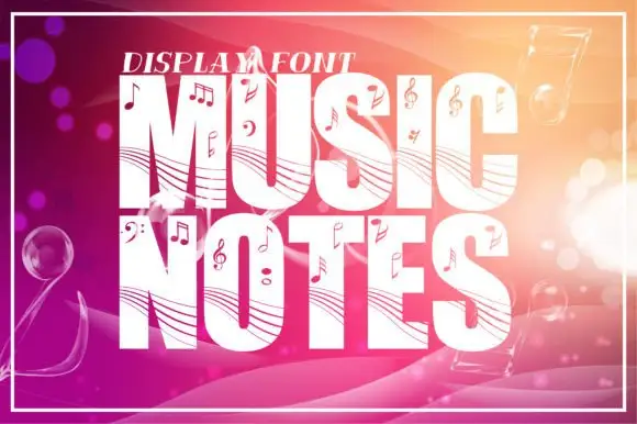
Staff-lined music display
Music Notes is a tall heavy display in white on a warm gradient ground: fat capitals crossed by curved staff-like lines and scattered with note heads, clefs, sharps and flats, with a small line above, a thin frame around the sheet and bokeh circles behind the type.
Ideas for this font
Same independent foundry
Allow optional Google Analytics to measure visits and catalogue actions. Your search words and notes are not included. Privacy & storage