Neutral Sans Workhorse

Marvel Brothers + Mango Dream
Lets Marvel Brothers own the focal silhouette while handling secondary copy, sizing and subheads cleanly.
Inspect Mango Dream specimenDisclosure: MakerFileHub may earn a commission from qualifying purchases via paid links on this page. How our links work.
Tilted multicolour block display
Marvel Brothers is a colour block display on a banded ground: tilted capitals with thick black depth, each in a different saturated colour, set as an alphabet row at the head and then as two large words, with a plain footer naming the format.
Paid link
Get this fontProject & layout blueprintsAt-a-glance maker compatibility
Sturdy stroke walls and open counters weed cleanly on adhesive vinyl, HTV apparel film, and cut cardstock.
Visual anatomy & craft review
The plate is a colour-font sheet, and the alphabet row at the head does the honest work: it shows the whole set at a size where the depth and the tilt can be judged before the display words are read. Each letter is a heavy block rotated slightly, with a thick black extrusion giving it the look of a comic caption, and the colours alternate so the row stays lively. That construction sets a moderate size floor, because the depth merges into the letter first. The footer is product copy. It suits a shirt, a poster and a party card for a young audience or a comic theme, and the tilt means the face should be set in short lines where the irregularity reads as deliberate.
Display, block, colourful, comic
Two-font hierarchy recipes
Tested contrast partners — pairing Marvel Brothers with grounded secondary typography.
Marvel Brothers + Mango Dream
Lets Marvel Brothers own the focal silhouette while handling secondary copy, sizing and subheads cleanly.
Inspect Mango Dream specimen
Marvel Brothers + Auretha
Grounds bold display lettering with classic typographic authority on posters, badges and apparel.
Inspect Auretha specimenPractical applications
Concrete hierarchy, scale and production guidance tailored to Marvel Brothers’s stroke geometry.
A comic block names a party, and the depth gives a small card the look of a printed caption rather than a template. It reads as a printed caption.
Hierarchy & layout recipe
A6 card: the greeting at 30 pt, the details in a 10 pt sans, and the date at 9 pt. Keep 15 mm margins, print four colours on a white card and leave 12 mm at the foot for the address.
Pre-production check
Check the 30 pt greeting at home-print resolution, where the depth merges; keep 1.2 mm of gap. Confirm the details read at arm's length and that the card folds flat.
A comic display prints as party kit, and the saturated colours hold on a light shirt where a single ink would look flat.
Hierarchy & layout recipe
Print a 250 mm chest graphic: the party at 55 mm cap height, the year at 24 mm, and four inks on a light shirt. Keep the depth at 3 mm and place the graphic 80 mm below the collar.
Pre-production check
Check the screen at actual mesh, where a 3 mm depth can merge; keep it at 4 mm. Wash-test one shirt and confirm the colours stay separate after five cycles.
A comic display holds a fair poster, and the tilt keeps a busy line-up lively where a straight block would look static. It keeps a line-up lively.
Hierarchy & layout recipe
A3 poster: the fair at 80 mm cap height, the times in an 18 mm sans, and the site at 11 mm. Keep 26 mm margins, print four colours on a light stock and keep the depth above 3 mm.
Pre-production check
Check the A3 at four metres, where the depth vanishes; keep it above 3 mm. Confirm the 11 mm site reads at two metres and that the tilt stays within the margins.
Technical & licence verification
Confirm included OTF/TTF/WOFF formats, full glyph tables and licence coverage on the live store page before batch production.
Closest visual alternatives
Matched across letterform anatomy, stroke behaviour and craft applications.
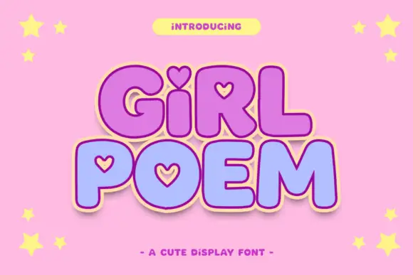
Round display blocks with heart-shaped counters and a soft outline
Girl Poem is a round display alphabet in which several letters carry heart-shaped counters, drawn as heavy soft blocks with a light outline and no contrast at all.
Ideas for this font
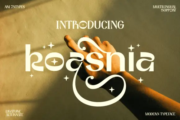
Rounded stylized lowercase with large upper curls and a deep lower sweep
Koasnia shows pale rounded lettering across a warm photograph of hands: wide bowls and fairly even substantial strokes contrast with a large curl above the middle letters and an open sweep that descends far below the line.
Ideas for this font
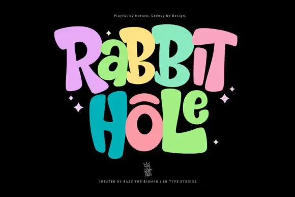
Groovy multicolour display
Rabbit Hole is a groovy multicolour display in pastel tones on a black ground: chunky rounded letters with soft corners and uneven widths, a bounce across both lines, four-point sparkles at the sides and a small crest at the foot.
Ideas for this font
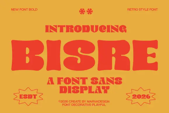
Retro fat display sans with blobby bowls and tight spacing
Bisre is a retro fat display sans in which the bowls swell into blobs, the counters close to slots and the letters jostle each other, so a short word reads as a hand-painted 1970s sign.
Ideas for this font
Same independent foundry
Allow optional Google Analytics to measure visits and catalogue actions. Your search words and notes are not included. Privacy & storage