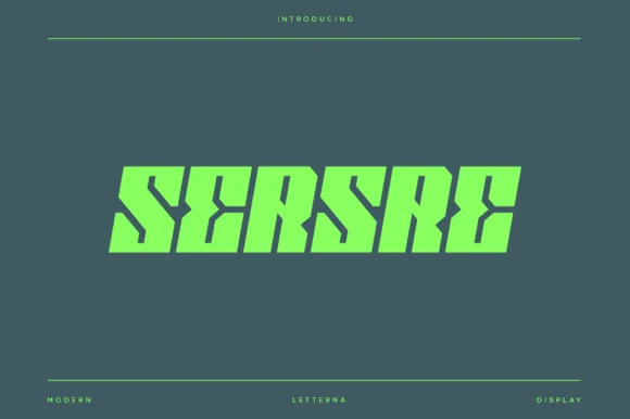
High-Contrast Display Serif

Sogtric + Amor Hadena
Pairs sculptural editorial warmth with Sogtric's clean modern geometry.
Inspect Amor Hadena specimenDisclosure: MakerFileHub may earn a commission from qualifying purchases via paid links on this page. How our links work.
Wide geometric sans for futuristic display
Sogtric is a wide geometric sans in white caps over dark science-fiction city art: even stroke weight throughout, near-square counters and a flat-sided O that make it read as signage projected onto a night skyline rather than a text face.
Paid link
Get this fontProject & layout blueprintsAt-a-glance maker compatibility
Sturdy stroke walls and open counters weed cleanly on adhesive vinyl, HTV apparel film, and cut cardstock.
Visual anatomy & craft review
The sample sets its name in one line of capitals and lets the letters run wide: the S carries long horizontal terminals at top and bottom, the O and the C are built from near-straight sides with small rounded corners instead of true curves, and the G closes on a short bar rather than a spur. Stroke weight stays almost identical in every direction, so the face holds together at large sizes on a dark ground where thin strokes would vanish, and letter spacing is open enough that the individual shapes stay distinct even when the word is projected or printed huge. The stock is a piece of digital artwork rather than a paper mockup: a dark sky, a lit city silhouette and a glow behind the type, with two lines of wide-tracked capitals above and below the main word acting as credits. Nothing in the layout is centred on a grid line, which suits a face whose geometry already does the organising.
Futuristic, wide, geometric, even
Two-font hierarchy recipes
Tested contrast partners — pairing Sogtric with grounded secondary typography.
Sogtric + Amor Hadena
Pairs sculptural editorial warmth with Sogtric's clean modern geometry.
Inspect Amor Hadena specimen
Sogtric + Simple Alphabet
Introduces organic movement on pull-quotes, signatures and gift tags.
Inspect Simple Alphabet specimenPractical applications
Concrete hierarchy, scale and production guidance tailored to Sogtric’s stroke geometry.
A wide geometric face makes a studio mark look engineered rather than decorative, and even stroke weight survives the tiny sizes a store badge is displayed at.
Hierarchy & layout recipe
Set the name at 40 pt in caps with 60 units of tracking and place it under a flat triangular mark; keep 12 mm above the mark and 10 mm below the word for a web storefront tile, then test the same lockup at 24 px tall to confirm the flat O sides do not fill in.
Pre-production check
Check the result at 24 px, 96 px and 1,200 px wide: the flat sides of the O must stay open at the small size, and the S terminals must not touch the following letter at the large one. Watch the counter of the G when the word is placed over a busy skyline image.
Because the letterforms are wide and evenly weighted, a single word set in them fills a chapter spread without a second graphic, which is exactly what a feature opener needs.
Hierarchy & layout recipe
Run the word at 120 pt across the full measure at the top of the recto, let it bleed 6 mm past the left margin, and set the standfirst in a narrow text serif at 10 pt below with a 30 mm gap. Keep the whole page black and print the type in one flat spot colour so the geometry stays the only image.
Pre-production check
Confirm the tracking does not add a gap wide enough to read as a word space between the S and the I, and check the page in proof on the actual uncoated stock, because even-weight sans on absorbent paper gains a little weight at 9 pt.
A futuristic sans signals technology without the clichés of circuitry or chrome, so a school club can look current while staying legible to parents at a distance.
Hierarchy & layout recipe
Print at A1: two words stacked, 90 mm cap height, tracked 80 units, white on a dark blue ground with the club name in a light grotesque at 14 pt underneath. Put the time and date in a separate band along the bottom so the display word is never broken by a line of data.
Pre-production check
Read the banner from five metres and confirm the counters of the O and G stay visible; check the white against the dark blue for the printing house and ask for the same file at half scale for the corridor noticeboard.
Technical & licence verification
Confirm included OTF/TTF/WOFF formats, full glyph tables and licence coverage on the live store page before batch production.
Closest visual alternatives
Matched across letterform anatomy, stroke behaviour and craft applications.
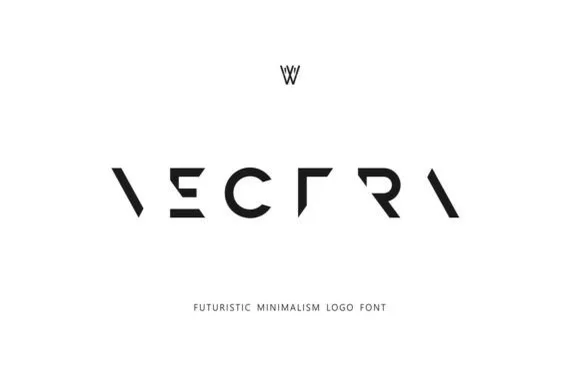
Deconstructed minimalist stencil & puzzle logo font
Vectra is an experimental futuristic logo font that strips each capital down to minimalist geometric strokes and negative-space angles.
Ideas for this font
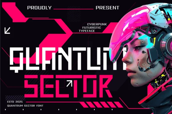
Modular stencil-cut cyberpunk & HUD techno display
Quantum Sector is a square-jawed cyberpunk techno sans featuring futuristic stencil cuts, directional arrow accents, and HUD geometry.
Ideas for this font
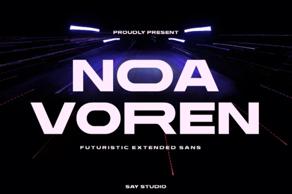
Wide extended futuristic & aerospace display grotesk
Noa Voren is a bold, wide-stance extended sans serif featuring stretched horizontal proportions and subtle speed-sliced diagonal cuts.
Ideas for this font
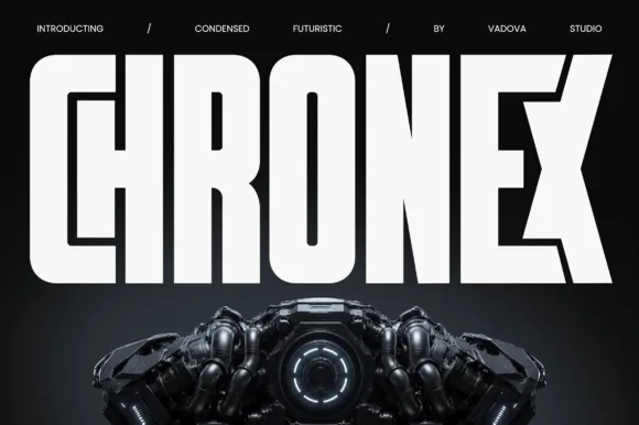
Towering ultra-condensed industrial sci-fi block sans
Chronex is an imposing, ultra-condensed sci-fi sans serif built with heavy monolithic pillars and chamfered geometric corners.
Ideas for this font
Same independent foundry
Allow optional Google Analytics to measure visits and catalogue actions. Your search words and notes are not included. Privacy & storage