Neutral Sans Workhorse

Flairiquet + Lemon Milk Pro FTR
Lets Flairiquet own the focal silhouette while handling secondary copy, sizing and subheads cleanly.
Inspect Lemon Milk Pro FTR specimenDisclosure: MakerFileHub may earn a commission from qualifying purchases via paid links on this page. How our links work.
Y2K street display in rounded retro caps with an inner fill and keyline
Flairiquet is a rounded retro display alphabet in which the fat italic caps carry a white inner fill inside a coloured keyline, so the word reads as a spray-can sticker from the early 2000s rather than as plain type.
Paid link
Get this fontProject & layout blueprintsAt-a-glance maker compatibility
Sturdy stroke walls and open counters weed cleanly on adhesive vinyl, HTV apparel film, and cut cardstock.
Visual anatomy & craft review
The F leans a fat stem into a short arm, the A pinches a rounded apex, the R turns a soft leg, the Q drops a curly tail and the T spreads a wide arm, all at a bubble weight with fully round terminals, a slight backward lean and a double contour that separates the fill from the keyline. The pairing of fill and line is the character: it lets one word carry three colours without any extra artwork, which is exactly how the sample stacks a purple line on a white face against orange. Because the outline is drawn, the face keeps its edge at 24 pt, and the fat strokes cut cleanly. The orange ground, the flame panels, the corner marks and the small caps above and below are presentation; the big display word is the face.
Y2K · Rounded · Outlined
Two-font hierarchy recipes
Tested contrast partners — pairing Flairiquet with grounded secondary typography.
Flairiquet + Lemon Milk Pro FTR
Lets Flairiquet own the focal silhouette while handling secondary copy, sizing and subheads cleanly.
Inspect Lemon Milk Pro FTR specimen
Flairiquet + Svara
Grounds bold display lettering with classic typographic authority on posters, badges and apparel.
Inspect Svara specimenPractical applications
Concrete hierarchy, scale and production guidance tailored to Flairiquet’s stroke geometry.
The Y2K outline gives a party card its period look in one colour pair, and the rounded caps stay legible at 28 pt on a small card.
Hierarchy & layout recipe
Print a 120 mm square card: set the name at 28 pt inside the keyline, keep the line at 1.2 mm, and leave 10 mm of orange ground around the word so the contour has air.
Pre-production check
A thin keyline on a coloured ground shows every printer drift; check the card and print the line as a separate spot if the fill shifts.
The fat outlined letters hold their shape at 40 mm on a vinyl sticker, and the lean gives a short shop name the right street energy.
Hierarchy & layout recipe
Print a 70 mm round sticker: set the shop name at 40 mm across the middle, keep 4 mm between the word and the die edge, and set the address in a 6 pt sans along the lower arc.
Pre-production check
Small text on a round die distorts as it follows the arc; check the sticker and set the address straight across rather than on a curve.
The bright outline reads from across a pool deck, and the rounded fat strokes survive a cheap two-colour print at 80 pt.
Hierarchy & layout recipe
Print an A2 poster: set the headline at 80 pt over the sky area, keep the keyline at 2 mm, and set the date in a 14 pt caps sans in the lower band with 30 mm of clearance.
Pre-production check
Two-colour registration on a large poster can shift the line off the fill; check the proof and allow a 0.5 mm trap where the outline meets the face.
Technical & licence verification
Confirm included OTF/TTF/WOFF formats, full glyph tables and licence coverage on the live store page before batch production.
Closest visual alternatives
Matched across letterform anatomy, stroke behaviour and craft applications.
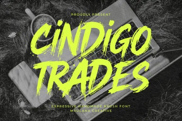
Ragged slanted brush lettering with dry edges and uneven pressure
Cindigo Trades is expressive brush lettering that leans hard to the right, its strokes ragged at the edges and uneven in pressure, so the words look sprayed or painted rather than drawn.
Ideas for this font
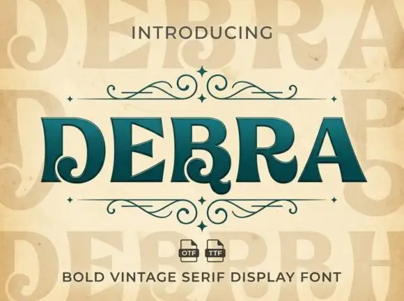
Heavy contrast serif capitals with curled lower terminals in D, B and R
Debra places dark teal capitals on warm cream, where broad vertical strokes meet fine triangular serifs and the D curls inward at its lower-left corner, the B carries a small lower curl and the R adds a similar turn under its leg.
Ideas for this font
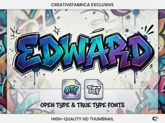
Angular graffiti capitals with overlapping facets and a dripped edge
Edward is an angular graffiti display alphabet in capitals only, built from overlapping faceted strokes in two colours, with short drips running off the lower edges and a hard shadow behind each letter.
Ideas for this font
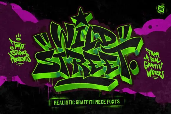
Graffiti piece display
Wild Street is a graffiti piece display in acid green on black and magenta: interlocking letters with a 3D block shadow, heavy outlines, exaggerated arrows and a star at the apex, surrounded by spray marks and a hand-lettered caption, so the plate reads as a wall piece rather than a typeface.
Ideas for this font
Same independent foundry
Allow optional Google Analytics to measure visits and catalogue actions. Your search words and notes are not included. Privacy & storage