High-Contrast Display Serif

Gothic + Bulgary
Pairs sculptural editorial warmth with Gothic's clean modern geometry.
Inspect Bulgary specimenDisclosure: MakerFileHub may earn a commission from qualifying purchases via paid links on this page. How our links work.
Real hand-carved woodblock letterpress condensed sans (6 alternates per glyph!!)
Gothic (by wtl.typography — historical 'Wood-Type Gothic' condensed sans!) was physically carved from wood, inked, letterpress-printed & scanned with 6 unique alternates per letter!
Paid link
Get this fontProject & layout blueprintsAt-a-glance maker compatibility
Sturdy stroke walls and open counters weed cleanly on adhesive vinyl, HTV apparel film, and cut cardstock.
Visual anatomy & craft review
Gothic is a condensed sans carved from real woodblock type, with six alternates per glyph: narrow squared stems, small nicks and splinters along the edges, uneven inking and alternate cuts that vary the wear on each letter. The wear is the design and it fills in when the face is reversed or printed small. It needs roughly 22 mm for the nick and the splinter to read, and it is best in one dense ink on uncoated stock, or a single ink with a deboss so the carved edge catches light.
Real-woodcut-press · 6-alternates-per-key · Tactile-ink
Two-font hierarchy recipes
Tested contrast partners — pairing Gothic with grounded secondary typography.
Gothic + Bulgary
Pairs sculptural editorial warmth with Gothic's clean modern geometry.
Inspect Bulgary specimen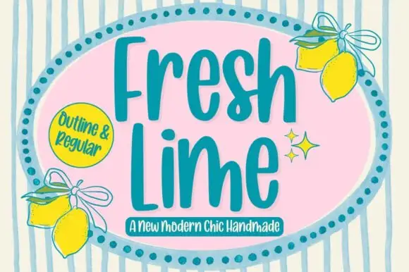
Gothic + Fresh Lime
Introduces organic movement on pull-quotes, signatures and gift tags.
Inspect Fresh Lime specimenPractical applications
Concrete hierarchy, scale and production guidance tailored to Gothic’s stroke geometry.
A carved woodblock sans gives a feature on printing the look of pressed type rather than a styled headline. The nicks hold at 24 pt on uncoated paper, and the alternates let a repeated letter vary like real type.
Hierarchy & layout recipe
Header 24 pt with 6 mm nick clearance, standfirst 11/15 pt, body 9/13 pt over two columns of 82 mm, 18 mm margins. Folio line 7/9 pt, 12 mm from the trim.
Pre-production check
At 7 pt the folio line's splinters fill and the line reads as a grey rule. Set folios in the body face and keep the woodblock at 12 pt and above, then proof one page at 1:1.
A carved woodblock sans reads as a pressed imprint rather than a designed logo, which is what a letterpress shop wants on its card. The nicks hold at 18 mm, and one ink prints the card and the letterhead in one order.
Hierarchy & layout recipe
Card 85 x 55 mm, word 18 mm with 5 mm nick clearance, details 7/9 pt, 5 mm margins. Letterhead 210 x 297 mm, word 28 mm, 20 mm margins. Stamp 50 x 20 mm, word 8 mm, 2 mm margin.
Pre-production check
A 50 x 20 mm rubber stamp at 8 mm bridges the carved nicks and the mark prints as a blot. Keep stamps at 12 mm and above, and test one impression before the order.
A condensed woodblock sans fits a long stall name on a narrow board, which is what a market actually needs in bad light. The nicks hold at 60 mm on a board, and one ink prints the board and the price cards in one pass.
Hierarchy & layout recipe
Board 600 x 900 mm, word 100 mm with 12 mm nick clearance, items 26 mm, 30 mm margins. Price card 105 x 75 mm, item 18 mm, price 24 mm. Bag print 200 x 250 mm, word 50 mm, 15 mm margins.
Pre-production check
A 105 x 75 mm price card at 18 mm fills the nicks and the item reads as a bar in low winter light. Raise the item to 24 mm, and check one card under the market lamp.
Technical & licence verification
Confirm included OTF/TTF/WOFF formats, full glyph tables and licence coverage on the live store page before batch production.
Closest visual alternatives
Matched across letterform anatomy, stroke behaviour and craft applications.
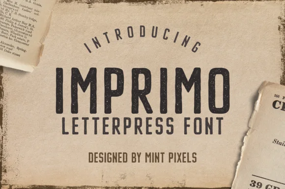
Worn wood-type letterpress condensed sans display
Imprimo Letterpress is a tall, condensed uppercase sans-display font stamped with subtle vintage ink grain and soft wood-type corners.
Ideas for this font
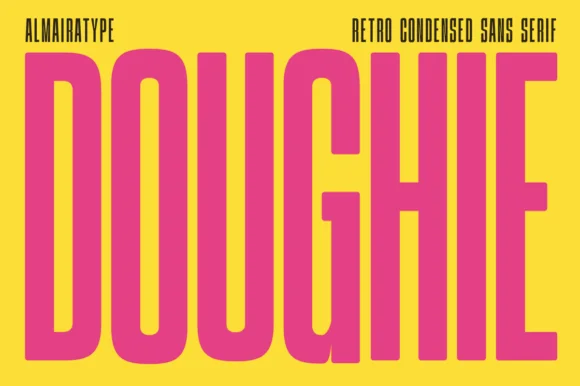
Ultra-tall 5:1 pillar-condensed retro poster sans
Doughie is an ultra-tall, compressed retro condensed sans stretching rounded-corner vertical pillars edge-to-edge across posters and packaging!
Ideas for this font
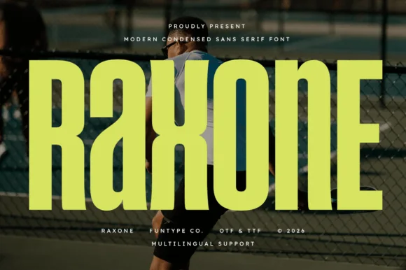
Heavy notched-joint athletic court condensed sans (OTF, TTF & Multilingual)
Raxone is a heavy, muscular condensed sans featuring subtle architectural waist notches on 'R', 'a', 'x', and 'n' for modern sports & streetwear (OTF/TTF).
Ideas for this font

Ultra-narrow 6:1 skyscraper condensed editorial sans (OTF & TTF)
Homies is an extreme 6:1 ultra-condensed sans serif packing razor-slim, towering vertical bars for high-fashion streetwear & album art (OTF & TTF).
Ideas for this font
Same independent foundry
Allow optional Google Analytics to measure visits and catalogue actions. Your search words and notes are not included. Privacy & storage