Neutral Sans Workhorse

Getting Blacker + Bielchon
Lets Getting Blacker own the focal silhouette while handling secondary copy, sizing and subheads cleanly.
Inspect Bielchon specimenDisclosure: MakerFileHub may earn a commission from qualifying purchases via paid links on this page. How our links work.
Tall Victorian Tuscan & spooky-parlor spurred display
Getting Blacker is a tall, clean Victorian-gothic display font featuring bifurcated fishtail serifs and sharp mid-stem diamond spurs.
Paid link
Get this fontProject & layout blueprintsAt-a-glance maker compatibility
Sturdy stroke walls and open counters weed cleanly on adhesive vinyl, HTV apparel film, and cut cardstock.
Visual anatomy & craft review
Getting Blacker is a tall Victorian-gothic display with bifurcated fishtail serifs and sharp diamond spurs at mid-stem, drawn clean rather than distressed, so the ornament comes from the form instead of a texture. The capitals are narrow and tightly spaced, which stacks a long word into a tall panel, and the spurs give the face its period signature at 20 mm and above. It is a poster, label and signage face, best in one bone colour on black or a deep ink on parchment.
Cobweb-Victorian · Tall-spurred · Crisp
Two-font hierarchy recipes
Tested contrast partners — pairing Getting Blacker with grounded secondary typography.
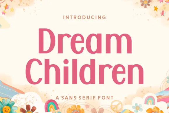
Getting Blacker + Bielchon
Lets Getting Blacker own the focal silhouette while handling secondary copy, sizing and subheads cleanly.
Inspect Bielchon specimen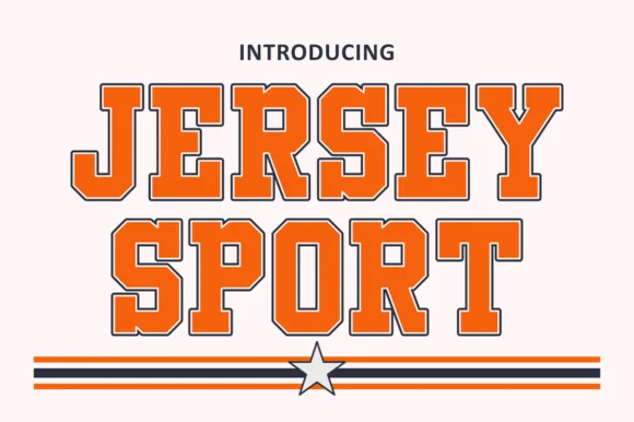
Getting Blacker + Jersey Sport
Grounds bold display lettering with classic typographic authority on posters, badges and apparel.
Inspect Jersey Sport specimenPractical applications
Concrete hierarchy, scale and production guidance tailored to Getting Blacker’s stroke geometry.
Fishtail serifs read as a printed parlour poster, which suits a séance or gothic theme better than a slasher graphic. Narrow caps stack a long word in a tall panel.
Hierarchy & layout recipe
Poster 500 x 700 mm, word 260 mm, details 18/24 pt, 40 mm margins. Label 70 x 50 mm, word 12 mm, 4 mm die margin. Wrap 60 x 45 mm, word 9 mm, 3 mm top arc.
Pre-production check
Diamond spurs under 1 mm at 12 mm on a jar label close into a solid bulge. Keep the smallest use above 15 mm, or use a plain cut for small labels and keep the spurs for the poster.
Victorian display letters are the correct vocabulary for a nineteenth-century poster, so a reproduction reads as source rather than pastiche. Tight spacing gives a cover density without ornament.
Hierarchy & layout recipe
Poster 500 x 700 mm, title 220 mm, imprint 16/22 pt, 40 mm margins. Cover 129 x 198 mm, title 34 pt, author 14 pt. Label 100 x 60 mm, object 8 mm, data 6 pt.
Pre-production check
Museum labels sit at 8 mm and read at 40 cm, where fishtails become specks. Keep the display face on the poster and set the label in a plain serif, checking one at its stated distance.
Victorian spurring gives a small producer the look of an old label without a texture overlay. The narrow caps fit a tall bottle face with room for data beneath.
Hierarchy & layout recipe
Label 70 x 110 mm, name 18 mm, data 5/7 pt, 5 mm top arc. Bottle 80 x 120 mm, name 20 mm, abv 4.5 pt. Stamp 45 x 25 mm, word 7 mm, 2 mm relief border.
Pre-production check
Rubber stamps press by hand and a diamond spur at 7 mm prints unevenly. Cut the block with 0.5 mm relief, and press three test impressions on the actual label stock before approving.
Technical & licence verification
Confirm included OTF/TTF/WOFF formats, full glyph tables and licence coverage on the live store page before batch production.
Closest visual alternatives
Matched across letterform anatomy, stroke behaviour and craft applications.
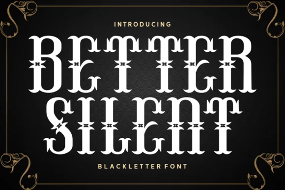
Spurred Victorian Tuscan & Western saloon display
Better Silent is a bold Victorian-Tuscan display font (more saloon-Victorian than medieval blackletter) armed with bifurcated spurs and curls.
Ideas for this font
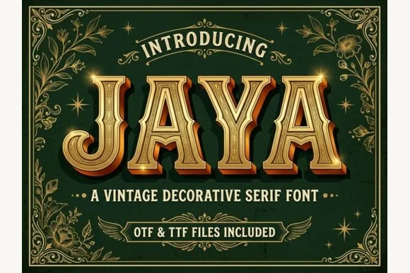
3D chiseled gold Western saloon & Victorian Tuscan serif (OTF & TTF)
Jaya is an opulent Western saloon & Victorian Tuscan display font sporting sharp median spurs and chiseled golden bevels (OTF & TTF)!
Ideas for this font
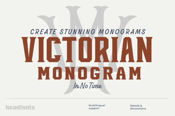
Condensed bold serif for monograms
Victorian Monogram is a condensed bold serif in brick red: tall narrow capitals with sharp bracketed serifs, a high waist, a tight inner counter and flat terminals, shown over a large ghosted monogram letter with a script accent line beneath, so the plate reads as a monogram kit.
Ideas for this font
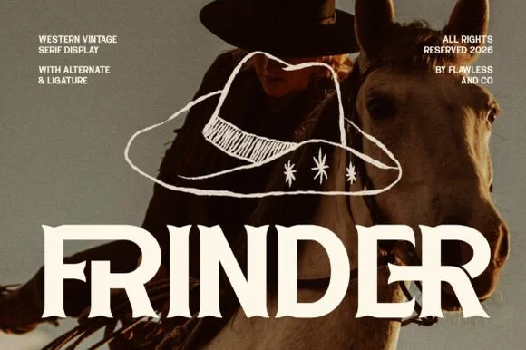
Modern sharp-spurred Western serif with interlocking ligatures
Frinder is a sharp, modern editorial Western serif combining triangular thorn spurs with custom interlocking ligatures ('DE') and hooked 'R' legs.
Ideas for this font
Same independent foundry
Allow optional Google Analytics to measure visits and catalogue actions. Your search words and notes are not included. Privacy & storage