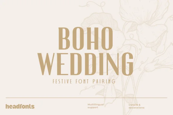
Neutral Sans Workhorse

Victorian Monogram + Furion
Lets Victorian Monogram own the focal silhouette while handling secondary copy, sizing and subheads cleanly.
Inspect Furion specimenDisclosure: MakerFileHub may earn a commission from qualifying purchases via paid links on this page. How our links work.
Condensed bold serif for monograms
Victorian Monogram is a condensed bold serif in brick red: tall narrow capitals with sharp bracketed serifs, a high waist, a tight inner counter and flat terminals, shown over a large ghosted monogram letter with a script accent line beneath, so the plate reads as a monogram kit.
Paid link
Get this fontProject & layout blueprintsAt-a-glance maker compatibility
Sturdy stroke walls and open counters weed cleanly on adhesive vinyl, HTV apparel film, and cut cardstock.
Visual anatomy & craft review
The two lines are stacked and the drawing is a condensed serif built for letters rather than for words: the stems are heavy, the counters are narrow slots, and the serifs are sharp triangles, which is what makes a single letter read as a crest at small size. The narrow width is the point of the design, since a monogram needs to sit inside a circle or a square without touching the frame, and the specimen demonstrates that by placing the words over an oversized letterform in a pale grey. A short italic script line beneath the title adds a contrasting voice, which is how a monogram lockup usually pairs a name with an initial. The palette is two inks on white, and the frame is a hairline rule with a footer of small tracked notes.
Condensed, bold, monogram, classic
Two-font hierarchy recipes
Tested contrast partners — pairing Victorian Monogram with grounded secondary typography.
Victorian Monogram + Furion
Lets Victorian Monogram own the focal silhouette while handling secondary copy, sizing and subheads cleanly.
Inspect Furion specimen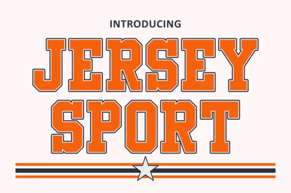
Victorian Monogram + Jersey Sport
Grounds bold display lettering with classic typographic authority on posters, badges and apparel.
Inspect Jersey Sport specimenPractical applications
Concrete hierarchy, scale and production guidance tailored to Victorian Monogram’s stroke geometry.
A condensed serif keeps a monogram inside a circular frame without the letters touching the border, and the sharp serifs read as an engraved crest even in a single flat ink.
Hierarchy & layout recipe
Build the monogram at 30 mm on the invitation, 16 mm on the menu and 10 mm on a favour tag. Keep one colour, hold 4 mm clear inside the frame, and pair the letters with a small roman for the names beneath.
Pre-production check
Check the 10 mm version, where the narrow counters can fill; keep the size above 8 mm or use a simplified single letter. Confirm the monogram reads on a wax seal and that the serifs clear the frame ring.
A condensed serif reads as bespoke tailoring, and the narrow letters let a two-letter monogram sit in a woven label where a wide serif would need to be redrawn.
Hierarchy & layout recipe
Set the monogram at 25 mm on a shop window, 12 mm on a woven label and 8 mm on a button tag. Keep the mark one colour and reserve clear space equal to the serif width so the letters never touch the frame.
Pre-production check
Check the 12 mm woven label, where a sharp serif can disappear into the weave; use a mill file with the corners thickened. Confirm the window mark weeds cleanly and that the monogram still reads as two letters at 8 mm.
A condensed serif gives a classic an authentic period setting, and the narrow width lets a long title and a publisher's mark share the spine without crowding.
Hierarchy & layout recipe
Set the title at 70 mm cap height, the author in a 12 pt roman, and the imprint at 8 pt. Keep the title in the upper half, print two inks on an uncoated stock, and use the monogram from the same family as the imprint mark.
Pre-production check
Check the 70 mm title, where tight counters can close on uncoated paper; proof the stock. Confirm the 8 pt imprint reads on the spine and that the monogram mark still reads at 6 mm.
Technical & licence verification
Confirm included OTF/TTF/WOFF formats, full glyph tables and licence coverage on the live store page before batch production.
Closest visual alternatives
Matched across letterform anatomy, stroke behaviour and craft applications.
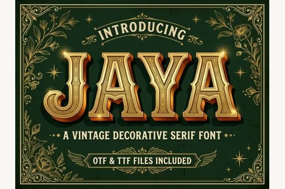
3D chiseled gold Western saloon & Victorian Tuscan serif (OTF & TTF)
Jaya is an opulent Western saloon & Victorian Tuscan display font sporting sharp median spurs and chiseled golden bevels (OTF & TTF)!
Ideas for this font
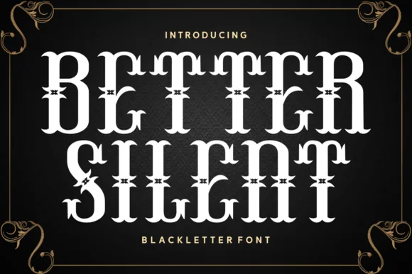
Spurred Victorian Tuscan & Western saloon display
Better Silent is a bold Victorian-Tuscan display font (more saloon-Victorian than medieval blackletter) armed with bifurcated spurs and curls.
Ideas for this font
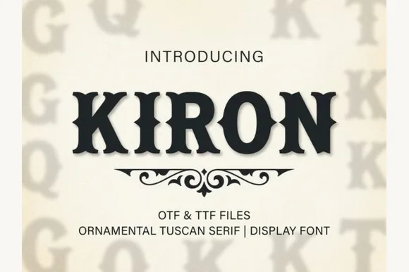
Classic median-spurred Western Tuscan slab-serif
Kiron is a clean, heavy Western Tuscan display serif with crisp diamond median spurs, flared bracketed serifs, and solid single-layer geometry.
Ideas for this font
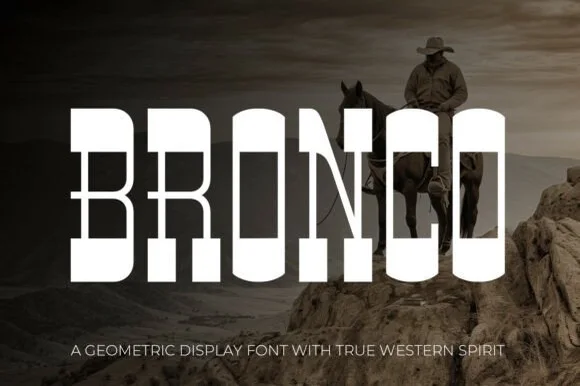
Tall architectural geometric spur-slab Western display
Bronco is a tall, clean-lined geometric Western slab serif pairing crisp rectangular counters with razor-sharp horizontal waist spurs.
Ideas for this font
Same independent foundry
Allow optional Google Analytics to measure visits and catalogue actions. Your search words and notes are not included. Privacy & storage