Modern Grotesque Body

Loving Dream + Taught
Creates crisp high-hierarchy contrast beneath Loving Dream headlines across menus, websites and labels.
Inspect Taught specimenDisclosure: MakerFileHub may earn a commission from qualifying purchases via paid links on this page. How our links work.
Modern sharp-join serif
Loving Dream is a modern serif in near-black on an off-white sheet: heavy capitals with sharp triangular joins, contained bowls, fine bracketed serifs and a tall M, set in two lines with a tracked line above and beneath, and two soft pastel circles at the corners.
Paid link
Get this fontProject & layout blueprintsAt-a-glance maker compatibility
Sturdy stroke walls and open counters weed cleanly on adhesive vinyl, HTV apparel film, and cut cardstock.
Visual anatomy & craft review
The two words are stacked and the drawing is a modern serif at a bold weight: the joins are sharp triangles, the bowls are contained, and the serifs are fine but bracketed, which gives the face a contemporary formality rather than a period one. The two pastel circles at the corners are the only ornament, and they show how the face behaves beside a soft shape without losing its edge. That construction sets a moderate size floor, because the sharp joins close when the letters shrink, and the plate sets the lines large enough that each join is visible. The tracked line above and beneath are plain caps. Because the letters are heavy and the serifs fine, the face suits a cover, an invitation and a label, and it prints well in one ink on a smooth stock.
Serif, contrast, modern, bold
Two-font hierarchy recipes
Tested contrast partners — pairing Loving Dream with grounded secondary typography.
Loving Dream + Taught
Creates crisp high-hierarchy contrast beneath Loving Dream headlines across menus, websites and labels.
Inspect Taught specimen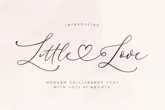
Loving Dream + Little Love
Adds a warm human signature touch for 1-to-3-word callouts without competing against structured serif capitals.
Inspect Little Love specimenPractical applications
Concrete hierarchy, scale and production guidance tailored to Loving Dream’s stroke geometry.
A modern serif reads as formal without a period feel, and the heavy capitals hold a long couple's name across an invitation.
Hierarchy & layout recipe
A5 invitation: the names at 26 pt, the request in a 9.5 pt serif, and the date at 8.5 pt caps. Keep 24 mm margins and print one ink on a cotton card. Keep the names on one line at 26 pt.
Pre-production check
Check the 26 pt names on a cotton card, where a fine serif can break; keep it above 0.25 mm. Confirm the 9.5 pt request reads at arm's length and that the names clear the trim.
A contemporary serif gives a debut a bold cover, and the sharp joins keep the title crisp at thumbnail size. The sharp joins give it a modern edge.
Hierarchy & layout recipe
Set the title at 80 mm cap height across 185 mm, the author in a 12 pt serif, and the imprint at 8 pt. Print two colours on a matte stock and keep the title off the author line.
Pre-production check
Check the title at 80 mm, where a sharp join can clot; keep the counters open. Confirm the 8 pt imprint survives lamination and that the title reads in a shop thumbnail.
A modern serif gives a chocolate box a considered look, and the fine serifs hold on a foil-blocked die. A box should look considered before it is opened.
Hierarchy & layout recipe
Print a 70 by 50 mm label: the house at 12 pt, the collection at 8 pt, and the weight at 7 pt. Keep 4 mm inside the die and keep the finest serif above 0.25 mm in foil.
Pre-production check
Check the 12 pt house in foil, where a serif can fill; keep the stroke above 0.25 mm. Confirm the 7 pt weight reads on a box edge and that the label holds in a warm room.
Technical & licence verification
Confirm included OTF/TTF/WOFF formats, full glyph tables and licence coverage on the live store page before batch production.
Closest visual alternatives
Matched across letterform anatomy, stroke behaviour and craft applications.
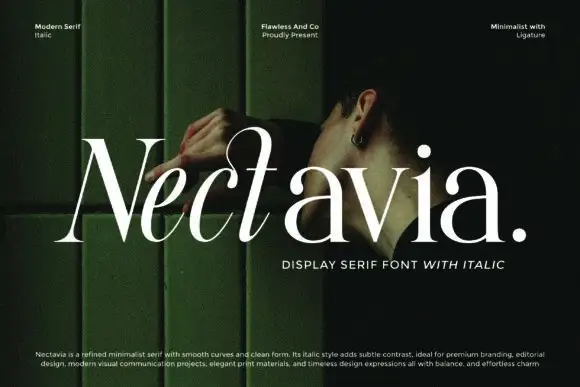
Minimalist display serif with italic
Nectavia is a refined minimalist serif in white over a dark green portrait: moderate contrast, smooth curves, a clean stem and sharp serifs, set in title case on one line with a small italic line beneath and three tracked notes across the top.
Ideas for this font
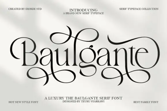
Tall high-contrast serif with looping figure-eight extensions in regular and slant
Baulgante is an elegant high-contrast serif in which the stems stay narrow, the bowls round broadly and repeated figure-eight extensions loop above and below the line, and the family ships in regular and slant so a suite can shift its axis.
Ideas for this font
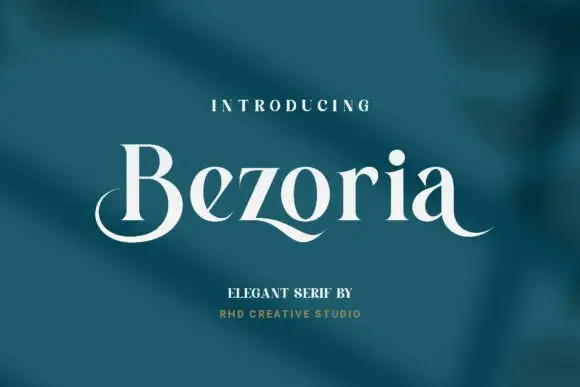
Elegant serif with calligraphic tails and a flowing lowercase
Bezoria is an elegant serif in which the lowercase carries calligraphic tails, the bowls flow into their stems and the serifs stay fine, so a single name reads as a piece of modern lettering rather than as a text face.
Ideas for this font
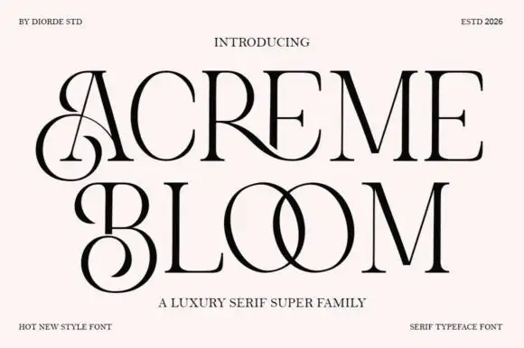
Luxury serif super family with ligatures and high contrast
Acreme Bloom is a luxury serif family in which neighbouring letters join into drawn ligatures, the stems keep a high contrast and the fit stays wide, so a two-word title reads as a couture wordmark rather than as a headline.
Ideas for this font
Same independent foundry
Allow optional Google Analytics to measure visits and catalogue actions. Your search words and notes are not included. Privacy & storage