High-Contrast Display Serif

Dream Children + Stanza
Pairs sculptural editorial warmth with Dream Children's clean modern geometry.
Inspect Stanza specimenDisclosure: MakerFileHub may earn a commission from qualifying purchases via paid links on this page. How our links work.
Upright contrast mixed case with oval bowls and a round i dot
Dream Children sets a bold pink grotesque in two stacked rows on a cream card, its bowls open, its terminals flat and its spacing tight enough that the pair reads as one block of colour.
Paid link
Get this fontProject & layout blueprintsAt-a-glance maker compatibility
Sturdy stroke walls and open counters weed cleanly on adhesive vinyl, HTV apparel film, and cut cardstock.
Visual anatomy & craft review
The name fills the centre while a border of pastel flowers, rainbows, stars and kites runs around the edge, which is the only illustration on the cover. Letters keep heavy even strokes, the D and the C draw wide curves and the a closes with a small tail, so the face reads as a modern display grotesque rather than as a book weight. Two tracked captions name the style above and below. The contrast between the plain letterforms and the busy border is what makes the sample work, and that is also the lesson: the face needs a quiet field, because it will not hold up against its own decoration.
Upright contrast mixed case with oval bowls and a round i dot
Two-font hierarchy recipes
Tested contrast partners — pairing Dream Children with grounded secondary typography.
Dream Children + Stanza
Pairs sculptural editorial warmth with Dream Children's clean modern geometry.
Inspect Stanza specimen
Dream Children + Coastal Honey
Introduces organic movement on pull-quotes, signatures and gift tags.
Inspect Coastal Honey specimenPractical applications
Concrete hierarchy, scale and production guidance tailored to Dream Children’s stroke geometry.
The bold grotesque reads on a photocopied sheet, and the plain forms let a busy border of children's drawings sit around them.
Hierarchy & layout recipe
Print an A4 newsletter: set the heading at 40 pt across one row, keep 14 mm of clear ground beneath before the first item at 11 pt, and keep 18 mm of margin from the edge so the border art stays clear.
Pre-production check
Heavy ink fills on cheap copiers; check a photocopy before running a class set. Ask the printer for a sample at the finished size.
The bright weight carries across a hall, and the plain letterforms stay readable while the decorations stay at the edges.
Hierarchy & layout recipe
Print a 500 by 700 mm board: set the greeting at 90 pt on one row, keep 26 mm of clear ground beneath before the name at 30 pt, and keep 30 mm of border so the lettering has air around it.
Pre-production check
Pink inks fade on a sunlit board; check where it will hang before printing. Confirm it on a printed sample, not on screen.
The heavy lettering and the pastel edge give a family fair a poster that reads from a school gate, and the palettes stay separated.
Hierarchy & layout recipe
Print an A2 poster: set the fair name at 84 pt across two rows, keep 24 mm of clear ground beneath before the date at 16 pt, and keep 26 mm of border so the floral edge is not crowded.
Pre-production check
Two palettes on one page need contrast; check the proof before the poster run. Have the printer send a physical sample first.
Technical & licence verification
Confirm included OTF/TTF/WOFF formats, full glyph tables and licence coverage on the live store page before batch production.
Closest visual alternatives
Matched across letterform anatomy, stroke behaviour and craft applications.
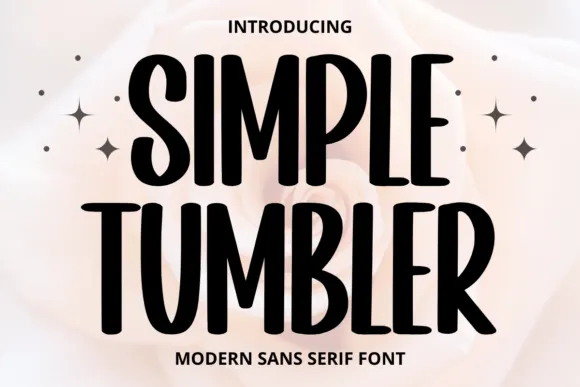
Tall informal sans
Simple Tumbler is a tall informal sans in black over a pale rose photograph: condensed capitals with rounded ends, uneven bowl widths and a slight bounce, with four sparkles at the sides and tracked lines above and beneath.
Ideas for this font
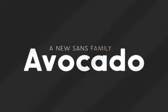
Heavy rounded mixed case with broad circular bowls and softly cut ends
Avocado is a bold geometric sans built on near-circular bowls, set in white on charcoal so the family reads as a clean modern voice rather than a decorative display face.
Ideas for this font
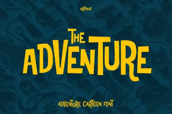
Uneven tall capitals with oversized V and T and a curved R leg
Adventure shows yellow capitals rising and falling across a dark teal field, where tall narrow bodies vary strongly in height, the V grows oversized, the T carries a broad top and the R leg curves below its neighbours.
Ideas for this font
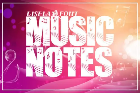
Staff-lined music display
Music Notes is a tall heavy display in white on a warm gradient ground: fat capitals crossed by curved staff-like lines and scattered with note heads, clefs, sharps and flats, with a small line above, a thin frame around the sheet and bokeh circles behind the type.
Ideas for this font
Same independent foundry
Allow optional Google Analytics to measure visits and catalogue actions. Your search words and notes are not included. Privacy & storage