Neutral Sans Workhorse

Graffiti Youth + Cultivo
Lets Graffiti Youth own the focal silhouette while handling secondary copy, sizing and subheads cleanly.
Inspect Cultivo specimenDisclosure: MakerFileHub may earn a commission from qualifying purchases via paid links on this page. How our links work.
Broad graffiti capitals with sharp projecting joins
Graffiti Youth shows dense irregular capitals with angular tips, slanted crossbars and closely fitted side strokes, and the lower word leans and spreads differently from the upper row.
Paid link
Get this fontProject & layout blueprintsAt-a-glance maker compatibility
Sturdy stroke walls and open counters weed cleanly on adhesive vinyl, HTV apparel film, and cut cardstock.
Visual anatomy & craft review
The strokes stay broad, the tips cut into sharp points, the crossbars slant against the uprights and the letters press close enough that neighbours nearly touch. The projecting join is the character: the row reads as tagged lettering rather than a set alphabet, which is why the sample lets the two rows move differently. Because the side strokes fit tightly, keep 34 pt so the joins stay separate, and note that the gradients, black surround and mural behind the title are artwork rather than verified font contents.
Graffiti · Angular · Dense
Two-font hierarchy recipes
Tested contrast partners — pairing Graffiti Youth with grounded secondary typography.
Graffiti Youth + Cultivo
Lets Graffiti Youth own the focal silhouette while handling secondary copy, sizing and subheads cleanly.
Inspect Cultivo specimen
Graffiti Youth + Medvilea Editorial
Grounds bold display lettering with classic typographic authority on posters, badges and apparel.
Inspect Medvilea Editorial specimenPractical applications
Concrete hierarchy, scale and production guidance tailored to Graffiti Youth’s stroke geometry.
The dense caps suit a shop sticker, and the angular joins stay sharp at 30 mm on a shaped die with a dark ground. The angular tips also give a sticker its direction.
Hierarchy & layout recipe
Print a 60 mm sticker: set the word at 30 mm, keep 4 mm of clear vinyl between the letter joins, and keep 6 mm of border so the angled tips are not trimmed. Keep the die shape simple.
Pre-production check
Two projecting joins closer than 3 mm merge into one shape; check the sheet at full size and open the spacing.
The broad lettering scales to a wall, and the sharp tips hold a club name at 200 mm across a painted panel. The broad strokes also hold a wall panel together.
Hierarchy & layout recipe
Paint a 1500 by 900 mm panel: set the name at 200 mm, keep 60 mm of space between the letters so the tips read separately, and keep 80 mm of border for the mask edges. Keep the mask edges clean.
Pre-production check
A sharp tip painted at 40 mm rounds off under a roller; check the mask and keep the letter at 150 mm or above.
The angular capitals give a workbook energy, and the dense row holds a short title at 24 pt on an A5 cover. The dense row also keeps a small cover bold.
Hierarchy & layout recipe
Print an A5 cover: set the title at 24 pt in the upper half, keep 5 mm between the letters, and set the subject line at 10 pt in a plain sans beneath with 8 mm of clear ground.
Pre-production check
A dense masked row printed at 18 pt becomes a dark bar; check the proof and keep the title at 22 pt or above. Keep the subject line plain.
Technical & licence verification
Confirm included OTF/TTF/WOFF formats, full glyph tables and licence coverage on the live store page before batch production.
Closest visual alternatives
Matched across letterform anatomy, stroke behaviour and craft applications.
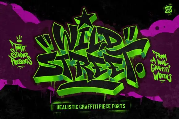
Graffiti piece display
Wild Street is a graffiti piece display in acid green on black and magenta: interlocking letters with a 3D block shadow, heavy outlines, exaggerated arrows and a star at the apex, surrounded by spray marks and a hand-lettered caption, so the plate reads as a wall piece rather than a typeface.
Ideas for this font
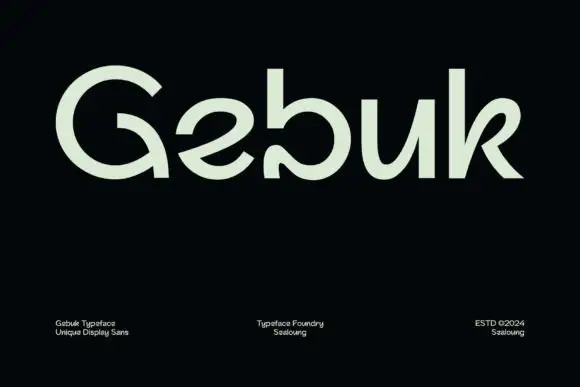
Rounded open forms with a curling G interior and a turned-in b terminal
Gebuk centres pale green lettering on black, where the G carries a large circular outer curve and a hooked interior, the b ends in an inward curl near the baseline, the e opens diagonally and the k uses a curved upper arm beside a straighter leg.
Ideas for this font
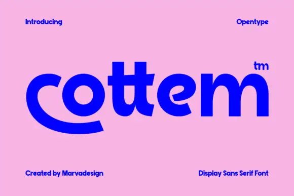
Heavy rounded lowercase with a sweeping c foot and closely joined double-t crossbars
Cottem sets a bold grotesque in lowercase, then lets the c break out of the line and sweep under the whole word as a flat curved tail, which turns a plain sans into a mark.
Ideas for this font
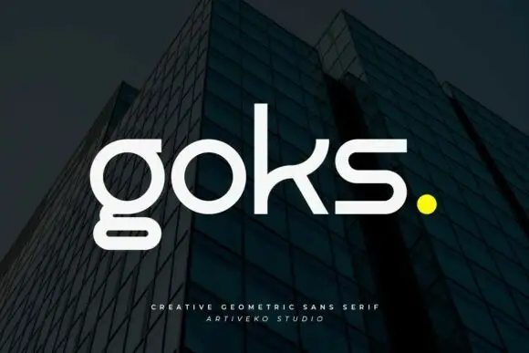
Geometric lowercase with circular o, rectangular lower g loop and curved k arm
Goks is a geometric sans with lowercase forms drawn from circles and straight lines, flat-cut terminals, and a g whose descender drops as a straight stem and stops on a horizontal bar.
Ideas for this font
Same independent foundry
Allow optional Google Analytics to measure visits and catalogue actions. Your search words and notes are not included. Privacy & storage