Neutral Sans Workhorse

Gashroad + Bargain Condensed
Lets Gashroad own the focal silhouette while handling secondary copy, sizing and subheads cleanly.
Inspect Bargain Condensed specimenDisclosure: MakerFileHub may earn a commission from qualifying purchases via paid links on this page. How our links work.
Western slabs with rounded bowls and pointed waist spurs
Gashroad presents a red uppercase title on crumpled cream paper, where rounded bowls and short curved terminals sit beside pointed waist spurs cutting into the stems, the G curls inward and arched captions run above and below.
Paid link
Get this fontProject & layout blueprintsAt-a-glance maker compatibility
Fine grain and micro-texture excel in 300 DPI print, sublimation, and screen print rather than small vinyl weeding.
Visual anatomy & craft review
The bowls stay round, the spurs cut into the waist, the terminals curve and fine pale wear freckles the red fill without hiding the silhouette. That spur is the character: the word reads as an ornate Western plate rather than a plain slab, which is why the sample surrounds it with creased paper and a small script line. The creases and captions are cover design, so inspect the actual alternates and punctuation before building a decorative title, keep 36 pt and leave the surrounding copy quieter than the main word.
Western slabs with rounded bowls and pointed waist spurs
Two-font hierarchy recipes
Tested contrast partners — pairing Gashroad with grounded secondary typography.
Gashroad + Bargain Condensed
Lets Gashroad own the focal silhouette while handling secondary copy, sizing and subheads cleanly.
Inspect Bargain Condensed specimen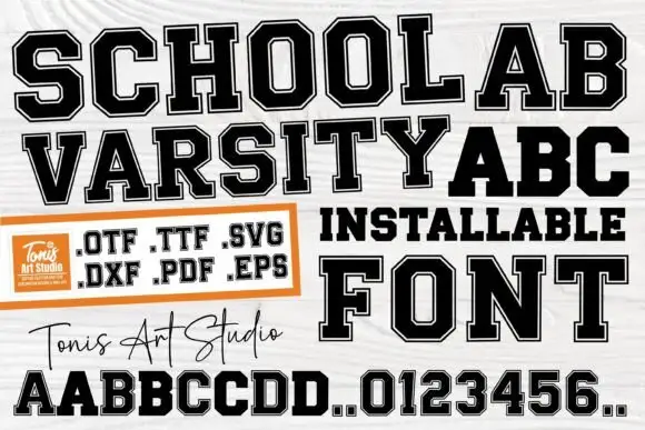
Gashroad + School Varsity
Grounds bold display lettering with classic typographic authority on posters, badges and apparel.
Inspect School Varsity specimenPractical applications
Concrete hierarchy, scale and production guidance tailored to Gashroad’s stroke geometry.
The spurred Western slabs give a bottle character, and the rounded bowls hold a two-word name at 24 pt on a 55 mm panel, where the spurs stay visible.
Hierarchy & layout recipe
Print a 55 by 60 mm label: set the brand at 24 pt on one row, keep 10 mm of clear ground beneath before the strength at 6 pt, and keep 6 mm of border each side.
Pre-production check
Waist spurs printed at 16 pt close into the stem; check the plate proof and hold the brand at 22 pt.
The ornate slabs set a seasonal sign, and the heavy stems read at 56 mm on a painted board, where the curved terminals keep the row warm.
Hierarchy & layout recipe
Paint a 500 by 250 mm board: set the sign at 56 mm on one row, keep the waist spurs at 4 mm minimum, keep 22 mm of border all round, and have the signwriter cut a mask rather than brush the outline.
Pre-production check
Spurs painted with a fine brush blur; check the mask artwork and hold the sign at 48 mm or above.
The Western plate sets a heritage heading, and the rounded bowls hold a two-word title at 46 pt on a page, where the spurs add period detail.
Hierarchy & layout recipe
Print a 210 mm page: set the heading at 46 pt on one row, keep 18 mm beneath before the standfirst at 10 pt, keep the body in a quieter serif, and leave the spurs undecorated.
Pre-production check
An ornate title beside ornate body copy competes; check the page and strip decoration from the text.
Technical & licence verification
Confirm included OTF/TTF/WOFF formats, full glyph tables and licence coverage on the live store page before batch production.
Closest visual alternatives
Matched across letterform anatomy, stroke behaviour and craft applications.
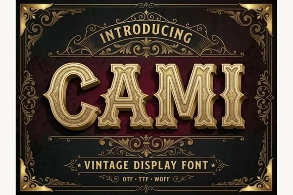
Bevel-grooved 1920s saloon capitals
Cami sculpts wide Victorian-Western capitals with mid-stem spurs and recessed inline grooves, so a three to seven letter name reads as a carved sign over a saloon door or a theatre header.
Ideas for this font
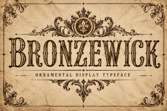
Engraved woodcut western display
Bronzewick pairs tall narrow Old West capitals with fine engraved linework inside every stem, so a single-colour print gains the depth of copperplate or woodblock engraving without a second ink.
Ideas for this font
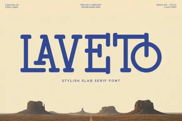
Rounded slab with overlapping bars
Laveto is a rounded slab display in ultramarine on a bleached desert landscape: wide capitals with long overlapping horizontal bars, rounded stroke ends and a final letter drawn as a circular bowl pierced by a stem, with a tracked line beneath and three small credits in the corners.
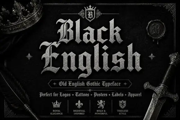
Angular blackletter with diamond-ended strokes and ornate initials
Black English shows pale Gothic mixed case on black, where angular broken bowls, pointed joins and diamond stroke endings give the lowercase a dense rhythm, the large B and E carry extra entry flourishes and a grey hatched treatment adds surface detail to the shown title.
Ideas for this font
Same independent foundry
Allow optional Google Analytics to measure visits and catalogue actions. Your search words and notes are not included. Privacy & storage