Modern Grotesque Body

Frontier Grunge + Modern Heritage
Creates crisp high-hierarchy contrast beneath Frontier Grunge headlines across menus, websites and labels.
Inspect Modern Heritage specimenDisclosure: MakerFileHub may earn a commission from qualifying purchases via paid links on this page. How our links work.
Tall Western slabs with pale edging and chipped fill
Frontier Grunge shows dark brown slab capitals with pale contours on wooden boards, where tall narrow counters and pinched sides sit beside scattered pale chips that create a layered worn surface, and the boards, rope, hat and windmill form the scene around the word.
Paid link
Get this fontProject & layout blueprintsAt-a-glance maker compatibility
Fine grain and micro-texture excel in 300 DPI print, sublimation, and screen print rather than small vinyl weeding.
Visual anatomy & craft review
The stems stay tall, the sides pinch, the pale contour repeats the outline and the chips break the fill in small patches. That layering is the character: the word looks cut from painted timber rather than distressed with a filter, which is why the sample sets it on planks. The contour and shadow may be designed effects, so inspect the supplied style first, keep 40 pt before the pinched sides close and proof the chips at final size. The pale contour is the layer that goes first: it thins out at about 30 pt and the chips read as damage, so keep 40 pt and check which style the file actually ships.
Tall Western slabs with pale edging and chipped fill
Two-font hierarchy recipes
Tested contrast partners — pairing Frontier Grunge with grounded secondary typography.
Frontier Grunge + Modern Heritage
Creates crisp high-hierarchy contrast beneath Frontier Grunge headlines across menus, websites and labels.
Inspect Modern Heritage specimen
Frontier Grunge + Honey
Adds a warm human signature touch for 1-to-3-word callouts without competing against structured serif capitals.
Inspect Honey specimenPractical applications
Concrete hierarchy, scale and production guidance tailored to Frontier Grunge’s stroke geometry.
The Western slabs suit a gate sign, and the tall forms hold a two-word name at 56 mm on a painted board, where the chipped fill reads as weathering.
Hierarchy & layout recipe
Paint a 600 by 300 mm board: set the farm name at 56 mm on one row, keep 22 mm of clear ground beneath before the opening times at 14 pt, and keep 24 mm of border so the pale edging is not lost.
Pre-production check
Painted chips at banner size become noise; check the mask and keep the chipping to the outer edges only.
The worn slabs give a bottle age, and the tall counters hold a two-word name at 22 pt on a 55 by 70 mm label, where the pale contour separates it from a dark ground.
Hierarchy & layout recipe
Print a 55 by 70 mm label: set the name at 22 pt on one row, keep 10 mm of clear ground beneath before the age statement at 6 pt, and keep the label dark so the pale edge reads.
Pre-production check
The pale contour printed at 0.3 mm drops out; check the plate proof and hold the name at 20 pt or above.
The chipped slabs set a period heading, and the pinched sides hold a two-word title at 50 pt on a page, where the pale edge adds a second tonal layer.
Hierarchy & layout recipe
Print a 210 mm page: set the heading at 50 pt on one row, keep 20 mm of clear ground beneath before the standfirst at 10 pt, and keep the body in a plain serif so the worn heading stays singular.
Pre-production check
Two chipped rows on one spread read as damage; check the page and keep the deck in roman type.
Technical & licence verification
Confirm included OTF/TTF/WOFF formats, full glyph tables and licence coverage on the live store page before batch production.
Closest visual alternatives
Matched across letterform anatomy, stroke behaviour and craft applications.
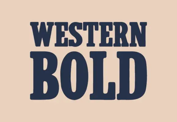
Heavy western slab
Western Bold is a heavy slab shown in navy on a warm sand ground: two lines of capitals with broad rounded brackets, narrow vertical counters in the O, blunt serifs and a heavy even stroke, with no ornament on the sheet at all.
Ideas for this font
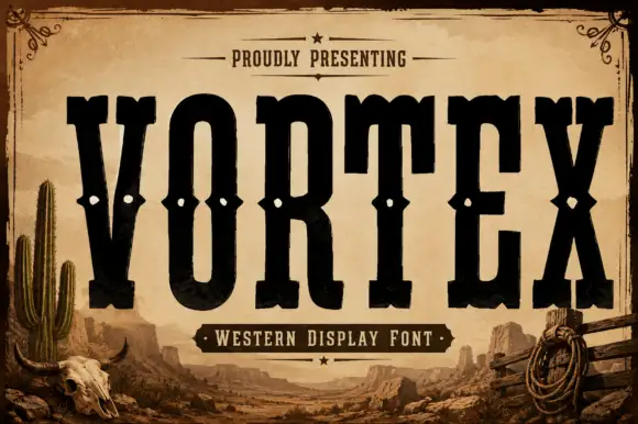
Tall western slab
Vortex is a very tall western slab in black on a sepia desert scene: narrow caps with heavy square slabs, spurs at the joins, and a row of small diamond cut-outs across the waist of each letter, with a small line above in a rule frame and a banner beneath naming the style.
Ideas for this font
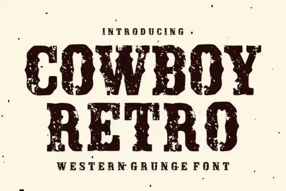
Western capitals with pinched sides and large broken ink patches
Cowboy Retro uses dark Western slabs with inward notches at mid-height, where broad pale chips break the heavy fill around the C and O and the word edges turn visibly irregular.
Ideas for this font
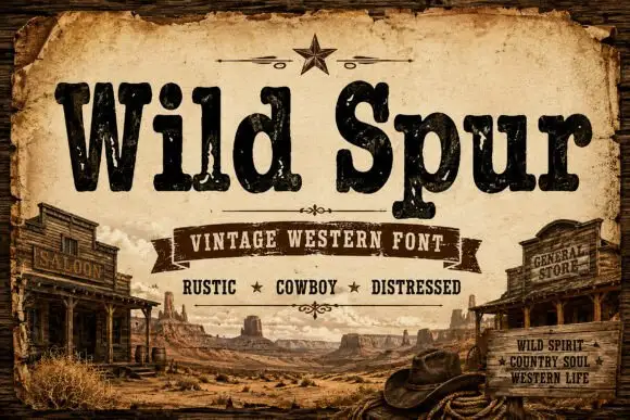
Rustic chipped western slab
Wild Spur is a heavy rustic slab in near-black and brown on an aged board: mixed case with uneven chipped fill, blunt serifs and a warm weight, set in two lines above a banner line, with drawn saloon and storefronts at the sides and a desert scene along the foot.
Same independent foundry
Allow optional Google Analytics to measure visits and catalogue actions. Your search words and notes are not included. Privacy & storage