Modern Grotesque Body

Vortex + Swaraga
Creates crisp high-hierarchy contrast beneath Vortex headlines across menus, websites and labels.
Inspect Swaraga specimenDisclosure: MakerFileHub may earn a commission from qualifying purchases via paid links on this page. How our links work.
Tall western slab
Vortex is a very tall western slab in black on a sepia desert scene: narrow caps with heavy square slabs, spurs at the joins, and a row of small diamond cut-outs across the waist of each letter, with a small line above in a rule frame and a banner beneath naming the style.
Paid link
Get this fontProject & layout blueprintsAt-a-glance maker compatibility
Sturdy stroke walls and open counters weed cleanly on adhesive vinyl, HTV apparel film, and cut cardstock.
Visual anatomy & craft review
The word spans the plate and the drawing is a western slab: the letters are very tall, the slabs are heavy and square, and the joins carry spurs, which is what makes the style read as a frontier sign rather than as a modern slab. The row of diamond cut-outs across the waist is the detail that separates this cut from a generic western, and the specimen sets the letters large enough that the diamonds read as shapes. The desert scene, the skull and the rope are staging, and the rule frame above with the banner beneath supplies the period card layout. Because the letters are narrow and tall, the face needs a large size for legibility, and the plate sets one word that fills the width.
Slab, western, tall, vintage
Two-font hierarchy recipes
Tested contrast partners — pairing Vortex with grounded secondary typography.
Vortex + Swaraga
Creates crisp high-hierarchy contrast beneath Vortex headlines across menus, websites and labels.
Inspect Swaraga specimen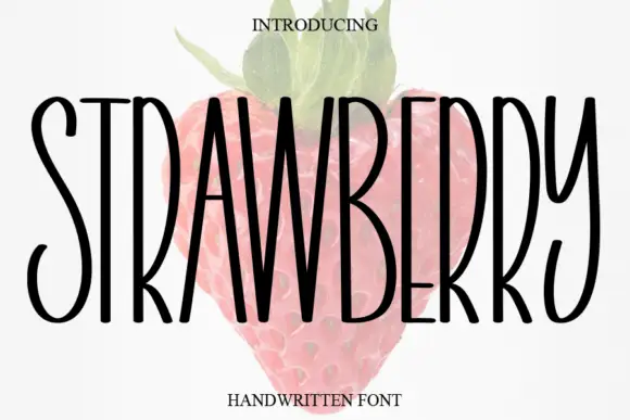
Vortex + Strawberry
Adds a warm human signature touch for 1-to-3-word callouts without competing against structured serif capitals.
Inspect Strawberry specimenPractical applications
Concrete hierarchy, scale and production guidance tailored to Vortex’s stroke geometry.
A western slab reads as a painted sign, and the narrow letters fit a long name on a fascia where a wide slab would have to shrink.
Hierarchy & layout recipe
Paint a 1,200 by 400 mm fascia: the smokehouse at 120 mm cap height, the hours in a 24 mm slab, and a 5 mm rule. Keep 28 mm margins and paint two colours on a dark board.
Pre-production check
Check the fascia at six metres, where the diamond cut-outs can read as damage; keep them above 8 mm. Confirm the 24 mm hours read at three metres and that the rule clears the fixings.
A western slab sets a fair poster as a period bill, and the tall letters fill the width with one line instead of stacking two.
Hierarchy & layout recipe
A2 poster: the fair at 100 mm cap height, the dates in a 24 mm slab, and the venue at 11 mm. Keep 28 mm margins and print one colour on an aged stock with a rule frame.
Pre-production check
Check the poster at five metres, where the spurs can clot the joins; open the spacing. Confirm the 11 mm venue reads at three metres and that the frame clears the trim.
A western slab gives a themed party an authentic board, and the diamond cut-outs add detail without needing a second graphic element.
Hierarchy & layout recipe
A1 board: the greeting at 90 mm cap height, the names at 45 mm, and the date at 20 mm. Keep 35 mm margins and paint one colour on a stained board with a rope border.
Pre-production check
Check the board at five metres, where the diamonds can disappear in the grain; keep them above 6 mm. Confirm the 20 mm date reads from the door and that the rope border is level.
Technical & licence verification
Confirm included OTF/TTF/WOFF formats, full glyph tables and licence coverage on the live store page before batch production.
Closest visual alternatives
Matched across letterform anatomy, stroke behaviour and craft applications.
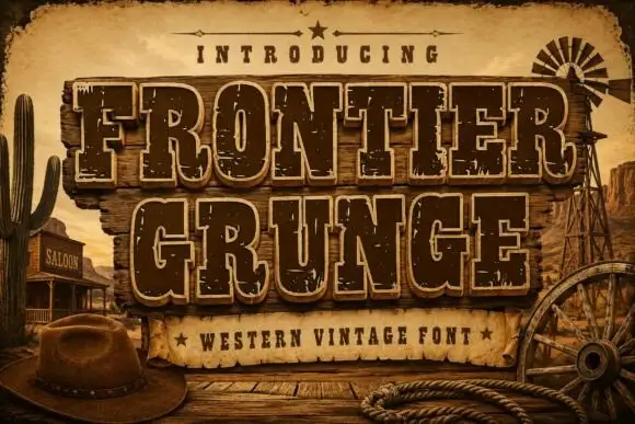
Tall Western slabs with pale edging and chipped fill
Frontier Grunge shows dark brown slab capitals with pale contours on wooden boards, where tall narrow counters and pinched sides sit beside scattered pale chips that create a layered worn surface, and the boards, rope, hat and windmill form the scene around the word.
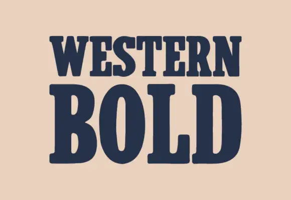
Heavy western slab
Western Bold is a heavy slab shown in navy on a warm sand ground: two lines of capitals with broad rounded brackets, narrow vertical counters in the O, blunt serifs and a heavy even stroke, with no ornament on the sheet at all.
Ideas for this font
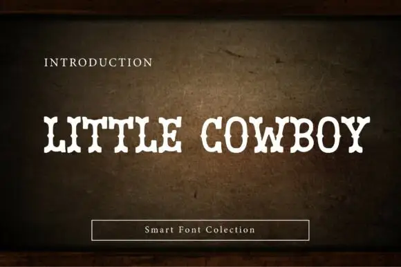
Soft narrow western slab
Little Cowboy is a soft narrow western slab in cream on a worn leather ground: capitals with bifurcated slab ends, waist spurs and slight swelling at the joins, set as one line with a small plain line above and a boxed label beneath.
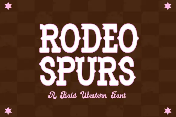
Western slab with mid-stroke spurs
Rodeo Spurs is a tall rounded western slab in pale pink on a dark brown check: heavy caps with pointed spurs standing out from the mid-stroke, round bowls and a strong vertical stress, with a script line beneath in the same tone and four stars set in the corners.
Ideas for this font
Same independent foundry
Allow optional Google Analytics to measure visits and catalogue actions. Your search words and notes are not included. Privacy & storage