Modern Grotesque Body

Wild Spur + Furion
Creates crisp high-hierarchy contrast beneath Wild Spur headlines across menus, websites and labels.
Inspect Furion specimenDisclosure: MakerFileHub may earn a commission from qualifying purchases via paid links on this page. How our links work.
Rustic chipped western slab
Wild Spur is a heavy rustic slab in near-black and brown on an aged board: mixed case with uneven chipped fill, blunt serifs and a warm weight, set in two lines above a banner line, with drawn saloon and storefronts at the sides and a desert scene along the foot.
Paid link
Get this fontProject & layout blueprintsAt-a-glance maker compatibility
Fine grain and micro-texture excel in 300 DPI print, sublimation, and screen print rather than small vinyl weeding.
Visual anatomy & craft review
The plate is a printed western board, and the framing illustration is the world the type belongs to: a saloon on the left, a general store on the right, a desert and a hat along the foot. The drawing is a heavy slab with a chipped fill, so the letters read as stamped on weathered wood, and the chips set a large size floor because they close into a tone when the letters shrink. The banner line beneath is done in the same face at a smaller size, which shows where the texture stops working. Because the letters are heavy and rustic, the face suits a package, a sign and a shirt, and it is best at a size where the chips read as damage rather than as noise.
Slab, western, rustic, textured
Two-font hierarchy recipes
Tested contrast partners — pairing Wild Spur with grounded secondary typography.
Wild Spur + Furion
Creates crisp high-hierarchy contrast beneath Wild Spur headlines across menus, websites and labels.
Inspect Furion specimen
Wild Spur + Handmade Calligraphy
Adds a warm human signature touch for 1-to-3-word callouts without competing against structured serif capitals.
Inspect Handmade Calligraphy specimenPractical applications
Concrete hierarchy, scale and production guidance tailored to Wild Spur’s stroke geometry.
A rustic slab reads as a painted board, and the chipped weight holds at the end of a drive where a clean face would look new.
Hierarchy & layout recipe
Paint a 1,000 by 380 mm board: the stand at 120 mm cap height, the hours in a 26 mm slab, and two colours on a primed board. Keep 26 mm margins and keep the chips above 4 mm.
Pre-production check
Check the board at 120 mm, where a chip can fill with paint; keep it above 4 mm. Confirm the 26 mm hours read at three metres and that the paint survives the weather.
A rustic label reads as a small batch product, and the heavy slabs hold a flavour name on a small die. It reads as a small batch jar.
Hierarchy & layout recipe
Print a 45 by 80 mm label: the brand at 12 pt, the flavour at 8 pt, and two colours on a kraft stock. Keep 4 mm inside the die and simplify the chips below 16 pt.
Pre-production check
Check the 12 pt brand on kraft, where the chips become noise; use the clean cut there. Confirm the 8 pt flavour reads at arm's length and that the label wipes clean.
A rustic slab prints as staff kit, and the heavy weight reads on a light shirt where a thin face would look weak. It reads as staff kit.
Hierarchy & layout recipe
Print a 260 mm chest graphic: the bar at 60 mm cap height, the year at 26 mm, and two inks on a light shirt. Keep the smallest chip at 3 mm and place the graphic 80 mm below the collar.
Pre-production check
Check the screen at actual mesh, where a 3 mm chip can fill; enlarge it. Wash-test one shirt and confirm the texture stays open after five cycles.
Technical & licence verification
Confirm included OTF/TTF/WOFF formats, full glyph tables and licence coverage on the live store page before batch production.
Closest visual alternatives
Matched across letterform anatomy, stroke behaviour and craft applications.
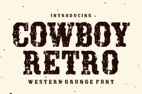
Western capitals with pinched sides and large broken ink patches
Cowboy Retro uses dark Western slabs with inward notches at mid-height, where broad pale chips break the heavy fill around the C and O and the word edges turn visibly irregular.
Ideas for this font
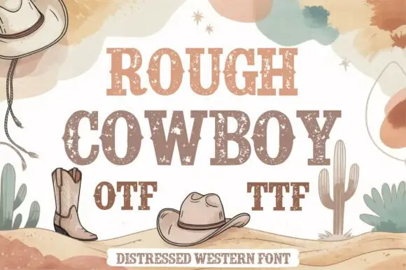
Distressed western slab in two tones
Rough Cowboy is a distressed western slab in brown and beige on cream: heavy capitals with thick flat serifs and a worn texture, printed in two tones so each letter reads as a stencil, with boots, hats, cacti and watercolour clouds around them.
Ideas for this font
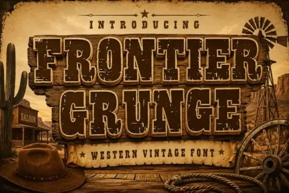
Tall Western slabs with pale edging and chipped fill
Frontier Grunge shows dark brown slab capitals with pale contours on wooden boards, where tall narrow counters and pinched sides sit beside scattered pale chips that create a layered worn surface, and the boards, rope, hat and windmill form the scene around the word.
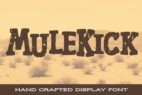
Rustic chipped slab display
Mulekick is a rustic slab display in dark brown on a bleached desert photograph: uneven mixed-height letters with thick square serifs, chipped edges and sparse pale spots, set across the middle of the sheet with a plain caption bar at the foot.
Same independent foundry
Allow optional Google Analytics to measure visits and catalogue actions. Your search words and notes are not included. Privacy & storage



