Modern Grotesque Body

Western Bold + Hermano
Creates crisp high-hierarchy contrast beneath Western Bold headlines across menus, websites and labels.
Inspect Hermano specimenDisclosure: MakerFileHub may earn a commission from qualifying purchases via paid links on this page. How our links work.
Heavy western slab
Western Bold is a heavy slab shown in navy on a warm sand ground: two lines of capitals with broad rounded brackets, narrow vertical counters in the O, blunt serifs and a heavy even stroke, with no ornament on the sheet at all.
Paid link
Get this fontProject & layout blueprintsAt-a-glance maker compatibility
Sturdy stroke walls and open counters weed cleanly on adhesive vinyl, HTV apparel film, and cut cardstock.
Visual anatomy & craft review
The plate is unusually plain, and that is useful: two words, two weights of the same face, no background, no frame and no copy, so the letterforms are the only thing to look at. The drawing is a heavy western slab with rounded brackets and narrow vertical O counters, so the face reads as a printed placard rather than as an engraved label, and the plain setting makes the bracket and the counter shape clear. That construction sets a moderate size floor, because the vertical counters close first, and the absence of any small-size sample means a print test at the intended size is worth doing. It suits a poster, a sign and a package where a heavy slab is the whole voice.
Slab, western, heavy, plain
Two-font hierarchy recipes
Tested contrast partners — pairing Western Bold with grounded secondary typography.
Western Bold + Hermano
Creates crisp high-hierarchy contrast beneath Western Bold headlines across menus, websites and labels.
Inspect Hermano specimen
Western Bold + Autography
Adds a warm human signature touch for 1-to-3-word callouts without competing against structured serif capitals.
Inspect Autography specimenPractical applications
Concrete hierarchy, scale and production guidance tailored to Western Bold’s stroke geometry.
A heavy western slab reads as a painted fairground sign, and the plain construction holds at distance where a decorated face would blur.
Hierarchy & layout recipe
Paint a 1,100 by 400 mm board: the fair at 120 mm cap height, the dates in a 26 mm slab, and two colours on a primed board. Keep 28 mm margins and keep the counters above 6 mm.
Pre-production check
Check the board at 120 mm, where a vertical counter can close; keep it above 6 mm. Confirm the 26 mm dates read at three metres and that the paint survives the weather.
A heavy slab reads as a long-established roaster, and the narrow counters hold a blend name on a small die. It reads as an established roaster.
Hierarchy & layout recipe
Print a 60 by 90 mm label: the roaster at 13 pt, the blend at 8 pt, and the weight at 7 pt. Keep 5 mm inside the die and keep the brackets above 0.4 mm on the curve.
Pre-production check
Check the 13 pt roaster on a curved bag, where a bracket can fill; keep it above 0.4 mm. Confirm the 7 pt weight reads on the shelf and that the label holds on a folded bag.
A heavy slab gives a regional annual a plain, confident title, and the narrow counters hold at thumbnail size. It holds at thumbnail size.
Hierarchy & layout recipe
Set the title at 95 mm cap height across 195 mm, the subtitle in a 9 pt slab, and the year at 7 pt. Print two colours on a matte stock and keep 22 mm margins at the head.
Pre-production check
Check the title at 95 mm, where a counter can fill; keep it above 4 mm. Confirm the 7 pt year survives lamination and that the title clears the trim at both ends.
Technical & licence verification
Confirm included OTF/TTF/WOFF formats, full glyph tables and licence coverage on the live store page before batch production.
Closest visual alternatives
Matched across letterform anatomy, stroke behaviour and craft applications.
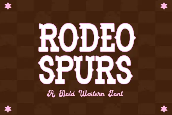
Western slab with mid-stroke spurs
Rodeo Spurs is a tall rounded western slab in pale pink on a dark brown check: heavy caps with pointed spurs standing out from the mid-stroke, round bowls and a strong vertical stress, with a script line beneath in the same tone and four stars set in the corners.
Ideas for this font
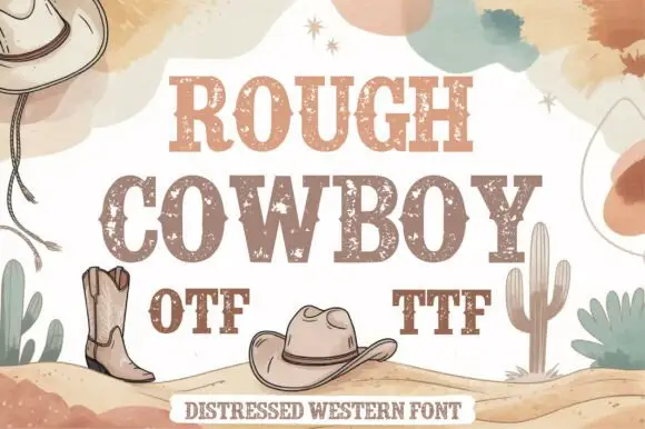
Distressed western slab in two tones
Rough Cowboy is a distressed western slab in brown and beige on cream: heavy capitals with thick flat serifs and a worn texture, printed in two tones so each letter reads as a stencil, with boots, hats, cacti and watercolour clouds around them.
Ideas for this font
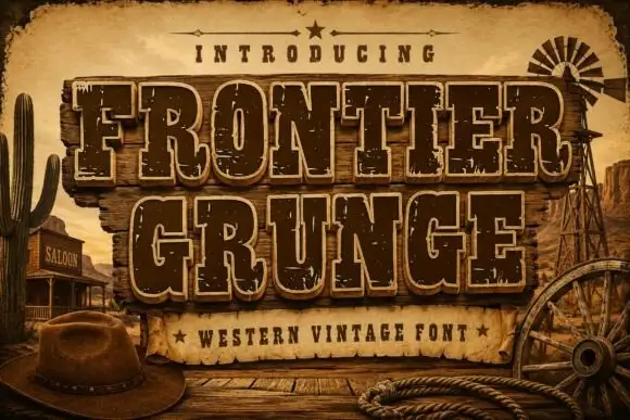
Tall Western slabs with pale edging and chipped fill
Frontier Grunge shows dark brown slab capitals with pale contours on wooden boards, where tall narrow counters and pinched sides sit beside scattered pale chips that create a layered worn surface, and the boards, rope, hat and windmill form the scene around the word.
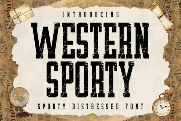
Very condensed distressed slab
Western Sporty is a very condensed square slab in black on a torn paper sheet: tall caps with heavy square slabs, scratched irregular fill and rough edges, set on two lines with a tracked line above and a caption beneath, over a ground of aged newspaper and travel props.
Same independent foundry
Allow optional Google Analytics to measure visits and catalogue actions. Your search words and notes are not included. Privacy & storage