Editorial Serif Anchor

Friday Goodness + Cervelique
Anchors Friday Goodness's fluid strokes with crisp Roman proportions on wedding suites, headers and packaging.
Inspect Cervelique specimenDisclosure: MakerFileHub may earn a commission from qualifying purchases via paid links on this page. How our links work.
Soft rounded mixed case with broad circular bowls and a compact curling y tail
Friday Goodness stacks black mixed case on white, where rounded substantial strokes form a broad G and circular o bowls, the r shoulder stays short, the i dot is small and round and the y descends into a short curved tail.
Paid link
Get this fontProject & layout blueprintsAt-a-glance maker compatibility
Weld or Unite overlapping script joins into one continuous vector path before sending to the blade.
Visual anatomy & craft review
The strokes stay thick and evenly weighted, the bowls close as near circles, the shoulders shorten and the repeated s letters differ slightly from one another. That soft roundness is the character: the writing looks quick and personal rather than drawn, which is why the sample keeps a short stacked name with space around it. The smiling circles below belong to the artwork, and a display sample says nothing about long text, so test the actual punctuation and repeated letters before using it for a message.
Soft · Circular bowls · Compact tail
Two-font hierarchy recipes
Tested contrast partners — pairing Friday Goodness with grounded secondary typography.
Friday Goodness + Cervelique
Anchors Friday Goodness's fluid strokes with crisp Roman proportions on wedding suites, headers and packaging.
Inspect Cervelique specimen
Friday Goodness + Clyne Sans
Keeps small-scale dates, URLs, nutrition facts and care instructions crisp and legible below script titles.
Inspect Clyne Sans specimenPractical applications
Concrete hierarchy, scale and production guidance tailored to Friday Goodness’s stroke geometry.
The soft rounded hand gives a home bakery warmth, and the circular bowls hold a two-word name at 26 pt on a 60 mm panel.
Hierarchy & layout recipe
Print a 60 by 45 mm label: set the bakery name at 26 pt on two short rows, keep 10 mm of clear ground beneath for the y tail, and set the flavour at 7 pt in a plain sans at the foot.
Pre-production check
Repeated letters differ in shape at 18 pt and look like a mistake; check the label and keep the name at 24 pt or above.
The friendly handwriting suits a classroom label, and the broad bowls keep a first name clear at 22 pt on a 70 mm sticker.
Hierarchy & layout recipe
Print a 70 by 25 mm label: set the name at 22 pt on one row, keep 6 mm of clear vinyl at each end, and keep 4 mm inside the die so the curling tail is not trimmed.
Pre-production check
A descending tail cut by the die looks like a fault; check the artwork and keep 6 mm of clear space below the row.
The rounded hand keeps a note informal, and the thick strokes stay legible at 28 pt on an A6 card left half blank, so the printed line invites a written reply.
Hierarchy & layout recipe
Print an A6 card: set the thank-you line at 28 pt across the upper third, keep 14 mm of clear ground beneath for the tail, and leave the lower half free for a message written by hand.
Pre-production check
A display hand set as a paragraph at 16 pt loses its rhythm; check the card and keep the script for the heading only.
Technical & licence verification
Confirm included OTF/TTF/WOFF formats, full glyph tables and licence coverage on the live store page before batch production.
Closest visual alternatives
Matched across letterform anatomy, stroke behaviour and craft applications.
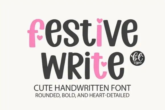
Heavy rounded letters with heart accents and uneven heights
Festive Write is heavy rounded lettering in which some letters carry a small heart instead of a bowl, and the heights vary a little so a phrase reads as playful rather than ruled.
Ideas for this font
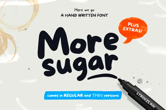
Heavy marker script
More Sugar is a heavy marker script in near-black on an off-white ground: fat rounded letters with uneven bowls and bulbous terminals, a long swooping g tail and a bounce on the baseline, set in two lines beside a marker pen, a speech bubble and a small banner beneath.
Ideas for this font
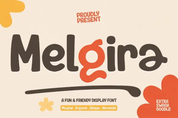
Heavy rounded display sans with a swash accent
Melgira draws a wide black rounded alphabet and then breaks its own rhythm with a lower-case pair whose descender swells into a long sweeping underline beneath the word.
Ideas for this font
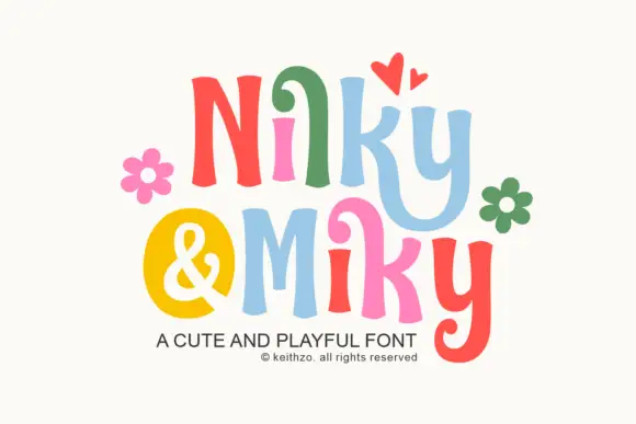
Bouncy curled display print
Nilky and Miky shows separate letters in six colours, each one flared at the ends and slightly tilted, with a curled inner stroke on the k and a deep hook on the y, while a yellow disc holds the ampersand between the two words and flowers and hearts sit around the row.
Ideas for this font
Same independent foundry
Allow optional Google Analytics to measure visits and catalogue actions. Your search words and notes are not included. Privacy & storage