Editorial Serif Anchor

Melgira + Aureline
Anchors Melgira's fluid strokes with crisp Roman proportions on wedding suites, headers and packaging.
Inspect Aureline specimenDisclosure: MakerFileHub may earn a commission from qualifying purchases via paid links on this page. How our links work.
Heavy rounded display sans with a swash accent
Melgira draws a wide black rounded alphabet and then breaks its own rhythm with a lower-case pair whose descender swells into a long sweeping underline beneath the word.
Paid link
Get this fontProject & layout blueprintsAt-a-glance maker compatibility
Weld or Unite overlapping script joins into one continuous vector path before sending to the blade.
Visual anatomy & craft review
In the cream specimen the two capital groups sit heavy and tightly spaced, with small rounded spurs at the M apex and even stem widths throughout. The middle letters are replaced by a much larger orange lower-case pair whose descender accelerates right and curls back under the word as a long underline, which is what makes the sample read as custom lettering. The single-storey a keeps a filled bowl and a short spur, and the g closes into a thick hook rather than an open tail. The card also announces a doodle set: those extra shapes are separate files, so the alphabet itself remains a straight, separable display face.
Chunky · Friendly · Doodled
Two-font hierarchy recipes
Tested contrast partners — pairing Melgira with grounded secondary typography.
Melgira + Aureline
Anchors Melgira's fluid strokes with crisp Roman proportions on wedding suites, headers and packaging.
Inspect Aureline specimen
Melgira + Memoir Slang
Keeps small-scale dates, URLs, nutrition facts and care instructions crisp and legible below script titles.
Inspect Memoir Slang specimenPractical applications
Concrete hierarchy, scale and production guidance tailored to Melgira’s stroke geometry.
The heavy rounded capitals survive cheap corrugated printing, and the swash pair gives the carton a hand-made signature without a second font.
Hierarchy & layout recipe
Set the capitals at 60 pt on the front panel, then add the swash pair at 90 pt so its curl underlines the name, keeping 15 mm clear below for the contents list.
Pre-production check
Check the bowl of the a and the hook of the g at print size; both are the first shapes to fill in on uncoated board.
Chunky letterforms stay readable from the back of a room, which matters when the same artwork is also printed as a wall card.
Hierarchy & layout recipe
Keep four words maximum at 24 pt, set the line on one flat baseline rather than the swash treatment, and put the instruction text in a plain sans beneath.
Pre-production check
Test the M and W widths against your page margin before adding the doodle extras, because the alphabet alone is already wide.
The rounded mass reads at a glance from standing distance while the swash gives a themed craft table a decorative break between two practical words on the sign.
Hierarchy & layout recipe
Place the headline at 1.2-inch cap height on a landscape A5, run the underline swash in a second colour, and keep the activity instructions at 12 pt beneath it.
Pre-production check
If you print the swash in a second colour, register it separately, because it will not align as one flattened layer.
Technical & licence verification
Confirm included OTF/TTF/WOFF formats, full glyph tables and licence coverage on the live store page before batch production.
Closest visual alternatives
Matched across letterform anatomy, stroke behaviour and craft applications.
Bouncy curled display print
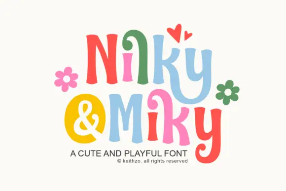
Nilky and Miky shows separate letters in six colours, each one flared at the ends and slightly tilted, with a curled inner stroke on the k and a deep hook on the y, while a yellow disc holds the ampersand between the two words and flowers and hearts sit around the row.
Ideas for this font
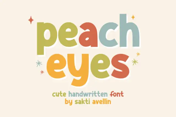
Heavy soft separate lowercase
Peach Eyes is a soft handwritten display in lowercase with fat rounded strokes and a different pastel colour on each letter, shown with drawn sparkles on a cream ground.
Ideas for this font
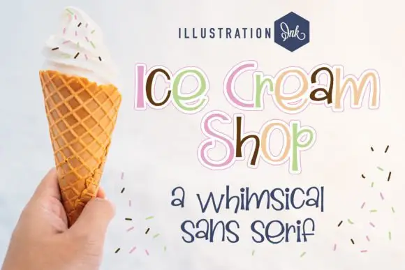
Whimsical separate rounded letters with a fine outline and uneven baseline
Ice Cream Shop is a whimsical sans-style lettering set in which the letters stand apart, the outlines stay fine and the baseline drifts slightly, so a phrase reads as something drawn on a menu board.
Ideas for this font
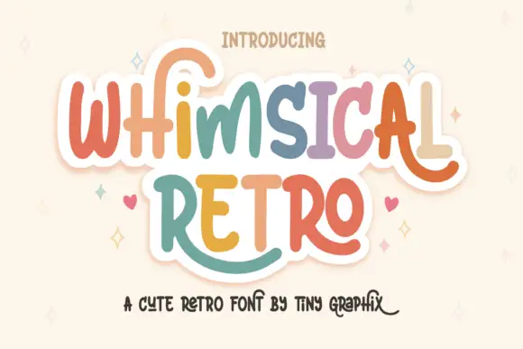
Rounded upright letters with long curled terminals
Whimsical Retro mixes soft upright letterforms with unusually long curled terminals, set over a pastel layered fill inside a thin outline on a warm paper ground.
Ideas for this font
Same independent foundry
Allow optional Google Analytics to measure visits and catalogue actions. Your search words and notes are not included. Privacy & storage