Modern Grotesque Body

Christmas Cheer Retro + Lemon Milk Pro FTR
Creates crisp high-hierarchy contrast beneath Christmas Cheer Retro headlines across menus, websites and labels.
Inspect Lemon Milk Pro FTR specimenDisclosure: MakerFileHub may earn a commission from qualifying purchases via paid links on this page. How our links work.
Cozy 1970s retro-groovy mixed-case holiday & everyday serif
Christmas Cheer Retro is a charming, chubby retro serif by Miss Tiina with soft rounded brackets and playful mixed-case bounce (zero holiday clipart attached!).
Paid link
Get this fontProject & layout blueprintsAt-a-glance maker compatibility
Sturdy stroke walls and open counters weed cleanly on adhesive vinyl, HTV apparel film, and cut cardstock.
Visual anatomy & craft review
Christmas Cheer Retro is a chubby 1970s retro serif with soft rounded brackets, tilted counters and a bouncy mixed-case rhythm, so a line reads as a hand-lettered shop sign from a decade rather than a festive cliché. The brackets are thick and the counters generous, which keeps it friendly at small sizes, and the bounce means a short word looks designed and a long one needs tracking. It needs roughly 22 mm for the rounded brackets to read, and it is best in mint or coral on midnight navy, or a warm ink on cream.
Mid-century-cozy · Soft-serif · Pastel-holiday
Two-font hierarchy recipes
Tested contrast partners — pairing Christmas Cheer Retro with grounded secondary typography.
Christmas Cheer Retro + Lemon Milk Pro FTR
Creates crisp high-hierarchy contrast beneath Christmas Cheer Retro headlines across menus, websites and labels.
Inspect Lemon Milk Pro FTR specimen
Christmas Cheer Retro + Hello Honey
Adds a warm human signature touch for 1-to-3-word callouts without competing against structured serif capitals.
Inspect Hello Honey specimenPractical applications
Concrete hierarchy, scale and production guidance tailored to Christmas Cheer Retro’s stroke geometry.
Soft retro brackets read as a shop that has sold the same Christmas stock for years, which is what a family business wants on a card. The mixed-case bounce softens the seasonal message without a script, and the face carries a long greeting at 12 pt on a 105 mm tag.
Hierarchy & layout recipe
Card 105 x 148 mm, greeting 22 mm, message 8/11 pt, 12 mm margins. Tag 50 x 90 mm, name 10 mm with a 5 mm hole and 6 mm clear card. Sign 600 x 400 mm, word 120 mm, 40 mm margins and 20 mm frame clearance.
Pre-production check
A tag word at 10 mm loses the tilted counter on the e and the greeting reads as a plain serif. Keep tags at 12 mm, and check one printed tag on the actual card stock before the batch.
A retro serif with rounded brackets reads as a neighbourhood bakery rather than a supermarket line, which is what a small shop prints on a box. The chubby forms hold one ink on kraft at 40 mm, and the bounce gives a short product name a period charm without a second face.
Hierarchy & layout recipe
Carton 200 x 150 x 80 mm, word 44 mm on the lid, 25 mm margins. Label 70 x 45 mm, name 12 mm, 4 mm die margin. Board 900 x 600 mm, header 80 mm, rows 22 mm on a 32 mm pitch.
Pre-production check
A kraft carton absorbs a mint fill unevenly and the rounded brackets go patchy under a shop light. Add a white underlay or print the name on a coated label, and check one assembled box before the run.
Retro softness reads as a warm winter café rather than a Christmas campaign, which lets a shop keep selling in the quiet weeks of January. The generous counters stay legible on a menu at 10 pt, and the bounce keeps a sale headline from looking corporate.
Hierarchy & layout recipe
Poster A3, word 200 mm, details 20/26 pt, 25 mm margins and 15 mm trim. Menu 210 x 297 mm, sections 20 mm, items 9/12 pt, 15 mm margins. Sleeve 180 x 60 mm, word 18 mm, 5 mm die margin.
Pre-production check
A cup sleeve follows a taper and a bouncing baseline tilts visibly at the seam. Keep the word inside the flat 120 mm centre band, and check one sleeved cup before the counter opens.
Technical & licence verification
Confirm included OTF/TTF/WOFF formats, full glyph tables and licence coverage on the live store page before batch production.
Closest visual alternatives
Matched across letterform anatomy, stroke behaviour and craft applications.
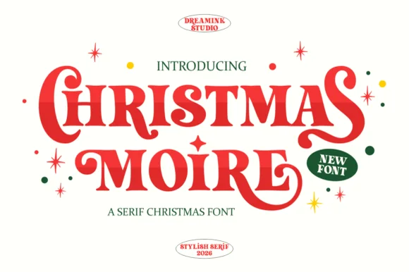
Bold retro teardrop-swashed holiday display serif
Christmas Moire is actually an exuberant, bold retro display serif (NOT a handwritten script!) curling plump teardrop swashes onto 'C', 'S', 'M', and 'R'!
Ideas for this font
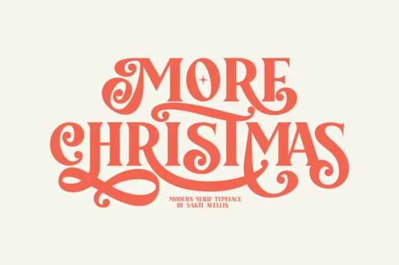
Lavish interlocking swash-ligature retro display serif
More Christmas is a showstopping modern-retro display serif weaving lavish, ribbon-smooth swash curls and custom ligatures across stacked titles!
Ideas for this font
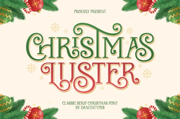
Ornamental ribbon-swashed vintage Christmas display serif
Christmas Luster is actually a lush, swash-curled classic display serif (NOT a connected script!) weaving storybook loops through red-and-green capitals!
Ideas for this font
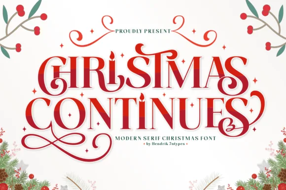
Ornamental holiday display serif with candle-flame i & spiral curls
Christmas Continues is a whimsical holiday display serif (not a cursive script) featuring curled spiral hooks, ligatures, and a candle-flame 'I'.
Ideas for this font
Same independent foundry
Allow optional Google Analytics to measure visits and catalogue actions. Your search words and notes are not included. Privacy & storage