Editorial Serif Anchor

Festive Write + Worldstar
Anchors Festive Write's fluid strokes with crisp Roman proportions on wedding suites, headers and packaging.
Inspect Worldstar specimenDisclosure: MakerFileHub may earn a commission from qualifying purchases via paid links on this page. How our links work.
Heavy rounded letters with heart accents and uneven heights
Festive Write is heavy rounded lettering in which some letters carry a small heart instead of a bowl, and the heights vary a little so a phrase reads as playful rather than ruled.
Paid link
Get this fontProject & layout blueprintsAt-a-glance maker compatibility
Weld or Unite overlapping script joins into one continuous vector path before sending to the blade.
Visual anatomy & craft review
The letters are built from thick rounded strokes: the f carries a long curved top and a heart worked into the loop, the e closes a heavy bowl, the s reverses through two fat curves and the w and the r keep thick even stems. The distinguishing habit is the heart: in the sample several letters replace a counter or a dot with a small solid heart, which is what gives the phrase its festive, greetings-card tone. Weight is heavy and uniform, the terminals are fully rounded, and the letters stand at slightly different heights, so the line bounces without ever losing its baseline. Counters stay open because the hearts are small. Two inks are used in the sample but the letterforms carry the tone alone. The cream ground and the two caption lines beneath are presentation; the lettering is the two words.
Rounded · Heavy · Hearted
Two-font hierarchy recipes
Tested contrast partners — pairing Festive Write with grounded secondary typography.
Festive Write + Worldstar
Anchors Festive Write's fluid strokes with crisp Roman proportions on wedding suites, headers and packaging.
Inspect Worldstar specimen
Festive Write + Godthem
Keeps small-scale dates, URLs, nutrition facts and care instructions crisp and legible below script titles.
Inspect Godthem specimenPractical applications
Concrete hierarchy, scale and production guidance tailored to Festive Write’s stroke geometry.
The heart details carry the warm tone without a printed symbol, and the heavy rounded weight reads at a small size where a fine script would fade.
Hierarchy & layout recipe
Set the greeting at 28 pt on a 105 by 148 mm card, keep the age and date in a 9 pt sans, and hold 14 mm below the lettering so the varied heights have air.
Pre-production check
A heart under 3 mm at 28 pt can fill in; check the proof at final size and open the heart rather than enlarging the whole line.
The rounded heavy lettering suits a wrapping service and the hearts read even on a small die-cut sticker, which is where most wrapping is signed.
Hierarchy & layout recipe
Set the phrase at 12 pt on a 45 mm round sticker, keep the service name in a 5 pt sans beneath, and leave 4 mm inside the die so the hearts are not clipped.
Pre-production check
Hearts close to a die edge get cut; check the artwork against the die and move the phrase inward before approving the sheet.
The bouncy heavy letters fill a banner at a modest height and read across a room, which is what a party table backdrop needs.
Hierarchy & layout recipe
Set the greeting at 75 mm on a 1.2 m paper banner, keep the name at 50 mm beneath it, and leave 30 mm at each end so the rounded ends stay inside the edge.
Pre-production check
Paper banners sag between supports; check the hanging before the event and add a second support rather than shortening the line.
Technical & licence verification
Confirm included OTF/TTF/WOFF formats, full glyph tables and licence coverage on the live store page before batch production.
Closest visual alternatives
Matched across letterform anatomy, stroke behaviour and craft applications.
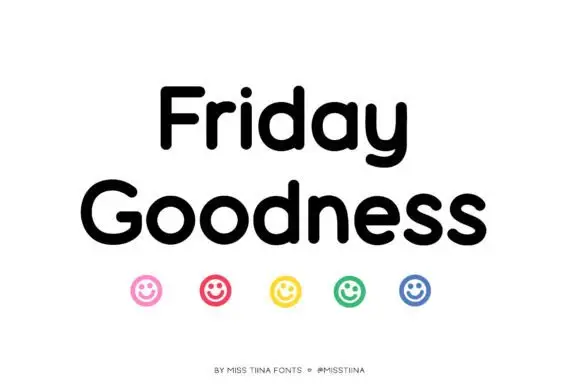
Soft rounded mixed case with broad circular bowls and a compact curling y tail
Friday Goodness stacks black mixed case on white, where rounded substantial strokes form a broad G and circular o bowls, the r shoulder stays short, the i dot is small and round and the y descends into a short curved tail.
Ideas for this font
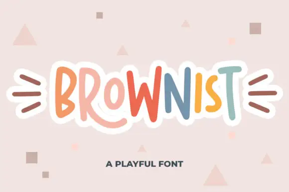
Irregular tall playful capitals in alternating colours with uneven weights
Brownist is playful capital lettering in which each letter is drawn at a different height and weight, with rounded corners and small banners on both sides of the word.
Ideas for this font
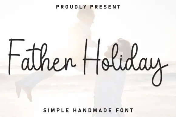
Tall simple connected pen strokes with a flat baseline and a light weight
Father Holiday is simple connected handwriting with tall ascenders, a light even stroke and a flat baseline, so a two-word phrase reads as an ordinary pen signature.
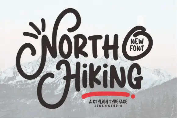
Heavy informal lettering with oversized looping N and H initials
North Hiking paints its words with one heavy rounded brush line, then lets the first letters break out into wide loops that travel above and below the rest of the word.
Ideas for this font
Same independent foundry
Allow optional Google Analytics to measure visits and catalogue actions. Your search words and notes are not included. Privacy & storage