Editorial Serif Anchor

More Sugar + The Avenue Editorial
Anchors More Sugar's fluid strokes with crisp Roman proportions on wedding suites, headers and packaging.
Inspect The Avenue Editorial specimenDisclosure: MakerFileHub may earn a commission from qualifying purchases via paid links on this page. How our links work.
Heavy marker script
More Sugar is a heavy marker script in near-black on an off-white ground: fat rounded letters with uneven bowls and bulbous terminals, a long swooping g tail and a bounce on the baseline, set in two lines beside a marker pen, a speech bubble and a small banner beneath.
Paid link
Get this fontProject & layout blueprintsAt-a-glance maker compatibility
Weld or Unite overlapping script joins into one continuous vector path before sending to the blade.
Visual anatomy & craft review
The plate is staged with the tool that would draw it: a marker pen lies at the lower right and a speech bubble sits at the shoulder, which tells the buyer the register before reading the caption. The drawing is a heavy marker script with uneven bowls and bulbous terminals, so the face reads as a hand-written sign rather than as a brush lettering, and the swooping g tail is the detail that gives a short phrase its finish. That construction sets a moderate size floor, because the counters close first. The banner beneath is product copy that names the two weights and the extras. Because the letters are fat and casual, the face suits a card, a label and a market sign, and a layout should allow for the bounce rather than setting on a strict baseline.
Handwritten, marker, heavy, casual
Two-font hierarchy recipes
Tested contrast partners — pairing More Sugar with grounded secondary typography.
More Sugar + The Avenue Editorial
Anchors More Sugar's fluid strokes with crisp Roman proportions on wedding suites, headers and packaging.
Inspect The Avenue Editorial specimen
More Sugar + Nyxar
Keeps small-scale dates, URLs, nutrition facts and care instructions crisp and legible below script titles.
Inspect Nyxar specimenPractical applications
Concrete hierarchy, scale and production guidance tailored to More Sugar’s stroke geometry.
A marker script sets a friendly card, and the heavy strokes read at a size where a fine hand would disappear. The heavy strokes read at size.
Hierarchy & layout recipe
A6 card: the greeting at 28 pt, the details in a 10 pt sans, and the date at 9 pt. Keep 15 mm margins, print two colours on a cream card and leave 12 mm at the foot for the party address.
Pre-production check
Check the 28 pt greeting at home-print resolution, where a counter can close; keep it open. Confirm the 10 pt details keep a 4.5:1 contrast and that the card folds flat.
A marker label reads as a small kitchen, and the bulbous terminals hold a long product name on a small die. The bulbs hold on a small die.
Hierarchy & layout recipe
Print a 55 by 80 mm label: the bakery at 12 pt, the product at 8 pt, and the price at 7 pt. Keep 5 mm inside the die and keep the counters above 1 mm.
Pre-production check
Check the 12 pt bakery on a small die, where a bowl can fill; keep it above 1 mm. Confirm the price reads at arm's length and that the label takes a fold.
A marker script reads as a hand-painted sign, and the heavy strokes hold across a lane of tables. It reads as a hand painted sign.
Hierarchy & layout recipe
A3 board: the stall at 70 mm cap height, the prices in a 26 mm marker, and two colours on a white board. Keep 25 mm margins and finish with a matte lacquer.
Pre-production check
Check the board at three metres, where a heavy bowl can look blobby; keep the counters open. Confirm the prices read at two metres and that the lacquer dries clear.
Technical & licence verification
Confirm included OTF/TTF/WOFF formats, full glyph tables and licence coverage on the live store page before batch production.
Closest visual alternatives
Matched across letterform anatomy, stroke behaviour and craft applications.
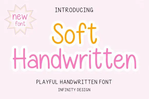
Slender rounded upright print
Soft Handwritten is a slender rounded print in orange and pink on blush: unfilled letters drawn with an even rounded stroke, a high x-height and a light keyline that lifts the words off the ground.
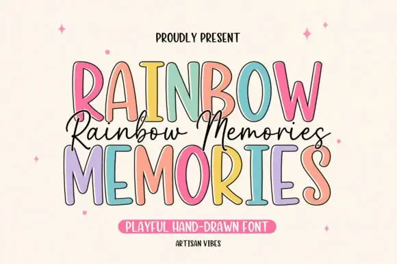
Tall irregular display capitals
Rainbow Memories is a tall irregular display capital hand in mixed pastels with a dark outline: letters of different widths and heights, a light monoline stroke and a small connected script that runs between the two capital lines.
Ideas for this font
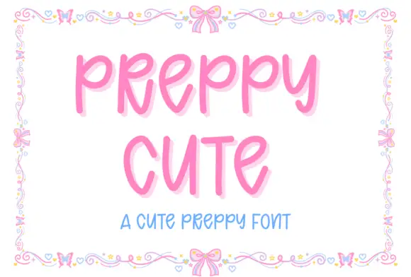
Tall rounded playful capitals
Preppy Cute is a tall rounded capital hand in candy pink with a soft glow: fat even strokes, open counters and a light bounce, framed by a drawn border of bows, hearts and tiny flowers.
Ideas for this font
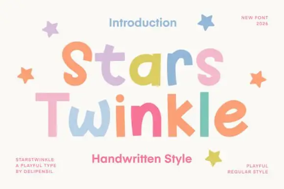
Uneven rounded separate display letters
Stars Twinkle is a playful separate-letter display in pastels on cream: fat rounded letters, no joins, uneven weights, and a different candy colour on every letter, with drawn stars at the edges.
Ideas for this font
Allow optional Google Analytics to measure visits and catalogue actions. Your search words and notes are not included. Privacy & storage