High-Contrast Display Serif

Fontuna Bold + Aureline
Pairs sculptural editorial warmth with Fontuna Bold's clean modern geometry.
Inspect Aureline specimenDisclosure: MakerFileHub may earn a commission from qualifying purchases via paid links on this page. How our links work.
Extremely narrow high-contrast capitals with hairline arms and vertical oval bowls
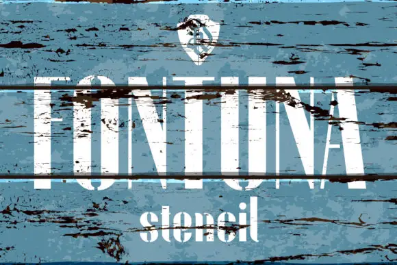
Fontuna Bold places white FONTUNA across a blue ocean photograph. Tall thick uprights meet very fine horizontal arms and diagonals; the O is a narrow vertical oval and the A has a tiny high opening, with a widely spaced bold lowercase line below.
Paid link
Get this fontProject & layout blueprintsAt-a-glance maker compatibility
Set Cricut or Silhouette operation to Pen, Foil Quill, or Laser Score — not Basic Blade Cut.
Visual anatomy & craft review
The uprights stay thick, the arms thin to hairlines, the bowls compress into vertical ovals and the counter openings close to slivers. That contrast is the character: the row reads as a tall engraved banner rather than a bold sans, which is why the sample sets it over water. The shield and palm are separate artwork, and despite the Bold name some strokes are exceptionally fine, so test on a flat dark field rather than a photograph, keep 34 pt and never place it over busy texture.
Extremely narrow high-contrast capitals with hairline arms and vertical oval bowls
Two-font hierarchy recipes
Tested contrast partners — pairing Fontuna Bold with grounded secondary typography.
Fontuna Bold + Aureline
Pairs sculptural editorial warmth with Fontuna Bold's clean modern geometry.
Inspect Aureline specimen
Fontuna Bold + Honey
Introduces organic movement on pull-quotes, signatures and gift tags.
Inspect Honey specimenPractical applications
Concrete hierarchy, scale and production guidance tailored to Fontuna Bold’s stroke geometry.
The narrow hairlines give a bottle an engraved look, and the tall uprights hold a short brand at 22 pt on a 55 by 60 mm panel, where the sliver counters stay open on glass.
Hierarchy & layout recipe
Print a 55 by 60 mm bottle label: set the brand at 22 pt in one row, keep 10 mm of clear ground beneath before the volume at 6 pt, and print white on a dark tint rather than a photograph.
Pre-production check
Hairline arms printed at 0.4 mm disappear on wet-strength paper; ask for a proof and hold the brand at 20 pt or above.
The vertical ovals suit a nautical title, and the fine arms hold a four-letter word at 64 pt across a magazine page, where the narrow silhouettes leave air between columns.
Hierarchy & layout recipe
Print a 210 mm page: set the title at 64 pt on one row, keep 24 mm of clear ground beneath before the deck at 11 pt, and keep the leading copy on flat stock so the arms stay sharp.
Pre-production check
A photo behind the title eats the hairlines; check the page proof and move any image below the title block.
The tall narrow letters give a seaside invitation poise, and the compressed bowls hold a surname at 28 pt on a heavy card, where the hairline joints stay crisp in letterpress.
Hierarchy & layout recipe
Letterpress a 105 by 148 mm card: set the surname at 28 pt on one row, keep 18 mm of clear ground beneath for the date, and keep the impression shallow so the fine arms do not bite through.
Pre-production check
Deep impression closes the tiny A opening; check one card and ask for a light impression on the fine strokes.
Technical & licence verification
Confirm included OTF/TTF/WOFF formats, full glyph tables and licence coverage on the live store page before batch production.
Closest visual alternatives
Matched across letterform anatomy, stroke behaviour and craft applications.
High contrast display sans
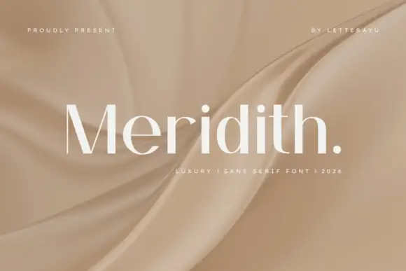
Meridith is a high contrast display sans in white over a folded satin ground: mixed case with tall ascenders, fine curved joins, thick stems and broad bowls, set as one word with a period, beneath a small tracked line above and a short note beneath.
Ideas for this font
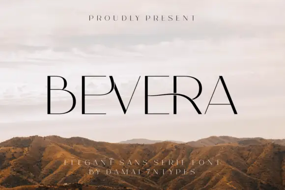
Fine high-contrast capitals with a sweeping E-R connection and a sharp narrow V
Bevera places thin black capitals over a pale landscape photograph, where fine horizontal arms meet stronger vertical strokes, the E near the middle extends into a long curved connection toward the R and the V narrows to a sharp point.
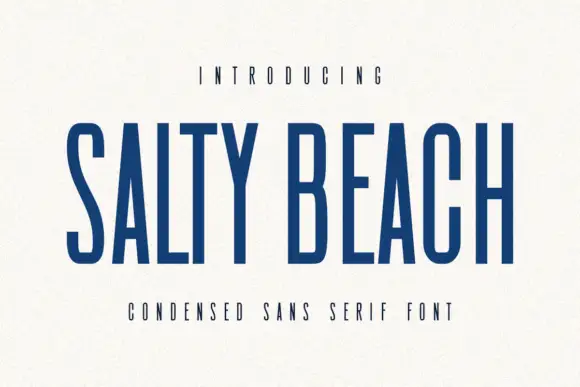
Tall narrow sans
Salty Beach is a tall narrow sans in navy on an off-white sheet: capitals with flat endings, compressed rounded bowls, a low middle bar and an even stroke, with tracked caps above and beneath that name the style.
Ideas for this font
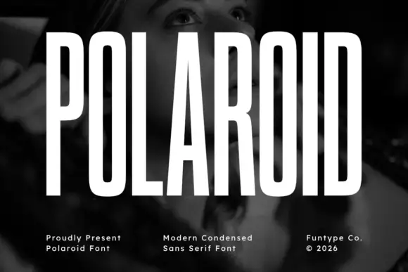
Tall condensed grotesque
Polaroid is a tall condensed grotesque in white over a monochrome portrait: very narrow capitals with flat terminals, a closed counter in the O, a short bar on the R, and a height that runs almost the full frame, so the word reads as a stretched sign rather than a standard alphabet.
Ideas for this font
Same independent foundry
Allow optional Google Analytics to measure visits and catalogue actions. Your search words and notes are not included. Privacy & storage