Modern Grotesque Body

Quartell Variable + Cultivo
Creates crisp high-hierarchy contrast beneath Quartell Variable headlines across menus, websites and labels.
Inspect Cultivo specimenDisclosure: MakerFileHub may earn a commission from qualifying purchases via paid links on this page. How our links work.
Squared variable slab
Quartell Variable is a squared slab in white on marbled pink and blue: mixed case with clipped corners, broad horizontal slabs, tight spacing and a heavy even stroke, set as one word with a small tracked line beneath naming the variable format.
Paid link
Get this fontProject & layout blueprintsAt-a-glance maker compatibility
Sturdy stroke walls and open counters weed cleanly on adhesive vinyl, HTV apparel film, and cut cardstock.
Visual anatomy & craft review
The word sits centred on a marbled ground and the drawing is a squared slab: the serifs are broad horizontals, the corners are clipped, and the counters are tight, which gives a heavy face with little air but a strong block. The note beneath matters, because a variable file means the buyer gets a weight range rather than one cut, and the plate shows the heaviest instance only. The marbled ground is staging and it is a useful test, since the white letters stay legible over a busy, mid-tone pattern. Because the letters are heavy and squared, the face suits a poster, a cover and a screen at large sizes, and the tight spacing means a buyer should add tracking before setting a long line.
Slab, variable, squared, bold
Two-font hierarchy recipes
Tested contrast partners — pairing Quartell Variable with grounded secondary typography.
Quartell Variable + Cultivo
Creates crisp high-hierarchy contrast beneath Quartell Variable headlines across menus, websites and labels.
Inspect Cultivo specimen
Quartell Variable + Hailey
Adds a warm human signature touch for 1-to-3-word callouts without competing against structured serif capitals.
Inspect Hailey specimenPractical applications
Concrete hierarchy, scale and production guidance tailored to Quartell Variable’s stroke geometry.
A squared heavy slab gives a release a blocky cover, and the variable range lets the title and the credits come from one file.
Hierarchy & layout recipe
Set the title at 90 mm cap height across 190 mm, the artist in a 10 pt sans, and the label at 8 pt. Print one ink on a coated stock and keep 22 mm margins.
Pre-production check
Check the title at 90 mm, where a clipped corner can look like damage; keep the clips consistent. Confirm the 8 pt label survives lamination and that the title clears the trim.
A squared slab gives a shop a mark that reads as a printed sleeve, and the variable weight adapts to a sign and a sticker.
Hierarchy & layout recipe
Set the mark at 18 pt on a sticker, 95 mm on a window and 12 pt on a card, using a lighter instance below 15 pt. Keep one colour and clear space equal to half the mark height.
Pre-production check
Check the 12 pt card mark, where the tight spacing can join two letters; add tracking. Confirm the window mark reads at six metres and that the clips stay clean in vinyl.
A heavy slab sets a launch apart on a table, and the single file keeps the card and the poster consistent. One file keeps a campaign consistent across pieces.
Hierarchy & layout recipe
A6 card: the greeting at 22 pt, the details in a 9 pt sans, and the date at 8 pt. Keep 15 mm margins and print two colours on a light card. Leave 14 mm at the foot for the venue.
Pre-production check
Check the 22 pt greeting, where a tight spacing can merge the letters; add 2 percent tracking. Confirm the 9 pt details keep a 4.5:1 contrast and that the card folds flat.
Technical & licence verification
Confirm included OTF/TTF/WOFF formats, full glyph tables and licence coverage on the live store page before batch production.
Closest visual alternatives
Matched across letterform anatomy, stroke behaviour and craft applications.
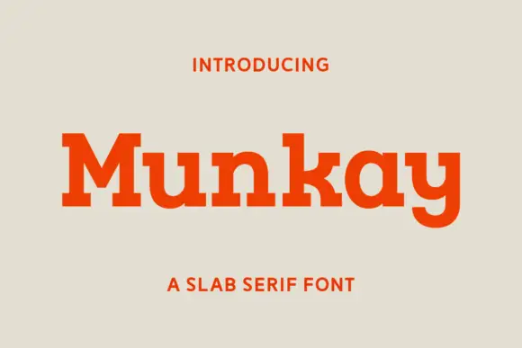
Heavy slab with soft corners
Munkay is a slab serif in orange on a warm grey ground: heavy stems with softly bracketed serifs, a large x-height and a short descender, set as one word with a tracked label above and beneath in the same family.
Ideas for this font

Layered varsity capitals with an inline stroke and outlined numbers
Varsity Spirit is a layered varsity capital alphabet in which each letter carries an inline stroke, a keyline and a set of matching numerals, so a team name reads as the appliqué on a college jacket.
Ideas for this font

Very heavy rounded sport slab capitals
Chicago Titans pushes slab weight to its limit: thick stems, counters narrowed to slots, wide flat feet and almost no space left between the letters of a word.
Ideas for this font

Broad angular baseball slabs with wedge serifs and a tight fit
Baseball Athlete Jersey is a broad slab capital alphabet with wedge serifs, angular bowls and a tight fit, drawn so a word reads as a sewn athletic letter rather than as a sports headline.
Ideas for this font
Same independent foundry
Allow optional Google Analytics to measure visits and catalogue actions. Your search words and notes are not included. Privacy & storage