Neutral Sans Workhorse

Nature Reserve + Kohilo
Lets Nature Reserve own the focal silhouette while handling secondary copy, sizing and subheads cleanly.
Inspect Kohilo specimenDisclosure: MakerFileHub may earn a commission from qualifying purchases via paid links on this page. How our links work.
Hatched outdoor slab
Nature Reserve is a hatched slab display in white over a mountain landscape: tall caps with heavy bracketed serifs, a high waist, and an interior filled with fine parallel hatch lines that follow the stroke direction, with a tracked subtitle beneath in the same construction.
Paid link
Get this fontProject & layout blueprintsAt-a-glance maker compatibility
Sturdy stroke walls and open counters weed cleanly on adhesive vinyl, HTV apparel film, and cut cardstock.
Visual anatomy & craft review
The word is set once, wide, and the drawing is a slab with an inline hatch: the serifs are heavy, the stems are wide, and the hatching runs inside each stroke, which gives the letters their engraved look without a second colour. Because the hatch is fine, the face needs a large size, and the specimen sets it across the whole plate over a landscape so the hatch reads against the sky. The tracked subtitle beneath uses the same slab skeleton at a fraction of the size, which keeps the plate to one voice, and the palette is white on a photographic ground so the hatch stays visible. It is a face for outdoor and travel subjects, and the specimen makes that clear without a badge or a claim.
Slab, hatched, outdoor, vintage
Two-font hierarchy recipes
Tested contrast partners — pairing Nature Reserve with grounded secondary typography.
Nature Reserve + Kohilo
Lets Nature Reserve own the focal silhouette while handling secondary copy, sizing and subheads cleanly.
Inspect Kohilo specimen
Nature Reserve + Kernova
Grounds bold display lettering with classic typographic authority on posters, badges and apparel.
Inspect Kernova specimenPractical applications
Concrete hierarchy, scale and production guidance tailored to Nature Reserve’s stroke geometry.
A hatched slab reads as a period travel poster, and the fine inline keeps the letters open against a photographic landscape where a solid face would blend in.
Hierarchy & layout recipe
A2 portrait: the park at 120 mm cap height, the facilities in a 16 mm slab, and the season at 14 mm. Keep 30 mm margins, print white on a photograph, and keep the type over the calmest area of the sky.
Pre-production check
Check the poster at five metres, where the hatch can disappear against a bright sky; darken the ground behind the type. Confirm the 14 mm season reads at three metres and that the subtitle clears the illustration.
A hatched slab reads as park signage, and the heavy serifs hold at a distance where a light face would vanish into foliage.
Hierarchy & layout recipe
Fabricate a 1,200 by 300 mm panel: the centre at 130 mm cap height, the direction in a 30 mm slab, and a 6 mm rule. Keep 30 mm margins and specify a matte finish so the hatch does not glare in sunlight.
Pre-production check
Check the panel at twenty metres, where the hatch can fill in; keep the lines above 2 mm. Confirm the 30 mm direction reads at eight metres and that the rule clears the fixings.
A hatched slab frames a travel memoir as a period poster, and the inline detail gives a cover texture without a photograph of a place.
Hierarchy & layout recipe
Set the title at 90 mm cap height across 210 mm, the subtitle in a 12 pt slab, and the author at 9 pt caps. Print white over a landscape photograph and keep the title in the upper half.
Pre-production check
Check the title at thumbnail size, where the hatch reduces contrast; keep the ground behind it even. Confirm the 9 pt author survives lamination and that the title clears the trim by 12 mm.
Technical & licence verification
Confirm included OTF/TTF/WOFF formats, full glyph tables and licence coverage on the live store page before batch production.
Closest visual alternatives
Matched across letterform anatomy, stroke behaviour and craft applications.
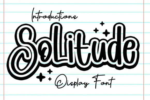
Outlined looping display script
Solitude shows connected upright script forms traced by a thick dark outer contour with a second pale inline inside it, where the S curls into a large lower loop, the tall l and d rise over a compact rounded body and four spark marks sit at the right.
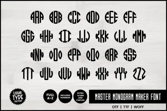
Narrow monogram letters fitted into circles
Master Monogram is a monogram set in black on white: narrow capitals drawn to be repeated and mirrored inside a circular silhouette, so each pair of letters fills a disc with stripes, plus digits and circle icons in the same weight.
Ideas for this font
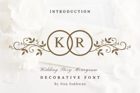
Circle-pair monogram with scrolls
Wedding Story Monogram is a two-initial monogram in bronze on a white still life: two serif capitals set inside two overlapping circles, with mirrored leafy scrolls extending sideways from the rings, staged on an envelope among white roses with a small line above and two lines beneath.
Ideas for this font
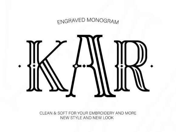
Tall outlined monogram capitals with diamond-shaped interruptions
Engraved shows three capitals drawn as several narrow parallel contours: tall flared serif ends frame open white interiors and small diamond-shaped breaks sit around the midline of each letter.
Ideas for this font
Same independent foundry
Allow optional Google Analytics to measure visits and catalogue actions. Your search words and notes are not included. Privacy & storage