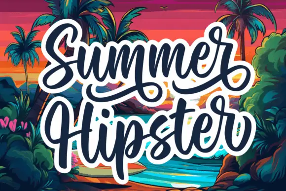
Neutral Sans Workhorse

Knight Stories + Cenura
Lets Knight Stories own the focal silhouette while handling secondary copy, sizing and subheads cleanly.
Inspect Cenura specimenDisclosure: MakerFileHub may earn a commission from qualifying purchases via paid links on this page. How our links work.
Outlined block capitals filled with varied stripes, zigzags, grids and crosshatching
Knight Stories places two colourful uppercase rows on a white sticker-like shape over a pink grid, where the broad outlined letters contain different linear patterns, from diagonals and zigzags to grids and crosshatching, one pattern per glyph.
Paid link
Get this fontProject & layout blueprintsAt-a-glance maker compatibility
Sturdy stroke walls and open counters weed cleanly on adhesive vinyl, HTV apparel film, and cut cardstock.
Visual anatomy & craft review
The outlines stay broad, each letter carries a different linear fill, the patterns run at varied angles and the rows sit inside a sticker shape. That per-letter pattern is the character: a word becomes a set of patterned panels, which is why the title shows no knight illustration at all. Confirm the pattern assigned to each glyph and whether colour is applied separately, keep 40 pt so the fine lines survive and check the fills at print size. The per-letter fills are the fragile part: on a shirt the fine crosshatch fills with plastisol and the panel prints as a solid block, so keep the face at 40 pt and use it flat for textile work.
Outlined block capitals filled with varied stripes, zigzags, grids and crosshatching
Two-font hierarchy recipes
Tested contrast partners — pairing Knight Stories with grounded secondary typography.
Knight Stories + Cenura
Lets Knight Stories own the focal silhouette while handling secondary copy, sizing and subheads cleanly.
Inspect Cenura specimen
Knight Stories + Glofi
Grounds bold display lettering with classic typographic authority on posters, badges and apparel.
Inspect Glofi specimenPractical applications
Concrete hierarchy, scale and production guidance tailored to Knight Stories’s stroke geometry.
The patterned blocks suit a school cover, and the broad outlines hold a two-word title at 46 pt on an A4 cover, where the varied fills stay distinct.
Hierarchy & layout recipe
Print an A4 notebook cover: set the title at 46 pt on one row, keep 22 mm of clear ground beneath before the subject line at 12 pt, and keep one pattern family so the cover stays coherent.
Pre-production check
Fine crosshatching closes at 24 pt; check the proof at final size and hold the title at 40 pt or above.
The patterned letters make a sticker sheet, and the outlined forms hold single initials at 30 mm on a 40 mm circle, where each pattern stays readable inside the die.
Hierarchy & layout recipe
Print a 40 mm circle sticker: set one initial at 30 mm, keep 4 mm of clear ring so the outline is not clipped, and keep one pattern per sticker rather than mixing.
Pre-production check
Patterns under 0.5 mm fill in on vinyl; check the cut file, simplify the fills and print one test sticker first.
The patterned caps read on a poster, and the heavy outlines hold a two-word title at 54 pt on an A3 sheet, where the different fills keep the row lively at distance.
Hierarchy & layout recipe
Print an A3 poster: set the title at 54 pt on one row, keep 24 mm of clear ground beneath before the dates at 14 pt, and keep the background pale so the outlines separate.
Pre-production check
Colour may be applied glyph by glyph; check the process before promising a two-ink run to a client or a printer.
Technical & licence verification
Confirm included OTF/TTF/WOFF formats, full glyph tables and licence coverage on the live store page before batch production.
Closest visual alternatives
Matched across letterform anatomy, stroke behaviour and craft applications.
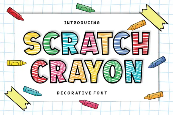
Crayon-filled outlined display
Scratch Crayon is an outlined display in black contours on a white sheet of graph paper: heavy capitals filled with irregular horizontal crayon strokes in red, blue, green and yellow, each letter offset slightly, with crayons scattered around the border and a tracked caption at the foot.
Ideas for this font
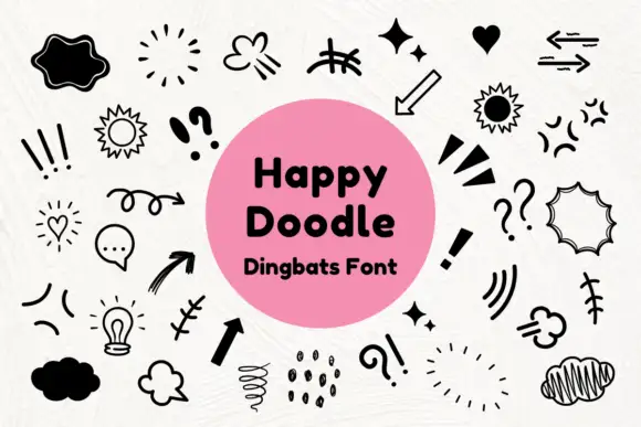
Black comic-style emphasis marks, arrows and outlined speech shapes
Happy Doodle is a dingbat set of marker-style marks: arrows, sparkles, suns, clouds, speech bubbles, exclamation marks, hatching and small stars, all drawn in one even black line.
Ideas for this font
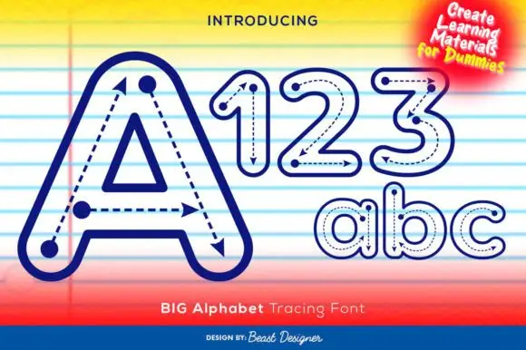
Outlined tracing letters with directional paths
Big Alphabet Tracing shows a large outlined A with dotted paths and arrowheads, and the sample also displays outlined numerals and rounded lowercase letters for practice sheets rather than display use.
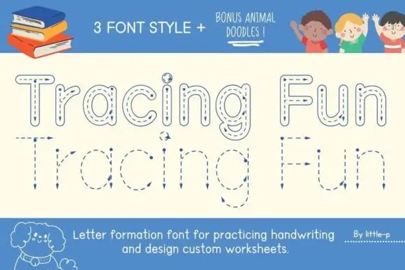
Tracing letter-formation display
Tracing Fun is a letter-formation display in blue on cream: outlined letters with dashed centre lines, arrows marking the stroke direction, and a second lower-case set with the same construction, sold with animal doodles, so the plate reads as a classroom worksheet rather than a typeface.
Ideas for this font
Same independent foundry
Allow optional Google Analytics to measure visits and catalogue actions. Your search words and notes are not included. Privacy & storage