Neutral Sans Workhorse

Beachway Ocean + Clyne Sans
Lets Beachway Ocean own the focal silhouette while handling secondary copy, sizing and subheads cleanly.
Inspect Clyne Sans specimenDisclosure: MakerFileHub may earn a commission from qualifying purchases via paid links on this page. How our links work.
Block capitals containing layered blue underwater scenes
Beachway Ocean is a color font in which the letters are windows into a reef: each cap is filled with a painted underwater scene of fish, kelp, coral and light, with the surface of the water across the top of the shape.
Paid link
Get this fontProject & layout blueprintsAt-a-glance maker compatibility
Cut solid base, outline, and shadow layers in separate vinyl colors and align on registration marks.
Visual anatomy & craft review
BEACHWAY sits at the top of the card in a lighter lettering that is also filled with the sea, and OCEAN fills the lower two thirds at a size where the scene inside the letters is visible: pale water at the top of each shape, dark blue deeper down, kelp, coral, small orange fish and a diver's silhouette in the N. The letters are plain block capitals with a thin edge, so the scene does the work and the shapes only provide the frame. A small mark sits at the lower left and a line at the lower right names the format. The face is a colour font of the picture-fill kind, and it is best used in short words at large sizes; a long line becomes a stripe of texture rather than a word.
Block capitals containing layered blue underwater scenes
Two-font hierarchy recipes
Tested contrast partners — pairing Beachway Ocean with grounded secondary typography.
Beachway Ocean + Clyne Sans
Lets Beachway Ocean own the focal silhouette while handling secondary copy, sizing and subheads cleanly.
Inspect Clyne Sans specimen
Beachway Ocean + Lumera Editorial
Grounds bold display lettering with classic typographic authority on posters, badges and apparel.
Inspect Lumera Editorial specimenPractical applications
Concrete hierarchy, scale and production guidance tailored to Beachway Ocean’s stroke geometry.
The reef inside the letters says what the day is about without a photograph, and the blues read across a sunny outdoor board.
Hierarchy & layout recipe
Print an A2 poster: set the event name at 160 pt across two rows, keep 34 mm of clear ground beneath before the times at 15 pt, and hold 28 mm of margin so no letter edge is cropped.
Pre-production check
The scene inside the letters turns to texture below 40 pt; print one poster at the final size and check the fish first.
One word carries the whole opening page, and the painted fill gives a spread a full-bleed image without a separate photograph.
Hierarchy & layout recipe
Print a 230 by 300 mm opener: set the feature word at 200 pt across one row, keep 36 mm of clear ground beneath before the standfirst at 11 pt, and hold 22 mm from the last letter to the right trim.
Pre-production check
Painted fills band on uncoated stock; print one opener on the real paper and check the blues before the issue.
The fill matches the product, and a short brand name reads clearly while the scene shows what the bottle is made of at a glance.
Hierarchy & layout recipe
Print a 55 by 95 mm label: set the brand name at 22 pt on one row, keep 8 mm of clear ground beneath before the volume at 4.5 pt, and hold 5 mm from the letter edge to the die line.
Pre-production check
Small labels turn the scene into noise; print one label on the actual bottle and check the shapes before the order.
Technical & licence verification
Confirm included OTF/TTF/WOFF formats, full glyph tables and licence coverage on the live store page before batch production.
Closest visual alternatives
Matched across letterform anatomy, stroke behaviour and craft applications.
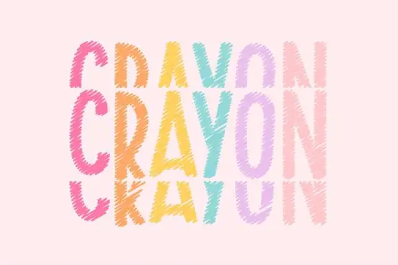
Tall crayon-textured capitals repeated in cropped upper and lower rows
Crayonfriends Stacked repeats the same tall word in three pastel rows on pale pink, where the middle row is complete while the rows above and below are cut by broad horizontal blank bands, and scratchy diagonal marks break both the coloured strokes and their edges.
Ideas for this font
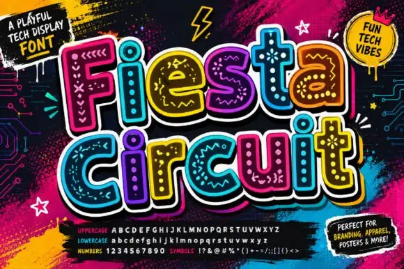
Rounded bold letters containing dots, chevrons and short circuit-like marks
Fiesta Circuit draws fat rounded capitals, fills every one with a different bright colour and then doodles circuit tracks, node dots, stars and coiled loops across the interior in white.
Ideas for this font
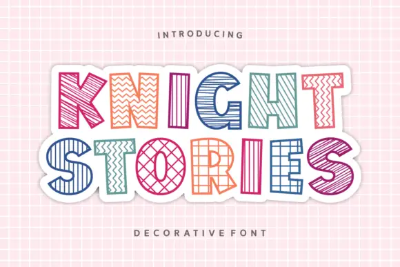
Outlined block capitals filled with varied stripes, zigzags, grids and crosshatching
Knight Stories places two colourful uppercase rows on a white sticker-like shape over a pink grid, where the broad outlined letters contain different linear patterns, from diagonals and zigzags to grids and crosshatching, one pattern per glyph.
Ideas for this font
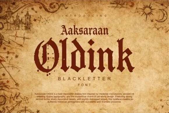
Heavy blackletter display
Oldink is a heavy blackletter in oxblood on aged parchment: mixed case with a divided O, uneven pointed terminals, dense stems and sharp spurs, set in two lines above and below a small serif line, all framed by drawn marginalia — a castle, comets and star charts — with a paragraph of description along the foot.
Allow optional Google Analytics to measure visits and catalogue actions. Your search words and notes are not included. Privacy & storage