Neutral Sans Workhorse

Ash + Inkora
Lets Ash own the focal silhouette while handling secondary copy, sizing and subheads cleanly.
Inspect Inkora specimenDisclosure: MakerFileHub may earn a commission from qualifying purchases via paid links on this page. How our links work.
Heavy pointed serif capitals wrapped in dense fine rose and leaf outlines
Ash presents three dark capitals on a red-green field. Broad contrast strokes taper into sharp curled serifs, while pale outlined roses, leaves and tendrils climb around the A, fill parts of the S and bridge the H crossbar, with thin outer contours separating ornament from letter body.
Paid link
Get this fontProject & layout blueprintsAt-a-glance maker compatibility
Sturdy stroke walls and open counters weed cleanly on adhesive vinyl, HTV apparel film, and cut cardstock.
Visual anatomy & craft review
The bodies stay heavy, the serifs curl to points, the ornament sits outside the stroke and the contours keep it separate. That climbing detail is the character: three letters become a floral panel rather than a word, which is why the sample allows tendrils to join the crossbar. The cover claims a full alphabet and punctuation but only shows ASH, so confirm the required letters and motif mapping, keep 40 pt and pull a final-size proof before trusting the fine outlines.
Heavy pointed serif capitals wrapped in dense fine rose and leaf outlines
Two-font hierarchy recipes
Tested contrast partners — pairing Ash with grounded secondary typography.
Ash + Inkora
Lets Ash own the focal silhouette while handling secondary copy, sizing and subheads cleanly.
Inspect Inkora specimen
Ash + The Simple Editorial
Grounds bold display lettering with classic typographic authority on posters, badges and apparel.
Inspect The Simple Editorial specimenPractical applications
Concrete hierarchy, scale and production guidance tailored to Ash’s stroke geometry.
The rose outlines suit a botanical invitation, and the heavy capitals hold an initial pair at 34 pt on cotton stock, where the fine tendrils read as engraving.
Hierarchy & layout recipe
Print a 130 by 180 mm sleeve: set the initials at 34 pt on one line, keep 20 mm of clear ground beneath for the tendrils, and let the floral outline stop 12 mm from the trim.
Pre-production check
Tendrils thinner than 0.3 mm break on cotton; check the wet proof and hold the initials at 30 pt or above.
The outlined roses give a shop label craft authority, and the tapered serifs hold a short name at 24 pt on a 60 mm square sticker, where the ornament frames the row.
Hierarchy & layout recipe
Print a 60 by 60 mm sticker: set the name at 24 pt on one row, keep 12 mm of clear ground beneath for the leaf detail, and keep the sticker on a matte stock so the fine contours hold.
Pre-production check
A glossy sticker reflects away the thin outlines; check a sample and choose matte uncoated vinyl instead.
The dense ornament sets a horticultural heading, and the broad strokes hold a one-word title at 54 pt on a magazine spread, where the roses survive at press size.
Hierarchy & layout recipe
Print a 210 mm page: set the heading at 54 pt on one row, keep 22 mm of clear ground beneath before the standfirst at 10 pt, and keep the body in a plain serif so the ornament stays the only decoration.
Pre-production check
Two decorative rows on one spread compete; check the layout and keep the second line plain.
Technical & licence verification
Confirm included OTF/TTF/WOFF formats, full glyph tables and licence coverage on the live store page before batch production.
Closest visual alternatives
Matched across letterform anatomy, stroke behaviour and craft applications.
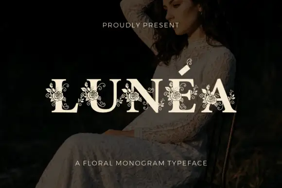
Floral monogram display
Lunéa is a floral monogram display in cream over a dark portrait: broad serif capitals with a fine accent, and fine roses, leaves and curled tendrils drawn over every letter, with a small sprig above the A and a tracked line beneath naming the style.
Ideas for this font
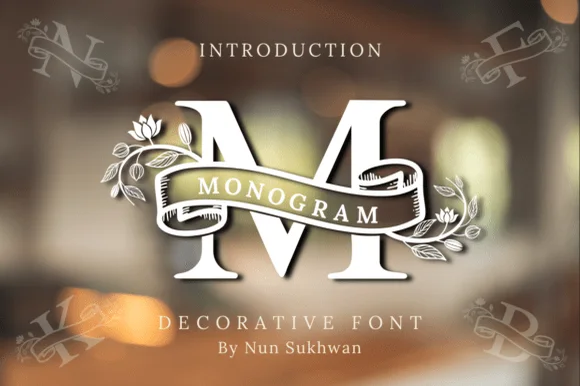
Ribbon-banner floral serif monogram
Amorette Monogram wraps classically built serif initials in a curved ribbon scroll and blooming botanical vines, and the corner specimens show N, F, K and B each carrying their own banner and floral detailing around bold structural stems.
Ideas for this font
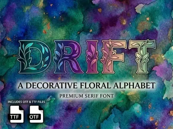
Outlined serif capitals with fine leafy stems woven through their interiors
Drift fills serif capitals with botanical patterns, so leaves, buds and grasses grow inside the strokes, and sets the word over a deep watercolour field in green, teal and purple.
Ideas for this font
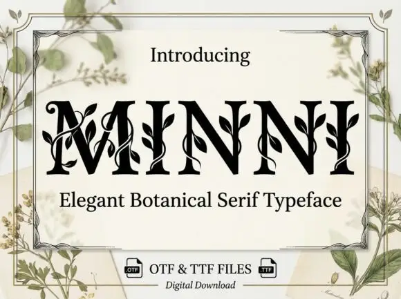
Botanical ornamented serif
Minni is a botanical serif in black on cream: high-contrast caps whose stems sprout leaves and curling vines, sharp serifs and a narrow waist, with a light botanical frame and small file badges at the foot.
Ideas for this font
Same independent foundry
Allow optional Google Analytics to measure visits and catalogue actions. Your search words and notes are not included. Privacy & storage