Editorial Serif Anchor

Farmhouse Handwriting + Askinо
Anchors Farmhouse Handwriting's fluid strokes with crisp Roman proportions on wedding suites, headers and packaging.
Inspect Askinо specimenDisclosure: MakerFileHub may earn a commission from qualifying purchases via paid links on this page. How our links work.
Tall narrow separate capitals with rounded shoulders and a light stroke
Farmhouse Handwriting is tall narrow capital lettering in which the letters stand separately, the shoulders are rounded and the stroke stays light and even across a word.
Paid link
Get this fontProject & layout blueprintsAt-a-glance maker compatibility
Weld or Unite overlapping script joins into one continuous vector path before sending to the blade.
Visual anatomy & craft review
Every letter is built from narrow stems: the F carries two short arms, the A closes to a rounded apex with a low bar, the R holds a short leg, the H joins two stems with a thin bar and the O closes an oval counter rather than a circle. Nothing connects, nothing slants and the weight is a true monoline with rounded ends, which is what gives the phrase its tidy, hand-lettered look on a sign. The narrow width is the useful property: a long word fits a narrow board at a large height, and the rounded shoulders keep the letterforms friendly rather than industrial. Counters stay open and the baseline is level. The white ground, the charcoal ink and the two tracked captions above and below are presentation; the lettering is the two words.
Narrow · Tall · Separate
Two-font hierarchy recipes
Tested contrast partners — pairing Farmhouse Handwriting with grounded secondary typography.
Farmhouse Handwriting + Askinо
Anchors Farmhouse Handwriting's fluid strokes with crisp Roman proportions on wedding suites, headers and packaging.
Inspect Askinо specimen
Farmhouse Handwriting + Base Edge
Keeps small-scale dates, URLs, nutrition facts and care instructions crisp and legible below script titles.
Inspect Base Edge specimenPractical applications
Concrete hierarchy, scale and production guidance tailored to Farmhouse Handwriting’s stroke geometry.
The narrow tall capitals fit a long shop name on a slim board, and the light monoline stroke reads clearly at a height of 15 cm from the road.
Hierarchy & layout recipe
Set the shop name at 15 cm tall on a 1.6 m board, keep the opening hours in a plain sans at 5 cm, and hold 12 cm of clear margin at each end of the panel.
Pre-production check
Narrow painted stems read thin at a distance; check the sign from the road and use a wider brush rather than repeating the stroke.
The tall narrow letters suit a timber board hung vertically, and the separate capitals stay readable at 10 cm even against a busy background.
Hierarchy & layout recipe
Set the greeting at 10 cm on a 500 by 800 mm board, set both names in the same face at 6 cm beneath, and leave 10 cm of margin so the narrow stems stay inside the frame.
Pre-production check
A light stroke on rough timber catches in the grain; check the board after the first coat and sand the surface before lettering again.
The narrow capitals fit a small label without wrapping, and the even stroke stays legible at 12 pt on a 40 mm jar label where a script would clot.
Hierarchy & layout recipe
Set the contents at 12 pt on a 40 by 25 mm jar label, keep the date in a 6 pt sans beneath, and leave 3 mm of margin so the lettering stays inside the cut.
Pre-production check
Jars handled after filling pick up grease; print on a matte stock and check that the thin stroke does not smudge onto fingers.
Technical & licence verification
Confirm included OTF/TTF/WOFF formats, full glyph tables and licence coverage on the live store page before batch production.
Closest visual alternatives
Matched across letterform anatomy, stroke behaviour and craft applications.
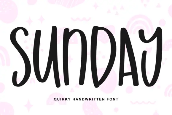
Quirky handwritten caps with irregular widths
Sunday is a quirky handwritten face in black on white: bold monoline capitals with irregular widths, odd joins where the strokes meet, and letters that lean against each other, shown over pale pink doodles of rainbows, stars and squiggles.
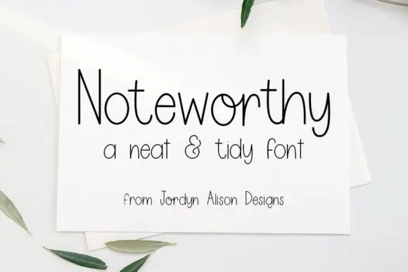
Fine tall handwriting
Noteworthy is a fine handwritten face in black on a white card: tall looping ascenders, open round bowls, a low crossbar on the t and a long descending loop on the y, set as one large word with a smaller line beneath and a credit under that.
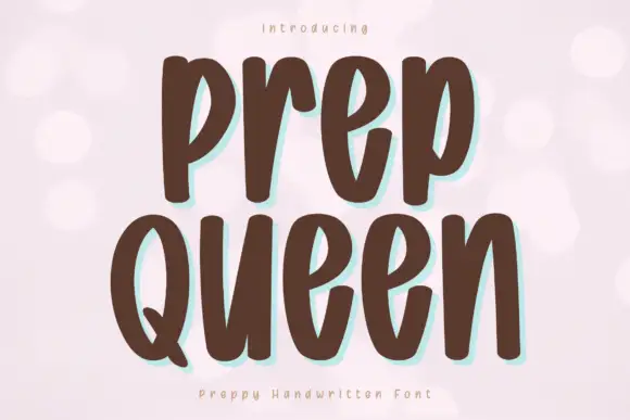
Tall heavy separate letters
Prep Queen is a tall heavy hand-drawn print in chocolate brown on pale pink: narrow letters with blunt ends, a light bounce, and a mint shadow behind each stroke.
Ideas for this font
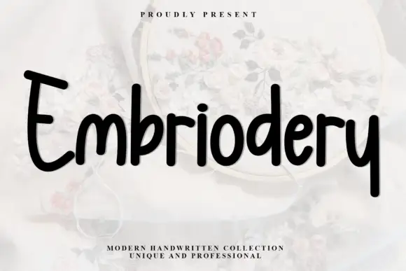
Heavy rounded upright handwriting with tall ascenders
Embriodery is upright handwriting in one heavy stroke, with tall flat-topped ascenders, generous rounded turns and letters that stand separately instead of joining, so a word reads as a row of soft blocks rather than a running script.
Ideas for this font
Same independent foundry
Allow optional Google Analytics to measure visits and catalogue actions. Your search words and notes are not included. Privacy & storage