Editorial Serif Anchor

Noteworthy + Augler
Anchors Noteworthy's fluid strokes with crisp Roman proportions on wedding suites, headers and packaging.
Inspect Augler specimenDisclosure: MakerFileHub may earn a commission from qualifying purchases via paid links on this page. How our links work.
Fine tall handwriting
Noteworthy is a fine handwritten face in black on a white card: tall looping ascenders, open round bowls, a low crossbar on the t and a long descending loop on the y, set as one large word with a smaller line beneath and a credit under that.
Paid link
Get this fontProject & layout blueprintsAt-a-glance maker compatibility
Weld or Unite overlapping script joins into one continuous vector path before sending to the blade.
Visual anatomy & craft review
The word fills the card and the drawing is neat everyday handwriting: the ascenders loop high, the bowls are round and open, and the joins sit on the baseline rather than linking every letter, which keeps the face readable at a paragraph length. That control is what separates a tidy handwriting face from a casual script, and the plate demonstrates it by setting three lines at three sizes on a plain card. The white card on a pale surface with a few leaves is staging, and the black holds because the ground is clean. Because the stroke is fine, the face works at small sizes only above about nine point, and the specimen shows the smaller line still legible, which is the practical check a buyer wants.
Handwritten, fine, tidy, friendly
Two-font hierarchy recipes
Tested contrast partners — pairing Noteworthy with grounded secondary typography.
Noteworthy + Augler
Anchors Noteworthy's fluid strokes with crisp Roman proportions on wedding suites, headers and packaging.
Inspect Augler specimen
Noteworthy + Bareum
Keeps small-scale dates, URLs, nutrition facts and care instructions crisp and legible below script titles.
Inspect Bareum specimenPractical applications
Concrete hierarchy, scale and production guidance tailored to Noteworthy’s stroke geometry.
A tidy handwriting face turns a printed note into a personal one, and the fine even stroke keeps a message readable at nine point.
Hierarchy & layout recipe
A6 card: the greeting at 22 pt, the message at 9.5 pt with 14 pt leading, and the shop name at 8 pt. Keep 16 mm margins and print one ink on a cream card.
Pre-production check
Check the 9.5 pt message on cream card, where the loops can close; open the leading. Confirm the greeting reads at arm's length and that the card folds without cracking.
A fine handwriting face reads as made by one person, and the even stroke survives on an uncoated label where a brush script fills with fibre.
Hierarchy & layout recipe
Print a 60 by 45 mm label: the brand at 14 pt, the product at 8 pt, and the weight at 6 pt. Keep 4 mm inside the die and print one ink on a kraft stock.
Pre-production check
Check the 14 pt brand on kraft, where a fine stroke can break; keep the size above 12 pt. Confirm the 6 pt weight reads at arm's length and that the label peels cleanly.
A tidy handwriting face suits a worksheet, and the open bowls keep a line of instructions legible for children who are still learning to read type.
Hierarchy & layout recipe
A4 worksheet: the heading at 20 pt, the instructions at 11 pt with 16 pt leading, and the name field at 10 pt. Keep 20 mm margins and print one colour on white.
Pre-production check
Check the 11 pt instructions on a school copier, where a fine stroke can break up; keep the size above 11 pt. Confirm the heading reads at two metres and that the lines sit on the grid.
Technical & licence verification
Confirm included OTF/TTF/WOFF formats, full glyph tables and licence coverage on the live store page before batch production.
Closest visual alternatives
Matched across letterform anatomy, stroke behaviour and craft applications.
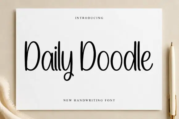
Narrow upright handwriting with tall ascenders and a soft even stroke
Daily Doodle is narrow upright handwriting in which the ascenders run tall, the stroke stays soft and even, and the letters stand apart at a gentle rhythm.
Ideas for this font
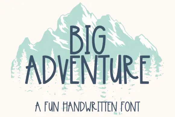
Tall handwritten capitals
Big Adventure shows tall separate capitals with narrow bowls and an angular A, where the G, T and R stand above an uneven baseline and a mountain illustration sits behind the lettering.
Ideas for this font
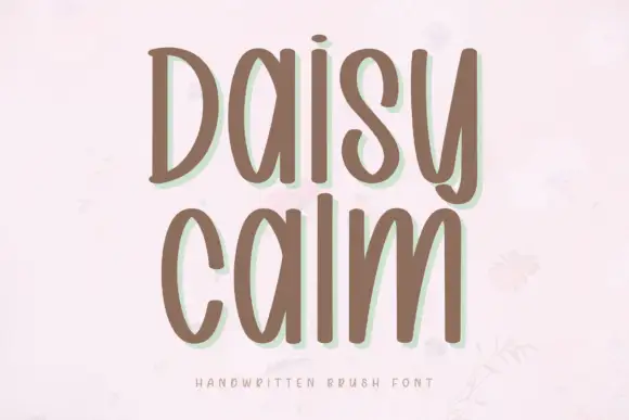
Soft brush capitals with a gentle bounce
Daisy Calm is a soft brush alphabet drawn with thick rounded strokes and a gentle bounce, set here in two lines of capitals that keep an even, unhurried rhythm.
Ideas for this font
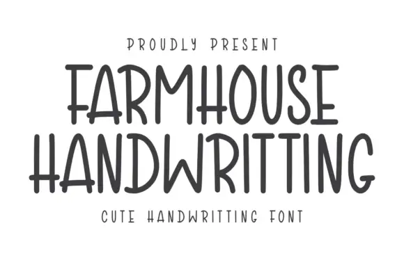
Tall narrow separate capitals with rounded shoulders and a light stroke
Farmhouse Handwriting is tall narrow capital lettering in which the letters stand separately, the shoulders are rounded and the stroke stays light and even across a word.
Ideas for this font
Allow optional Google Analytics to measure visits and catalogue actions. Your search words and notes are not included. Privacy & storage