Neutral Sans Workhorse

Fagor + Olline
Lets Fagor own the focal silhouette while handling secondary copy, sizing and subheads cleanly.
Inspect Olline specimenDisclosure: MakerFileHub may earn a commission from qualifying purchases via paid links on this page. How our links work.
Heavy circular logo letters with detached rounded pieces and a double-bowl g
Fagor builds its letters out of circles and squared stems, so the F is a bar and a stem with no curve, the a is a disc with a short spur and the g drops into a deep round bowl.
Paid link
Get this fontProject & layout blueprintsAt-a-glance maker compatibility
Sturdy stroke walls and open counters weed cleanly on adhesive vinyl, HTV apparel film, and cut cardstock.
Visual anatomy & craft review
The name runs in white on a black cover cut by red laser lines, the forms almost schematic: the o and the g are perfect circles, the F and the r are built from straight bars, and the spacing is tight enough that the word reads as one engineered object. A label above calls it a geometric logo font and a small block of text below quotes a glyph count and the intended uses: technology, gaming, startups and cyber-inspired design. Nothing in the face is drawn by hand, which is the point and also the risk: the shapes look strong at logo size and anonymous in a paragraph, so this is a mark-making face rather than a text face.
Heavy circular logo letters with detached rounded pieces and a double-bowl g
Two-font hierarchy recipes
Tested contrast partners — pairing Fagor with grounded secondary typography.
Fagor + Olline
Lets Fagor own the focal silhouette while handling secondary copy, sizing and subheads cleanly.
Inspect Olline specimen
Fagor + Kernova
Grounds bold display lettering with classic typographic authority on posters, badges and apparel.
Inspect Kernova specimenPractical applications
Concrete hierarchy, scale and production guidance tailored to Fagor’s stroke geometry.
The schematic shapes read as a constructed symbol rather than as a word, which is what a young technology studio wants on a deck and a door.
Hierarchy & layout recipe
Print a 55 by 90 mm card: set the studio name at 13 pt on one row, keep 7 mm of clear ground beneath before the contact line at 5 pt, and keep 6 mm of margin so the circular bowls stay whole.
Pre-production check
The circles gain weight in print; check the card proof at final size before ordering. Print a sample and re-check it at final size.
The geometric forms give a technology cover a graphic identity without an illustration, and the heavy shapes hold over a dark image.
Hierarchy & layout recipe
Print a 210 by 280 mm cover: set the cover title at 96 pt across one row, keep 22 mm of clear ground beneath before the standfirst at 11 pt, and keep 18 mm of margin from the trim on all sides.
Pre-production check
Tight spacing fuses letters at small sizes; check the printed cover before the run. Ask the printer for a sample at the finished size.
The face reads as a product mark at banner scale, and one short event name fills a wide banner strip without a second element.
Hierarchy & layout recipe
Print a 1200 by 400 mm banner: set the event name at 150 pt on one row, keep 34 mm of clear ground beneath before the dates at 22 pt, and keep 36 mm of border so the wide counters have air.
Pre-production check
Fine joints can fill in banner printing; check a physical proof before the order. Confirm it on a printed sample, not on screen.
Technical & licence verification
Confirm included OTF/TTF/WOFF formats, full glyph tables and licence coverage on the live store page before batch production.
Closest visual alternatives
Matched across letterform anatomy, stroke behaviour and craft applications.
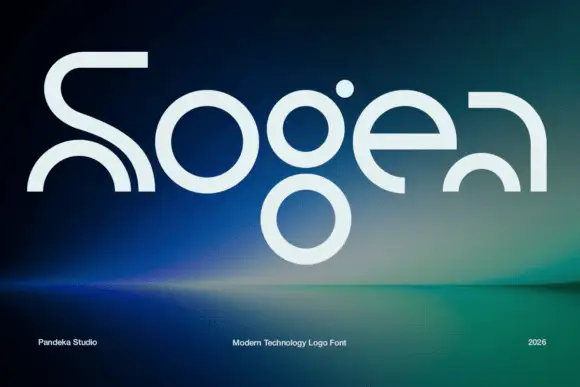
Elegant serif with ink traps
Sogea is an elegant serif in cream on a warm brown field: high contrast, fine hairlines, sharp serifs and small ink traps at the junctions, a tall waist and a wide x-height, set in two lines with a tracked caption beneath and a small ornament above.
Ideas for this font
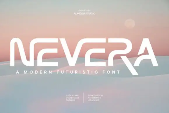
Wide angular capitals with open horizontal breaks and an extended diagonal R leg
Nevera is a wide futuristic sans in caps and lowercase: monoline strokes, rounded joins, a single-storey a and a very open skeleton that makes a word look engineered rather than written.
Ideas for this font
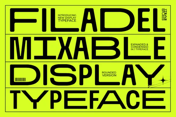
Expanded and narrow geometric capitals with rounded turns and long flat arms
Filadel fills a lime poster with four black uppercase rows, where wide D and B bowls sit beside narrow letters, the E uses long flat arms, the Y spreads into an angular fork and the R carries a diagonal leg, while a barcode, borders and a star sit around the block.
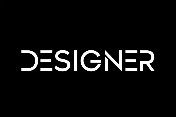
Segmented geometric capitals
Designer shows a thin geometric wordmark in white on black, where the E is reduced to three horizontal bars, the D loses its upright stem, the R opens at the join and the gaps between segments read as part of the drawing rather than as damage.
Ideas for this font
Same independent foundry
Allow optional Google Analytics to measure visits and catalogue actions. Your search words and notes are not included. Privacy & storage