Neutral Sans Workhorse

Nubico + Saltriver Grotesk
Lets Nubico own the focal silhouette while handling secondary copy, sizing and subheads cleanly.
Inspect Saltriver Grotesk specimenDisclosure: MakerFileHub may earn a commission from qualifying purchases via paid links on this page. How our links work.
Thin rounded geometric display
Nubico is a thin rounded geometric display in pale grey on charcoal: capitals with an inverted-arch N, broad circular O and even hairline strokes with rounded ends, set as one word with a small tracked line above and two plain notes at the foot.
Paid link
Get this fontProject & layout blueprintsAt-a-glance maker compatibility
Sturdy stroke walls and open counters weed cleanly on adhesive vinyl, HTV apparel film, and cut cardstock.
Visual anatomy & craft review
The word spans the sheet and the drawing is a geometric capital display at a light weight: the N is drawn as an inverted arch, the O is a broad circle, and the strokes are even with rounded ends, which gives a minimal face one unusual decision to remember it by. That construction sets a size floor, because a hairline with rounded ends fades quickly on uncoated stock, and the plate sets the word large enough that the arch reads. The charcoal ground gives the pale grey just enough contrast, and the tracked line above and the two notes at the foot carry the style, the studio and the styles included. Because the strokes are thin, the face suits a wordmark, a cover and a screen at display sizes rather than small print.
Display, rounded, geometric, minimal
Two-font hierarchy recipes
Tested contrast partners — pairing Nubico with grounded secondary typography.
Nubico + Saltriver Grotesk
Lets Nubico own the focal silhouette while handling secondary copy, sizing and subheads cleanly.
Inspect Saltriver Grotesk specimen
Nubico + Worldstar
Grounds bold display lettering with classic typographic authority on posters, badges and apparel.
Inspect Worldstar specimenPractical applications
Concrete hierarchy, scale and production guidance tailored to Nubico’s stroke geometry.
A thin rounded display gives a studio a mark that reads as drawn, and the inverted-arch N makes a short name memorable. One unusual letter is enough to be remembered.
Hierarchy & layout recipe
Set the mark at 17 pt on a card, 95 mm on a wall and 11 pt in a footer, keeping the hairline uncut. Keep one colour and clear space equal to the cap height.
Pre-production check
Check the 11 pt footer on uncoated paper, where a hairline can fill; keep the size above 12 pt. Confirm the wall mark reads at eight metres and that the arch stays open.
A thin geometric title gives a cover air, and the round O lets a short word hold a wide measure. Air is what a design cover needs most.
Hierarchy & layout recipe
Set the title at 90 mm cap height across 205 mm, the subtitle in a 9 pt sans, and the date at 8 pt. Print one ink on a coated stock and keep 22 mm margins.
Pre-production check
Check the title at 90 mm, where a rounded end can look soft; keep it consistent. Confirm the 8 pt date survives lamination and that the title clears the trim.
A thin rounded face keeps a modern sign calm, and the wide letters fill a board with one greeting. A quiet sign suits a quiet ceremony.
Hierarchy & layout recipe
A2 board: the greeting at 75 mm cap height, the names at 35 mm, and the date at 16 mm. Keep 32 mm margins and paint one colour on a pale board. Leave 40 mm of wall above the board for air.
Pre-production check
Check the board at four metres, where a hairline can fade in daylight; keep the weight up. Confirm the 16 mm date reads from the door and that the names clear the border.
Technical & licence verification
Confirm included OTF/TTF/WOFF formats, full glyph tables and licence coverage on the live store page before batch production.
Closest visual alternatives
Matched across letterform anatomy, stroke behaviour and craft applications.
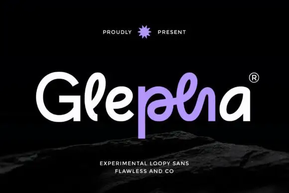
Looped rounded mixed case with interwoven central strokes and a deep p stem
Glepha shows white and purple lettering on black, where a broad open G introduces rounded lowercase forms, the l rises into a narrow loop and the central letters intertwine through a crossing horizontal stroke, while the p drops far below the main bodies and the final a keeps a simple broad bowl.
Ideas for this font
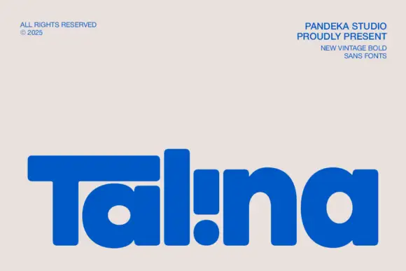
Heavy rounded logo display
Talina is a heavy rounded display in royal blue on a pale sheet: a short name set in very heavy rounded letters with an extended T arm, wide round bowls and an inverted dot-and-stem i that reads as a cut counter, with three small credits in the corners.
Ideas for this font
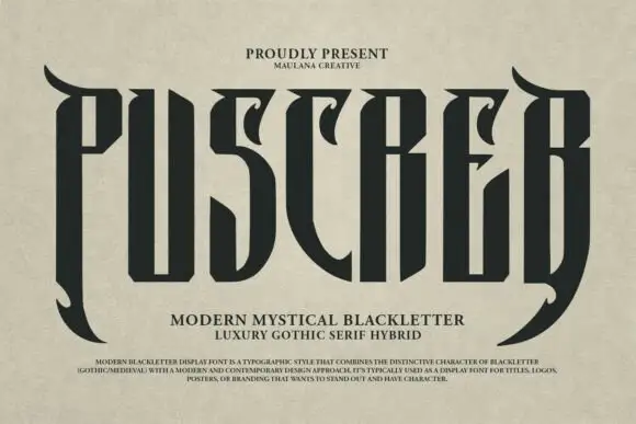
Tall narrow display with curved blades
Puscreb is a very tall narrow display in near-black on an aged paper ground: capitals with curved blades at the outer edges, deep pointed shoulders and narrow bodies, set as one large word above two plain lines and a small paragraph of description.
Ideas for this font
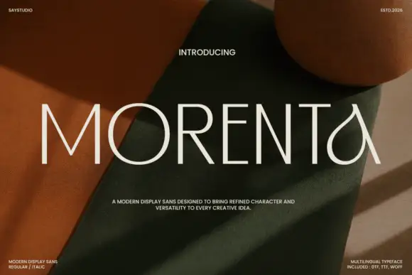
Thin straight display with teardrop forms
Morenta is a thin display in off-white over a rust and olive fabric still life: straight capitals with hairline-thin strokes, a teardrop-shaped A and a curved tail on the final letter, high contrast between the geometric stems and the curved finish, set as one large word with small tracked notes in each corner.
Ideas for this font
Same independent foundry
Allow optional Google Analytics to measure visits and catalogue actions. Your search words and notes are not included. Privacy & storage