Neutral Sans Workhorse

Filadel + Corven
Lets Filadel own the focal silhouette while handling secondary copy, sizing and subheads cleanly.
Inspect Corven specimenDisclosure: MakerFileHub may earn a commission from qualifying purchases via paid links on this page. How our links work.
Expanded and narrow geometric capitals with rounded turns and long flat arms
Filadel fills a lime poster with four black uppercase rows, where wide D and B bowls sit beside narrow letters, the E uses long flat arms, the Y spreads into an angular fork and the R carries a diagonal leg, while a barcode, borders and a star sit around the block.
Paid link
Get this fontProject & layout blueprintsAt-a-glance maker compatibility
Sturdy stroke walls and open counters weed cleanly on adhesive vinyl, HTV apparel film, and cut cardstock.
Visual anatomy & craft review
The widths alternate, the turns round, the arms stretch flat and the fork opens wide. That mixing of widths inside one row is the character: the block reads as a constructed poster rather than a text face, which is why the sample stacks four lines. The barcode and borders are composition, so confirm the actual members and build a controlled proof before mixing widths in your own title, keeping 40 pt throughout. The mixed widths are the risk in a row: a narrow letter between two expanded ones leaves a hole that reads as a missing glyph, so keep 40 pt and build the spacing yourself rather than trusting the default.
Expanded and narrow geometric capitals with rounded turns and long flat arms
Two-font hierarchy recipes
Tested contrast partners — pairing Filadel with grounded secondary typography.
Filadel + Corven
Lets Filadel own the focal silhouette while handling secondary copy, sizing and subheads cleanly.
Inspect Corven specimen
Filadel + Kernova
Grounds bold display lettering with classic typographic authority on posters, badges and apparel.
Inspect Kernova specimenPractical applications
Concrete hierarchy, scale and production guidance tailored to Filadel’s stroke geometry.
The mixed widths fill a cover block, and the flat arms hold a three-row title at 58 pt, where the narrow letters set the rhythm against the wide bowls.
Hierarchy & layout recipe
Print an A4 cover: set the title at 58 pt over three rows with 14 mm between baselines, keep 24 mm of clear ground beneath before the year at 10 pt, and keep the barcode away from the type.
Pre-production check
Mixing widths by hand needs a proof; check the block at final size before the cover is signed off.
The geometric caps read across a hall, and the rounded turns hold a two-word headline at 60 pt on an A2 sheet, where the flat arms keep the row even.
Hierarchy & layout recipe
Print an A2 poster: set the headline at 60 pt on one row, keep 26 mm of clear ground beneath before the dates at 15 pt, and keep 24 mm of border so the wide bowls are not cut.
Pre-production check
The star and barcode are not part of the letters; check what your file supplies and price the poster on the type alone.
The constructed forms suit a door plate, and the flat arms hold a studio name at 30 pt on a 300 mm plate, where the narrow and wide letters balance the panel.
Hierarchy & layout recipe
Print a 300 by 100 mm plate: set the studio name at 30 pt on one row, keep 14 mm of clear ground beneath before the floor at 8 pt, and keep 16 mm of margin for the fixings.
Pre-production check
Several members may be needed for the widths shown; check the files before promising the mix.
Technical & licence verification
Confirm included OTF/TTF/WOFF formats, full glyph tables and licence coverage on the live store page before batch production.
Closest visual alternatives
Matched across letterform anatomy, stroke behaviour and craft applications.
Elegant serif with ink traps
Sogea is an elegant serif in cream on a warm brown field: high contrast, fine hairlines, sharp serifs and small ink traps at the junctions, a tall waist and a wide x-height, set in two lines with a tracked caption beneath and a small ornament above.
Ideas for this font
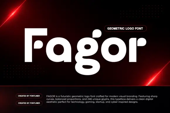
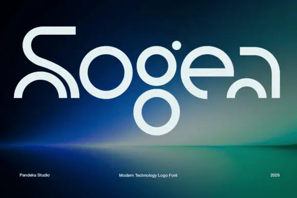
Heavy circular logo letters with detached rounded pieces and a double-bowl g
Fagor builds its letters out of circles and squared stems, so the F is a bar and a stem with no curve, the a is a disc with a short spur and the g drops into a deep round bowl.
Ideas for this font
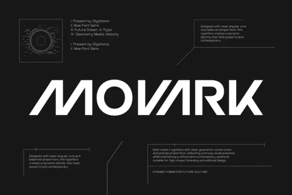
Angular geometric display
Movark is an angular geometric display in white on black: wide capitals with open diagonal constructions on the M and A, a circular O, flat terminals and a slight forward lean, set as one word between four blocks of small technical copy and a drawn diagram at the upper left.
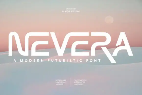
Wide angular capitals with open horizontal breaks and an extended diagonal R leg
Nevera is a wide futuristic sans in caps and lowercase: monoline strokes, rounded joins, a single-storey a and a very open skeleton that makes a word look engineered rather than written.
Ideas for this font
Same independent foundry
Allow optional Google Analytics to measure visits and catalogue actions. Your search words and notes are not included. Privacy & storage