Neutral Sans Workhorse

Gaiden + Sailors
Lets Gaiden own the focal silhouette while handling secondary copy, sizing and subheads cleanly.
Inspect Sailors specimenDisclosure: MakerFileHub may earn a commission from qualifying purchases via paid links on this page. How our links work.
Broad rounded blackletter with a flame-like d ascender
Gaiden sets a bold blackletter in white on black marble, its capitals hooked, its bowls rounded and its strokes thick enough to hold a curve rather than a break.
Paid link
Get this fontProject & layout blueprintsAt-a-glance maker compatibility
Sturdy stroke walls and open counters weed cleanly on adhesive vinyl, HTV apparel film, and cut cardstock.
Visual anatomy & craft review
The name runs as one line of mixed case, the G curling into a hook, the a and e keeping wide rounded bodies, the i carrying a diamond instead of a dot, and the whole word sitting low and wide. The strokes swell and taper slightly, so the face reads as written with a broad nib rather than cut from a template, and the counters stay open enough to keep a lowercase word legible. Two tracked captions sit beneath, one naming the genre and one the foundry, with a small descriptive line under them. It is a display face for dark luxury work, and the sample placement shows that it wants space around it rather than ornament.
Broad rounded blackletter with a flame-like d ascender
Two-font hierarchy recipes
Tested contrast partners — pairing Gaiden with grounded secondary typography.
Gaiden + Sailors
Lets Gaiden own the focal silhouette while handling secondary copy, sizing and subheads cleanly.
Inspect Sailors specimen
Gaiden + Mewah
Grounds bold display lettering with classic typographic authority on posters, badges and apparel.
Inspect Mewah specimenPractical applications
Concrete hierarchy, scale and production guidance tailored to Gaiden’s stroke geometry.
The blackletter gives an autumn event weight without a horror cliche, and the open counters keep a short name readable at a doorway.
Hierarchy & layout recipe
Print a 600 by 400 mm board: set the name at 62 mm on one row, keep 26 mm of clear ground beneath before the time at 16 pt, and keep 30 mm of border so the hooks stay clear of the frame.
Pre-production check
Fine joins close on cheap board stock; check a proof at final size before the print order.
A single gothic line makes a monograph feel printed rather than assembled, and the mixed case keeps a long title from turning into a black band.
Hierarchy & layout recipe
Print a 200 by 260 mm page: set the title at 54 pt across two lines, keep 20 mm of clear ground beneath before the introduction at 10 pt, and keep 18 mm of margin from the text block edge.
Pre-production check
The diamond i is a single glyph; check your own word in the file before designing around it.
The heavy strokes hold on a narrow label, and the blackletter gives a winter release a cellar character that a sans could not carry.
Hierarchy & layout recipe
Print a 40 by 100 mm label: set the release name at 15 pt on one row, keep 7 mm of clear ground beneath before the strength at 5 pt, and keep 5 mm to the die edge so no hook is trimmed.
Pre-production check
Counterfeit-looking texture is a mock-up; check the flat file before planning a foil print.
Technical & licence verification
Confirm included OTF/TTF/WOFF formats, full glyph tables and licence coverage on the live store page before batch production.
Closest visual alternatives
Matched across letterform anatomy, stroke behaviour and craft applications.
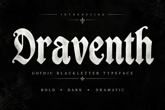
Broad rounded blackletter with curled D and pointed lower joins
Draventh is a wide gothic blackletter display face with heavy stems, sharp hooked shoulders and a weathered silver fill that reads as rubbed metal.
Ideas for this font
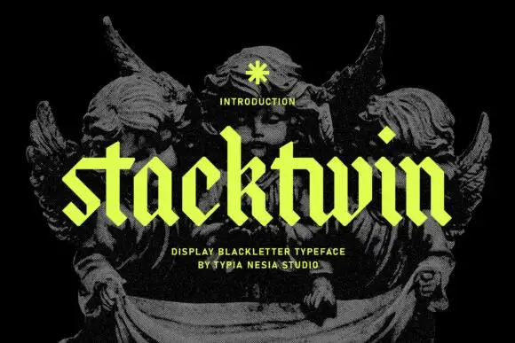
Geometric lowercase blackletter
Stackwin is a geometric lowercase blackletter in acid yellow over a black engraving: straight clipped ends, diamond-shaped dots, uniform stroke widths and angular joins, set as one word with a small note above and two plain lines beneath naming the style and the studio.
Ideas for this font
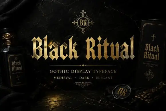
Faceted blackletter with split B and sharp diamond dots
Black Ritual sets heavy gothic capitals with diamond finials in a gold finish on a black ground, and shows the same face printed on a bottle label and a book cover so the range is visible.
Ideas for this font
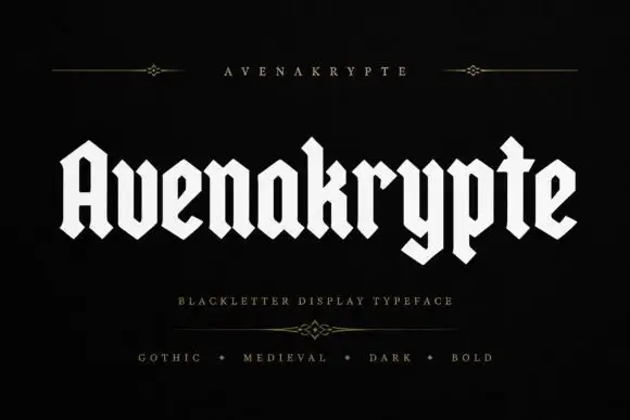
Solid angular blackletter with diamond joins and a long y
Avenakrypte is a blackletter display face drawn with flat angled strokes, diamond-cut feet and much wider counters than the historical model, so the letters look sharpened rather than densely woven.
Ideas for this font
Same independent foundry
Allow optional Google Analytics to measure visits and catalogue actions. Your search words and notes are not included. Privacy & storage