Neutral Sans Workhorse

Designer + Bielchon
Lets Designer own the focal silhouette while handling secondary copy, sizing and subheads cleanly.
Inspect Bielchon specimenDisclosure: MakerFileHub may earn a commission from qualifying purchases via paid links on this page. How our links work.
Segmented geometric capitals
Designer shows a thin geometric wordmark in white on black, where the E is reduced to three horizontal bars, the D loses its upright stem, the R opens at the join and the gaps between segments read as part of the drawing rather than as damage.
Paid link
Get this fontProject & layout blueprintsAt-a-glance maker compatibility
Sturdy stroke walls and open counters weed cleanly on adhesive vinyl, HTV apparel film, and cut cardstock.
Visual anatomy & craft review
The strokes stay thin and even, the curves stay circular and several letters are broken into separate pieces that still describe the shape. Those gaps are the character: the word reads as a constructed mark rather than a typeface sample, which is why the cover carries nothing else. That sparseness is also the limit, since a single word gives little evidence about paragraphs or small labels. Keep 40 pt so the gaps stay legible as intent and test the broken letters in any short word you plan.
Segmented geometric capitals
Two-font hierarchy recipes
Tested contrast partners — pairing Designer with grounded secondary typography.
Designer + Bielchon
Lets Designer own the focal silhouette while handling secondary copy, sizing and subheads cleanly.
Inspect Bielchon specimen
Designer + Lumera Editorial
Grounds bold display lettering with classic typographic authority on posters, badges and apparel.
Inspect Lumera Editorial specimenPractical applications
Concrete hierarchy, scale and production guidance tailored to Designer’s stroke geometry.
The broken geometry gives a practice a mark that looks drawn rather than licensed, and the single word keeps it clean at sign scale.
Hierarchy & layout recipe
Print a 300 by 120 mm reception plate: set the studio name at 40 pt on one row, keep 16 mm of clear ground beneath before the floor line at 10 pt, and keep 18 mm of margin for the fixings.
Pre-production check
The gaps are mistaken for print faults at small sizes; check the plate and keep the name at 34 pt.
The cut letters set a quiet cover line, and the black field makes the gaps read as a deliberate system rather than a broken file.
Hierarchy & layout recipe
Print a 210 by 280 mm cover: set the cover line at 56 pt on one row, keep 24 mm of clear ground beneath before the year at 12 pt, and keep 22 mm of margin at each side.
Pre-production check
Thin strokes on coated black lose edge; check the proof and add 0.1 mm to the stroke weight.
The constructed mark suits a gallery sign where the lettering is the whole identity and no image is allowed on the wall.
Hierarchy & layout recipe
Print a 600 by 300 mm panel: set the exhibition name at 70 mm on one row, keep 26 mm of clear ground beneath before the dates at 16 pt, and keep 30 mm of border so the gaps stay open.
Pre-production check
The broken D reads as a fault at distance; check the panel from four metres before it is mounted.
Technical & licence verification
Confirm included OTF/TTF/WOFF formats, full glyph tables and licence coverage on the live store page before batch production.
Closest visual alternatives
Matched across letterform anatomy, stroke behaviour and craft applications.
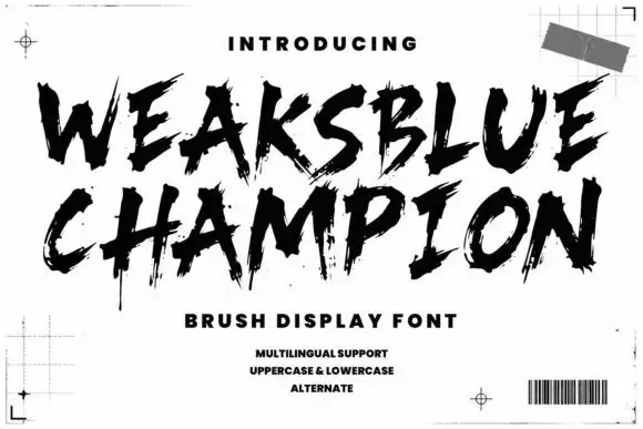
Dry brush capitals with spatter
Weaksblue Champion is a rough dry-brush display in black: heavy capital strokes with spattered edges, set on white inside printer's marks, a grid corner and a barcode.
Ideas for this font
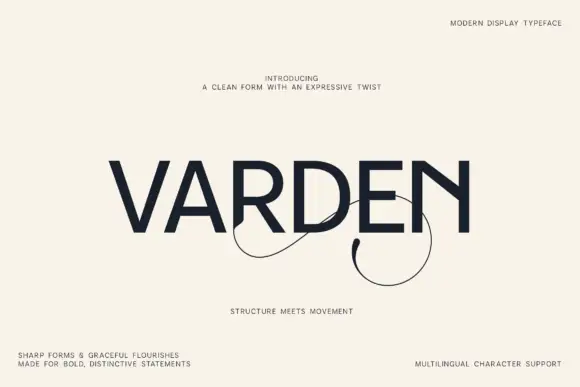
Geometric capitals with looping flourishes
Varden is a plain geometric capital face in dark navy on cream: even strokes, flat terminals and a circular O, with a pair of fine looping flourishes that spring from the bottom of two letters and swing below the baseline, set as one large word with four small copy blocks at the corners.
Ideas for this font
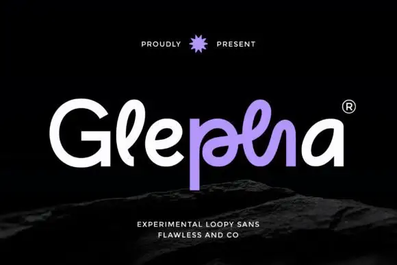
Looped rounded mixed case with interwoven central strokes and a deep p stem
Glepha shows white and purple lettering on black, where a broad open G introduces rounded lowercase forms, the l rises into a narrow loop and the central letters intertwine through a crossing horizontal stroke, while the p drops far below the main bodies and the final a keeps a simple broad bowl.
Ideas for this font
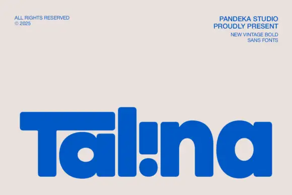
Heavy rounded logo display
Talina is a heavy rounded display in royal blue on a pale sheet: a short name set in very heavy rounded letters with an extended T arm, wide round bowls and an inverted dot-and-stem i that reads as a cut counter, with three small credits in the corners.
Ideas for this font
Same independent foundry
Allow optional Google Analytics to measure visits and catalogue actions. Your search words and notes are not included. Privacy & storage